
 v0.3.1
animated_button
一個簡單且高度可自訂的動畫按鈕,具有類似3D的效果。
169喜歡 605近 30 天下載140Pub 分數
AndroidiOSWebmacOSWindowsLinux
一個非常簡單且可自定義的動畫按鈕。

{"sdk":"flutter"}{"sdk":"flutter"}以下為英文專案原文快照,最新內容請造訪 GitHub。
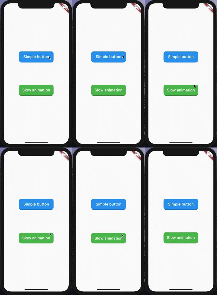
A very simple and customizable animated button. Providing simple animation, and many customizable attributes such height, width, child, ... etc.
Nothing difficult here, yet!
https://raw.githubusercontent.com/Emadeddin-eibo/animated_button/master/giphy.gif
import 'package:animated_button/animated_button.dart';
import 'package:flutter/material.dart';

void main() => runApp(MyApp());

class MyApp extends StatelessWidget {
  @override
  Widget build(BuildContext context) {
    return MaterialApp(
      title: 'Animated Button Demo',
      theme: ThemeData(
        primarySwatch: Colors.blue,
      ),
      home: Demo(),
    );
  }
}

class Demo extends StatelessWidget {
  @override
  Widget build(BuildContext context) {
    return Scaffold(
      body: Center(
        child:             AnimatedButton(
          onPressed: () {},
          color: Colors.blue,
          enabled: true,
          disabledColor: Colors.grey,
          shadowDegree: ShadowDegree.light,
          borderRadius: 8,
          duration: 85,
          height: 40,
          width: 140,
          child: Text(
            'Animated button',
            style: TextStyle(
              fontSize: 14,
              color: Colors.white,
              fontWeight: FontWeight.w500,
            ),
          ),
        ),
      ),
    );
  }
}
AnimatedButton(
child: ...,			    // Child widget, Row, Text, Column,...etc.
onPressed: () {},  	// Callback for onTap event
duration: 70,  		  // Animaton duration, default is 70 Milliseconds
height: 100,  		  // Button Height, default is 64
width: 200,  			  // Button width, default is 200
enabled: true,  		// When disabled, onTap won't be called
shadowDegree: ShadowDegree.dark, // Shadow color is generated from button color,
color: Colors.blue,
disabledColor: Colors.grey,
borderRadius: 8,
)
MIT License.