


 v2.2.0
animated_segmented_tab_control
一個可自訂的分段控制項,可用於標籤檢視中。
100喜歡 4130近 30 天下載160Pub 分數
AndroidiOSWebmacOSWindowsLinux
動畫分段標籤控制項

以下為英文專案原文快照,最新內容請造訪 GitHub。
A customizable segment tab control. Can be used with or without TabView.
Made in lanars.com.
The package provides an advanced segmented control widget based on the TabController.
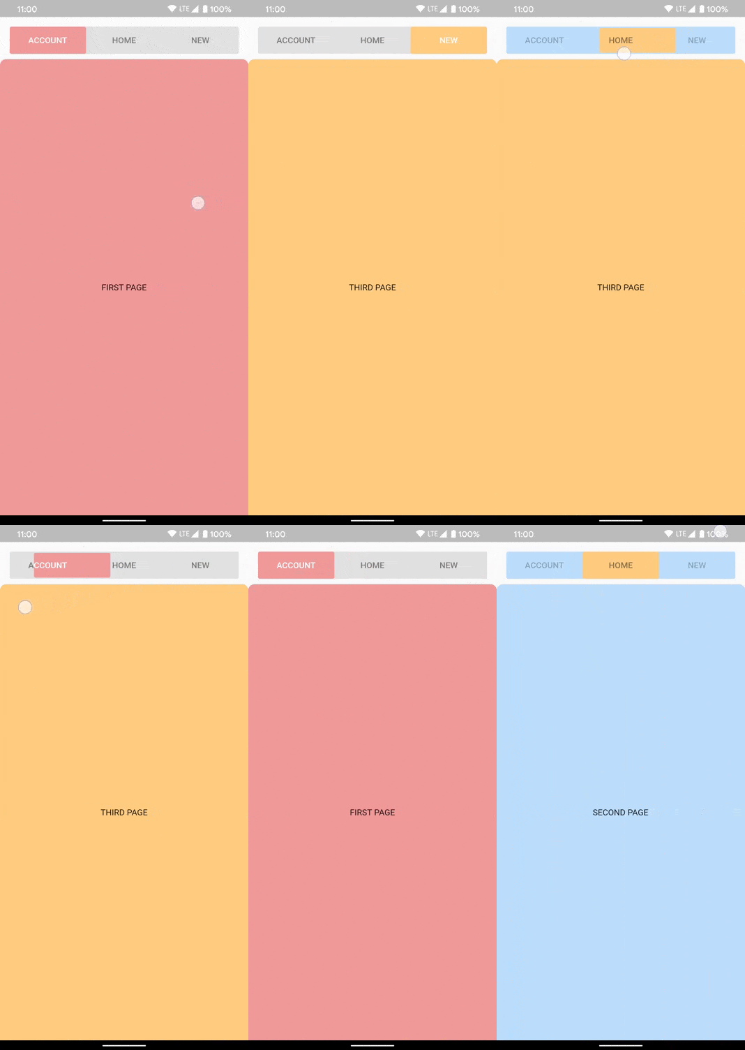

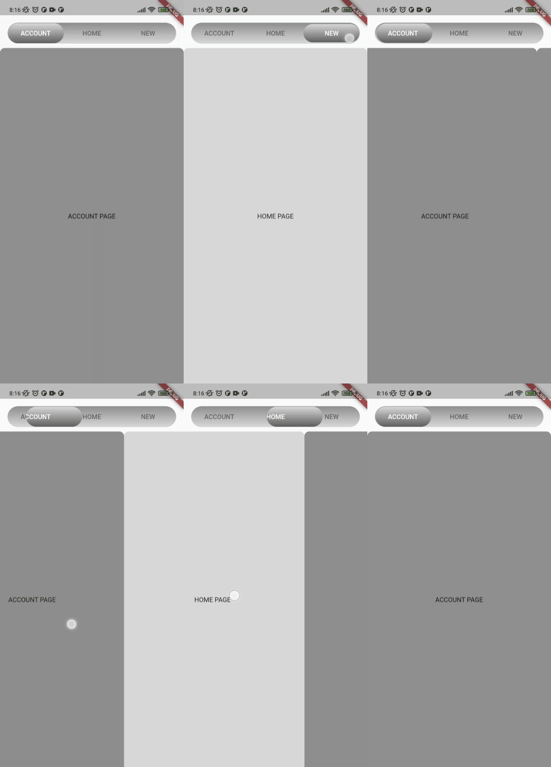
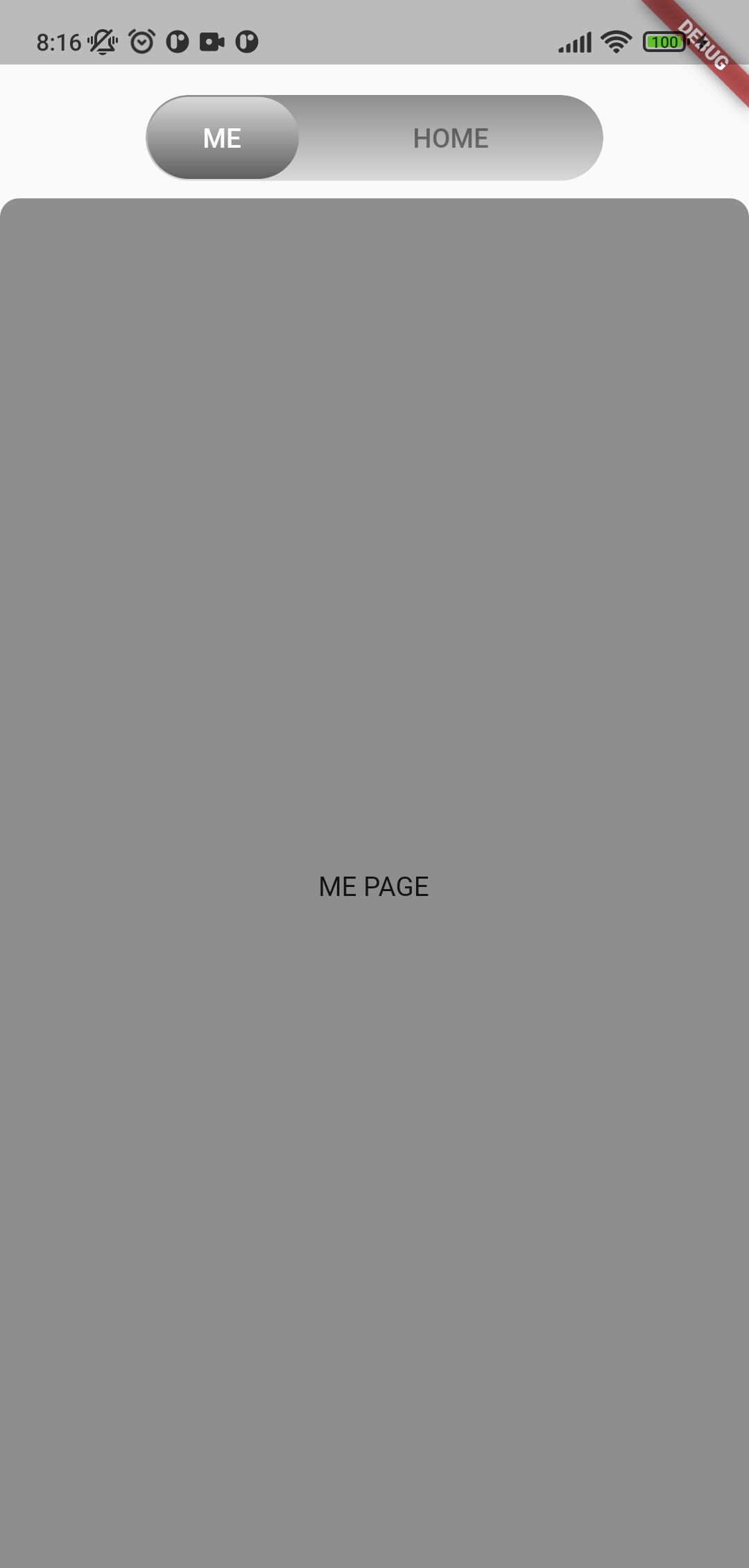
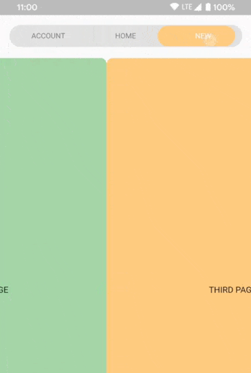
The package contains a SegmentedTabControl widget that requires a SegmentTab list.
SegmentedTabControl(
  tabs: [
    SegmentTab(
      label: 'Home',
    ),
  ],
)
SegmentedTabControl also requires a TabController. You can provide it with a DefaultTabController or instantiate a TabController instead.
DefaultTabController(
  length: 2,
  child: SegmentedTabControl(
    tabs: [
      SegmentTab(
        label: 'Home',
      ),
      SegmentTab(
        label: 'Account',
      ),
    ],
  ),
)
You can style the whole widget, an individual tab, or both. A value on the currently selected SegmentTab
overrides the corresponding value on SegmentedTabControl.
SegmentedTabControl(
  barDecoration: BoxDecoration(
    color: Colors.grey.shade300,
    borderRadius: BorderRadius.circular(10),
  ),
  indicatorDecoration: BoxDecoration(
    color: Colors.orange.shade200,
    borderRadius: BorderRadius.circular(10),
  ),
  tabTextColor: Colors.black45,
  selectedTabTextColor: Colors.white,
  tabs: [
    SegmentTab(
      label: 'ACCOUNT',
      color: Colors.red.shade200,
    ),
    SegmentTab(
      label: 'HOME',
      backgroundColor: Colors.blue.shade100,
      selectedTextColor: Colors.black45,
      textColor: Colors.black26,
    ),
    const SegmentTab(label: 'NEW'),
  ],
)
Note that the text colors are read from the selected tab and applied to the whole bar, so
textColor and selectedTextColor set the bar's label colors while that tab is selected rather than
coloring only that one tab.
Change tracking logic is identical to TabBar logic.
DefaultTabController.of(context).index
or
_controller.index
Use SegmentTab.labelBuilder to show any widget like an icon.
The selected-tab highlight is produced by painting the tab row twice and clipping the upper copy to the
indicator, so the builder is called once per layer and receives the color of the layer it is painting.
Plain Icon and Text children inherit that color. Use color for anything that does not inherit it, such as a
border or an SVG:
SegmentTab(
  label: 'NEW',
  labelBuilder: (context, color) => Container(
    padding: const EdgeInsets.symmetric(horizontal: 8, vertical: 2),
    decoration: BoxDecoration(
      border: Border.all(color: color),
      borderRadius: BorderRadius.circular(20),
    ),
    child: Text('NEW'),
  ),
)
Interactive children are not supported.
If you have any ideas or are running into a bug, please submit an issue on github page: https://github.com/LanarsInc/animated-segmented-tab-control/issues
依賴清單 3 項
{"sdk":"flutter"}{"sdk":"flutter"}^1.0.0先依使用情境篩選,再比較專案活躍情況,最後到原始儲存庫確認使用要求。
“A repository is the most basic element of GitHub.”
GitHub Docs — About repositories ↗