
 v1.5.1
flutter_toggle_tab
用於在 Flutter 上建立美觀且可自訂的切換標籤小部件的程式庫
120喜歡 4800近 30 天下載150Pub 分數
AndroidiOSWebmacOSWindowsLinux
用於在您的應用中建立自訂切換/標籤的程式庫

{"sdk":"flutter"}{"sdk":"flutter"}^2.3.0以下為英文專案原文快照,最新內容請造訪 GitHub。
A Beautiful and Simple Toggle Tab widget. It can be fully customized with desired icons, width, colors, text, corner radius, etc. It also maintains selection state.
In the pubspec.yaml of your flutter project, add the following dependency:
dependencies:
  flutter_toggle_tab: "^latestVersion"
Import it:
import 'package:flutter_toggle_tab/flutter_toggle_tab.dart';
image
// Here default theme colors are used for activeBgColor, activeFgColor, inactiveBgColor and inactiveFgColor
FlutterToggleTab
(
  width: 90, // width in percent
  borderRadius: 30,
  height: 50,
  selectedIndex: _tabTextIndexSelected,
  selectedBackgroundColors: [Colors.blue, Colors.blueAccent],
  selectedTextStyle: TextStyle(
  color: Colors.white,
  fontSize: 18,
  fontWeight: FontWeight.w700),
  unSelectedTextStyle: TextStyle(
  color: Colors.black87,
  fontSize: 14,
  fontWeight: FontWeight.w500),
  dataTabs: _listTextTabToggle,
  selectedLabelIndex: (index) {
    setState(() {
        _tabTextIndexSelected = index;
    });
  },
  isScroll:false,
)
image
// Here default theme colors are used for activeBgColor, activeFgColor, inactiveBgColor and inactiveFgColor
FlutterToggleTab
(
  width: 90, // width in percent
  borderRadius: 30,
  height: 50,
  selectedIndex: _tabTextIndexSelected,
  selectedBackgroundColors: [Colors.blue, Colors.blueAccent],
  selectedTextStyle: TextStyle(
  color: Colors.white,
  fontSize: 18,
  fontWeight: FontWeight.w700),
  unSelectedTextStyle: TextStyle(
  color: Colors.black87,
  fontSize: 14,
  fontWeight: FontWeight.w500),
  dataTabs: _listTextTabToggleCounter,
  selectedLabelIndex: (index) {
    setState(() {
        _tabTextIndexSelected = index;
    });
  },
  isScroll:false,
)
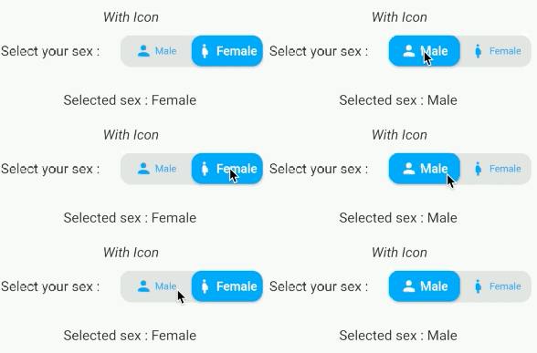
image
FlutterToggleTab
(
  width: 50,
  borderRadius: 15,
  selectedTextStyle: TextStyle(
  color: Colors.white,
  fontSize: 18,
  fontWeight: FontWeight.w600),
  unSelectedTextStyle: TextStyle(
  color: Colors.blue,
  fontSize: 14,
  fontWeight: FontWeight.w400),
  dataTabs: _listGenderText,
  selectedIndex: _tabTextIconIndexSelected,
  selectedLabelIndex: (index) {
    setState(() {
      _tabTextIconIndexSelected = index;
    });
  },
)
image
FlutterToggleTab
(
  width: 40,
  borderRadius: 15,
  selectedIndex: _tabIconIndexSelected,
  selectedTextStyle: TextStyle(
  color: Colors.white,
  fontSize: 18,
  fontWeight: FontWeight.w600),
  unSelectedTextStyle: TextStyle(
  color: Colors.grey,
  fontSize: 14,
  fontWeight: FontWeight.w400),
  dataTabs: _listIconTabToggle,
  selectedLabelIndex: (index) {
    setState(() {
      _tabIconIndexSelected = index;
    });
  },
  marginSelected: EdgeInsets.symmetric(horizontal: 4,vertical:4),
)
FlutterToggleTab
(
  width: 90,
  borderRadius: 15,
  selectedIndex: _tabSelectedIndexSelected,
  selectedTextStyle: TextStyle(
  color: Colors.white,
  fontSize: 18,
  fontWeight: FontWeight.w600),
  unSelectedTextStyle: TextStyle(
  color: Colors.grey,
  fontSize: 14,
  fontWeight: FontWeight.w400),
  dataTabs: _listTextSelectedToggle,
  selectedLabelIndex: (index) {
    setState(() {
      _tabSelectedIndexSelected = index;
    });
  },
)
| Param | isRequired |
|---|---|
| List<DataTab> dataTabs | Yes |
| Function(int) selectedLabelIndex | Yes |
| TextStyle selectedTextStyle default:Theme.of(context).textTheme.bodyMedium, | No |
| TextStyle unSelectedTextStyle default:Theme.of(context).textTheme.bodyMedium, | No |
| int selectedIndex (listener for index selected) see on example | Yes |
| double width (in Percent of width Screen) default: 100 | No |
| double height (double) default: 45 | No |
| double iconSize | No |
| double borderRadius (double) default 30 | No |
| List<Color> selectedBackgroundColors default : [ Theme.of(context).primaryColor] | No |
| List<Color> unSelectedBackgroundColors default [ Color(0xffe0e0e0)] | No |
| Alignment begin default : Alignment.topCenter | No |
| Alignment end default : Alignment.bottomCenter | No |
| bool isScroll default : true | No |
| EdgeInsets marginSelected default : EdgeInsets.zero | No |
| bool isShadowEnable default : true | No |
| bool isInnerShadowEnable default : true | No |
| https://img.shields.io/badge/UpWork-6FDA44?logo=Upwork&logoColor=white |
buymeacoffe ko-fi paypal https://1.bp.blogspot.com/-7OuHSxaNk6A/X92QPg8L9kI/AAAAAAAAG0E/lUzKf_uuVP8jCqvXpA7juh_l-TfK2jnbwCLcBGAsYHQ/s16000/SAWERIA.webp