


 v1.0.4
progressive_time_picker
此套件允許我們根據需求自訂時間選擇器,以從時間選擇器中選擇特定範圍,並支援多個平台。
177喜歡 2730近 30 天下載150Pub 分數
AndroidiOSWebmacOSWindowsLinux
適用於 Flutter 的可自訂漸進式時間選擇器。

以下為英文專案原文快照,最新內容請造訪 GitHub。








A Customizable Progressive Time Picker for Flutter. This package allow us to customize time picker based on our requirements for selecting a specific range from time picker and it's supports multiple platforms.
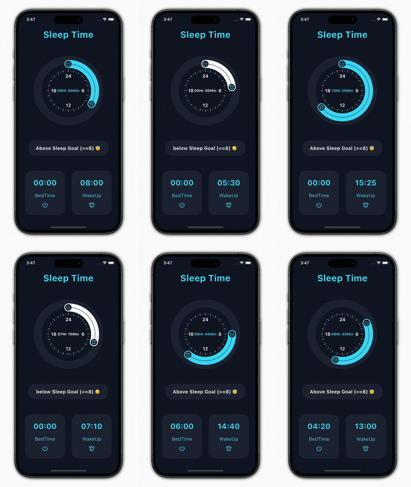
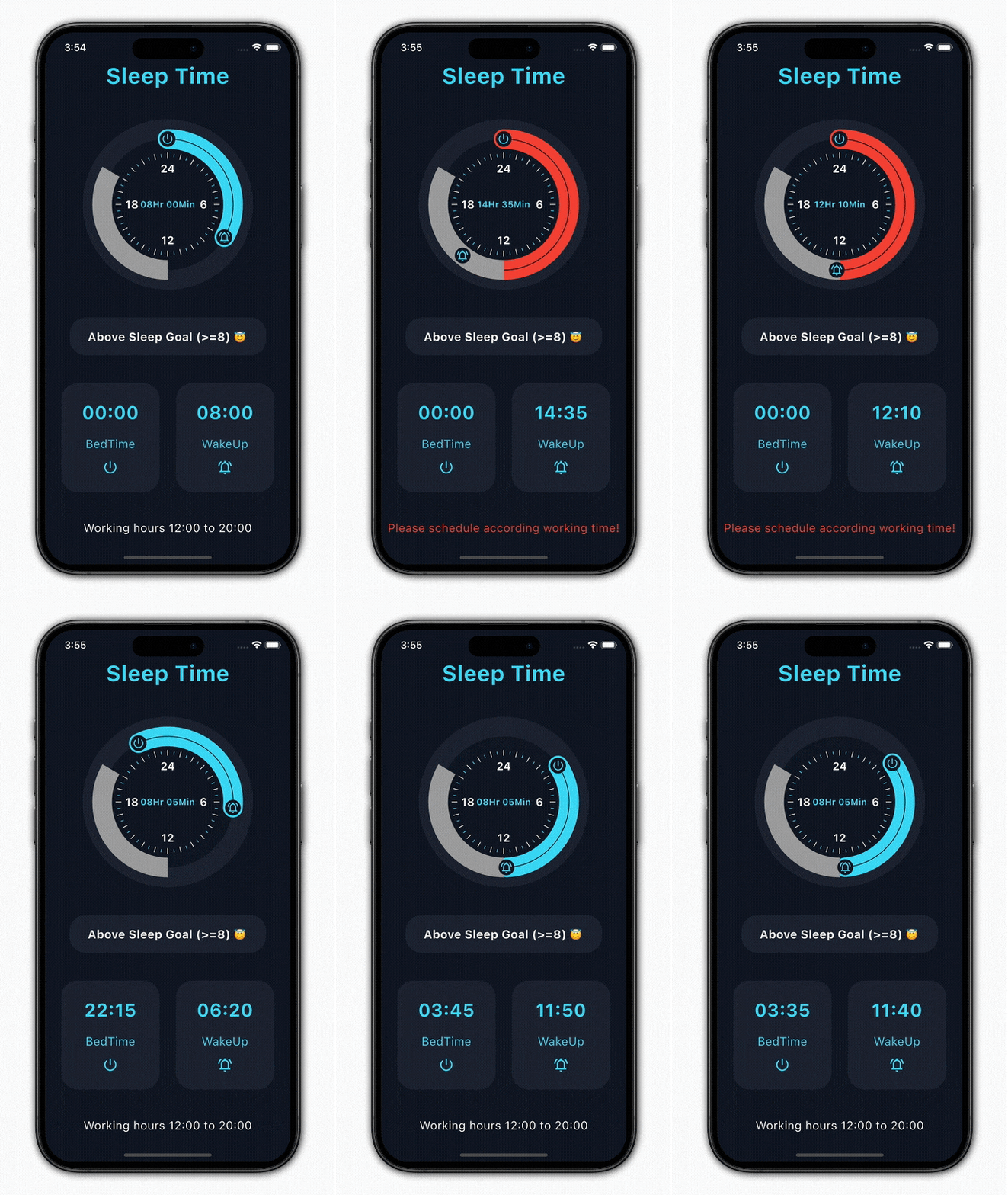
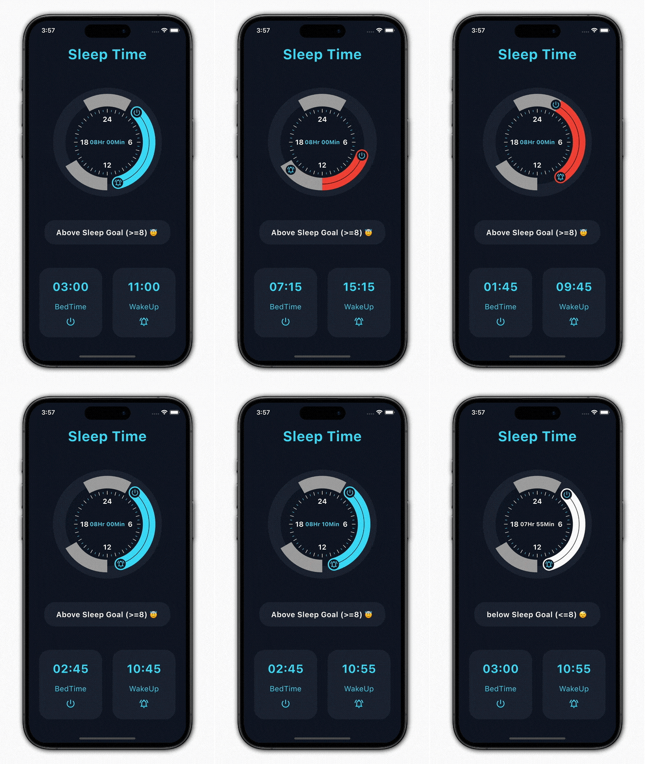
Import it to your project file
import 'package:progressive_time_picker/progressive_time_picker.dart';
And add it in its most basic form like it:
  TimePicker(
    initTime: PickedTime(h: 0, m: 0),
    endTime: PickedTime(h: 8, m: 0),
    onSelectionChange: (start, end, isDisableRange) =>
        print(
            'onSelectionChange => init : ${start.h}:${start.m}, end : ${end.h}:${end.m}, isDisableRangeRange: $isDisableRange'),
    onSelectionEnd: (start, end, isDisableRange) =>
        print(
            'onSelectionEnd => init : ${start.h}:${start.m}, end : ${end.h}:${end.m},, isDisableRangeRange: $isDisableRange'),
  );
And for the DisabledRanges:
TimePicker(
    initTime: PickedTime(h: 0, m: 0),
    endTime: PickedTime(h: 8, m: 0),
    disabledRanges: [
      DisabledRange(
        initTime: PickedTime(h: 12, m: 0),
        endTime: PickedTime(h: 20, m: 0),
      ),
    ],
    disabledRangesColor: Colors.grey,
    disabledRangesErrorColor: Colors.red,
    onSelectionChange: (start, end, isDisableRange) => print(
      'onSelectionChange => init : ${start.h}:${start.m}, end : ${end.h}:${end.m}, isDisableRangeRange: $isDisableRange'),
    onSelectionEnd: (start, end, isDisableRange) => print(
      'onSelectionEnd => init : ${start.h}:${start.m}, end : ${end.h}:${end.m},, isDisableRangeRange: $isDisableRange'),
);
| Parameter | Description |
|---|---|
| PickedTime initTime | the init PickedTime value in the selection |
| PickedTime endTime | the end PickedTime value in the selection |
| onSelectionChange | callback function when init and end PickedTime change |
| onSelectionEnd | callback function when init and end PickedTime finish |
| Parameter | Default | Description |
|---|---|---|
| double height | 220 | height of the canvas |
| double width | 220 | width of the canvas |
| int primarySectors | 0 | the number of primary sectors to be painted |
| int secondarySectors | 0 | the number of secondary sectors to be painted |
| Widget child | Container | widget that would be mounted inside the circle |
| TimePickerDecoration decoration | - | used to decorate our TimePicker widget |
| bool isInitHandlerSelectable | true | used to enabled or disabled Selection of Init Handler |
| bool isEndHandlerSelectable | true | used to enabled or disabled Selection of End Handler |
| bool isSelectableHandlerMoveAble | true | used to enabled or disabled the Movement of Init and End Handler when its not Selectable (disable the dragging of both handlers) |
| List disabledRanges | null | used to disable Selection ranges, If null so there is no disable time ranges |
| Color disabledRangesColor | Colors.grey | defines the color for the disabled range |
| Color disabledRangesErrorColor | Colors.red | defines the color for the error in disabled range |
| bool drawInitHandlerOnTop | false | used to set priority to draw init or end handler on the top |
| Parameter | Description |
|---|---|
| TimePickerSweepDecoration sweepDecoration | used to decorate our sweep part or a part between our init and end point with various options |
| TimePickerHandlerDecoration initHandlerDecoration | used to decorate our init or end handler of time picker |
| TimePickerHandlerDecoration endHandlerDecoration | used to decorate our init or end handler of time picker |
| Parameter | Default | Description |
|---|---|---|
| Color baseColor | cyanAccent | defines the background color of the picker |
| double pickerBaseCirclePadding | 0.0 | to add extra padding for picker base or outer circle |
| TimePickerSectorDecoration primarySectorsDecoration | - | used to decorate the primary sectors of out time picker |
| TimePickerSectorDecoration secondarySectorsDecoration | - | used to decorate the secondary of out time picker |
| TimePickerClockNumberDecoration clockNumberDecoration | - | Provides decoration options which will get applied to the internal clock's numbers when enable |
| SystemMouseCursor mouseCursor | - | Used to set SystemMouseCursor for PanGestureRecognizer |
It would be great for us if the reporter can share the below things to understand the root cause of the issue.
progressive_time_picker is MIT-licensed.
We’d be really happy if you send us links to your projects where you use our open-source libraries. Just send an email to [sales@mindinventory.com](mailto:sales@mindinventory.com) And do let us know if you have any questions or suggestion regarding our work.
Visit our website mindinventory.com
Let us know if you are interested to building Apps or Designing Products.

依賴清單 3 項
{"sdk":"flutter"}{"sdk":"flutter"}^5.0.0先依使用情境篩選,再比較專案活躍情況,最後到原始儲存庫確認使用要求。
“A repository is the most basic element of GitHub.”
GitHub Docs — About repositories ↗