
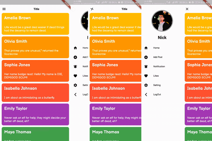
 v3.0.2
flutter_slider_drawer
一個帶有自訂滑動抽屜選單實作的 Flutter 套件
596喜歡 5.3萬近 30 天下載160Pub 分數
AndroidiOSWebmacOSWindowsLinux
您可以使用此外掛製作滑動抽屜式 UI

{"sdk":"flutter"}{"sdk":"flutter"}以下為英文專案原文快照,最新內容請造訪 GitHub。
slider_document
A Flutter package with custom implementation of the Slider Drawer Menu
To start using this package, add flutter_slider_drawer dependency to your pubspec.yaml
dependencies:
  flutter_slider_drawer: '<latest_release>'
SliderAppBar widgetisCupertino: true Widget build(BuildContext context) {
return Scaffold(
body: SliderDrawer(
key: _sliderDrawerKey,
appBar: SliderAppBar(
config: SliderAppBarConfig(
title: Text(
title,
textAlign: TextAlign.center,
style: const TextStyle(
fontSize: 22,
fontWeight: FontWeight.w700,
),
),
),
),
sliderOpenSize: 179,
slider: Container(color: Colors.red),
child: Container(color: Colors.amber),
),
);
}
slider_document
| SliderOpen.LEFT_TO_RIGHT | SliderOpen.RIGHT_TO_LEFT | SliderOpen.TOP_TO_BOTTOM |
|---|---|---|
| slider_left | slider_right | slider_top |
class _MyAppState extends State<MyApp> {
GlobalKey<SliderDrawerState> _sliderDrawerKey =
GlobalKey<SliderDrawerState>();
@override
  Widget build(BuildContext context) {
    return Scaffold(
      body: SliderDrawer(
        key: _sliderDrawerKey,
        appBar: SliderAppBar(
          config: SliderAppBarConfig(
            title: Text(
              title,
              textAlign: TextAlign.center,
              style: const TextStyle(
                fontSize: 22,
                fontWeight: FontWeight.w700,
              ),
            ),
          ),
        ),
        sliderOpenSize: 179,
        slider: Container(color: Colors.red),
        child: Container(color: Colors.amber),
      ),
    );
  }
}
 _sliderDrawerKey.currentState.closeDrawer();
 _sliderDrawerKey.currentState.openDrawer();
 _sliderDrawerKey.currentState.toggle();
 _sliderDrawerKey.currentState.isDrawerOpen();
__sliderDrawerKey.currentState.animationController
Your contribution will help improve the plugin
BSD 2-Clause License