
 v0.0.4
auto_size_widget
一個可以透過拖曳元件角落來調整子元件大小的 Flutter 小部件。
38喜歡 202近 30 天下載130Pub 分數
AndroidiOSWebmacOSWindowsLinux
一個 Flutter 小部件,可以透過拖動小部件角落來調整子小部件的大小

{"sdk":"flutter"}^2.0.0{"sdk":"flutter"}以下為英文專案原文快照,最新內容請造訪 GitHub。
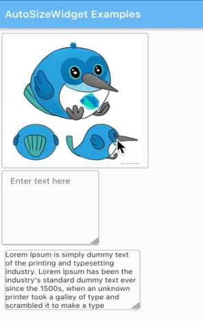
A Flutter widget that can resize the child widget by dragging the widget corner.
https://github.com/SamiaAshraff/auto_size_widget/blob/main/auto_size_widget.gifdependencies:
auto_size_widget: ^0.0.3
import 'package:auto_size_widget/auto_size_widget.dart';
initialWidth and initialHeight should be different from maxWidth and maxHeight respectively.
AutoSizeWidget(
  initialWidth: 120,
  initialHeight: 120,
  maxWidth: 320,
  maxHeight: 320,
  boxDecoration: BoxDecoration(
    border: Border.all(width: 1, color: Colors.grey),
    borderRadius: BorderRadius.circular(5)),
  child: Image.network(
    'https://docs.flutter.dev/assets/images/dash/early-dash-sketches2.jpg',
    fit: BoxFit.fill,
  ),
),
initialWidth and maxWidth should be same to ensure that the width does not change on resize.
AutoSizeWidget(
  initialWidth: 250,
  initialHeight: 120,
  maxWidth: 250,
  maxHeight: 280,
  boxDecoration: BoxDecoration(
    border: Border.all(width: 1, color: Colors.grey),
    borderRadius: BorderRadius.circular(5),
  ),
  child: const SelectableText(
    "Lorem Ipsum is simply dummy text of the printing and typesetting industry. Lorem Ipsum has been the industry's standard dummy text ever since the 1500s, when an unknown printer took a galley of type and scrambled it to make a type specimen book. It has survived not only five centuries, but also the leap into electronic typesetting, remaining essentially unchanged. It was popularised in the 1960s with the release of Letraset sheets containing Lorem Ipsum passages, and more recently with desktop publishing software like Aldus PageMaker including versions of Lorem Ipsum."
  ),
),
initialHeight and maxHeight should be same to ensure that the height does not change on resize.
AutoSizeWidget(
  initialWidth: 150,
  initialHeight: 200,
  maxWidth: 300,
  maxHeight: 200,
  boxDecoration: BoxDecoration(
    border: Border.all(width: 1, color: Colors.grey),
    borderRadius: BorderRadius.circular(5)),
  child: TextFormField(
    keyboardType: TextInputType.multiline,
    maxLines: 3 * 120,
    textAlign: TextAlign.start,
    decoration: const InputDecoration(
      focusedBorder: InputBorder.none,
      contentPadding:
        EdgeInsets.symmetric(vertical: 11, horizontal: 15),
      hintText: "Enter text here"
    ),
  ),
),