

 v3.1.3
sizer
適用於行動裝置、網頁與桌面的響應式UI解決方案——讓適應性變得輕鬆無比。
1850喜歡 7.2萬近 30 天下載150Pub 分數
AndroidiOSWebmacOSWindowsLinux
一個用於輕鬆讓Flutter應用響應式的Flutter外掛。自動適應不同螢幕尺寸。讓響應式設計變得簡單。

以下為英文專案原文快照,最新內容請造訪 GitHub。
Looking for Flutter development support? Let’s connect — available on WhatsApp and Email.


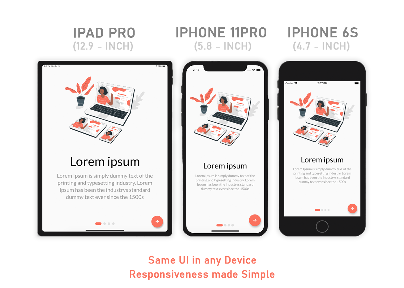
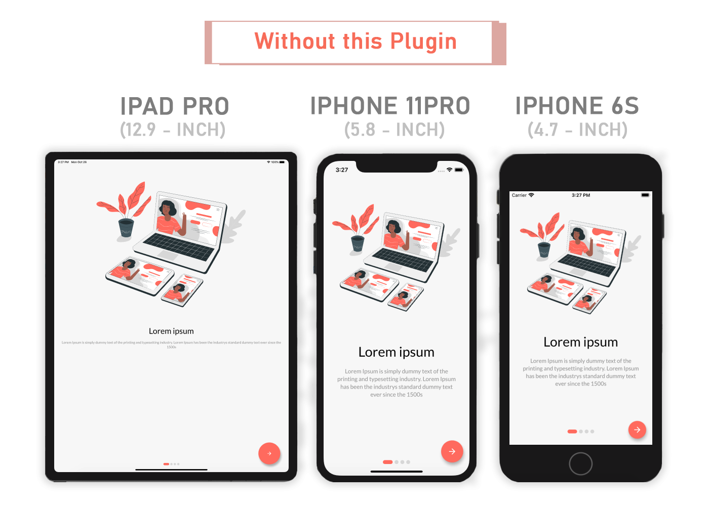
A Flutter package that simplifies responsive design by automatically adapting your app’s UI to any screen size — making responsiveness seamless and intuitive.
Add sizer to pubspec.yaml
dependencies:
  sizer: ^3.1.3
import 'package:sizer/sizer.dart';
Sizer(
  builder: (context, orientation, screenType) {
    return MaterialApp(
      home: HomePage(),
    );
  },
);
Container(
  width: Adaptive.w(20),    // This will take 20% of the screen's width
  height: 30.5.h     // This will take 30.5% of the screen's height
)
Text(
  'Sizer',
  style: TextStyle(fontSize: 15.dp),
  // 15.sp can also be used instead of .dp
  // To know their differences, check #FAQ
)
If your app needs to work seamlessly in both portrait and landscape orientations
Device.orientation == Orientation.portrait
  ? Container(   // Widget for Portrait
      width: 100.w,
      height: 20.5.h,
   )
  : Container(   // Widget for Landscape
      width: 100.w,
      height: 12.5.h,
   )
Same layout to look different in tablet and mobile, use the Device.screenType method:
Device.screenType == ScreenType.tablet
  ? Container(   // Widget for Tablet
      width: 100.w,
      height: 20.5.h,
   )
  : Container(   // Widget for Mobile
      width: 100.w,
      height: 12.5.h,
   )
*Device.ScreenType can not be Desktop unless maxTabletWidth is set
maxMobileWidth - Maximum width of a mobile device
(If the device's width is larger than this, it will be categorized as a tablet) - Default value: 599maxTabletWidth - Maximum width of a tablet device
(If the device's width is larger than this, it will be categorized as a desktop) - Optional: enables Desktop ScreenType if enabledAdaptive.h() or .h - Calculated percentage of the device's height (40.h -> 40% of device's height)Adaptive.w() or .w - Calculated percentage of the device's width (40.w -> 40% of device's width)Adaptive.sp() or .sp - Calculated sp based on the device's pixel density and aspect ratio (See FAQ)Adaptive.dp() or .dp - Calculated dp based on the device's pixel density (See FAQ).sh and .sw if you want height and width to depend on the device's available height and width after applying SafeArea. Use .h and .w by default.Adaptive.sh() or .sh - Calculated percentage of the remaining device's height after applying SafeAreaAdaptive.sw() or .sw - Calculated percentage of the remaining device's width after applying SafeAreaDevice.boxConstraints - BoxConstraints of the deviceDevice.orientation - Screen Orientation of the device (portrait or landscape)Device.screenType - Screen type of the device (mobile or tablet)Device.aspectRatio - Aspect ratio of the deviceDevice.pixelRatio - Pixel density ratio of the deviceAdaptive.cm() or .cm - The respective value in value in centimetersAdaptive.mm() or .mm - The respective value in value in millimetersAdaptive.Q() or .Q - The respective value in quarter-millimetersAdaptive.inches() or .inches - The respective value in inchesAdaptive.pc() or .pc - The respective value in picas (1/6th of 1 inch)Adaptive.pt() or .pt - The respective value in points (1/72th of 1 inch)Adaptive.px() or .px - The respective value in pixelsYou need to import sizer package in order to access number.h, number.w, number.dp, and number.sp
Auto import in VSCode and Android Studio doesn't work for dart extension methods. Typing 10.h would not bring up auto import suggestion for this package
One workaround is to type Device so that the auto import suggestion would show up:
import 'package:sizer/sizer.dart';
.sp and .dp?.dp is supposedly calculated see below based on Material Design's dp calculation
while.sp is calculated based on the device's pixel density and aspect ratio
Since there is no way to obtain a device's physical width in inches, we could not calculate for screen density. Material Design's screen density calculation involves a device's physical width in inches. As an alternative, dp is calculated using the device's pixel ratio.
If you have any suggestions or issues, feel free to open an issue
If you would like to contribute, feel free to create a PR
依賴清單 2 項
{"sdk":"flutter"}{"sdk":"flutter"}先依使用情境篩選,再比較專案活躍情況,最後到原始儲存庫確認使用要求。
“A repository is the most basic element of GitHub.”
GitHub Docs — About repositories ↗