

 v2.1.0
icon_decoration
為 Icon 小部件添加邊框和漸變的裝飾功能。
97喜歡 3120近 30 天下載150Pub 分數
AndroidiOSWebmacOSWindowsLinux
為 Icon 小部件添加裝飾功能,包括陰影、邊框和漸變。

以下為英文專案原文快照,最新內容請造訪 GitHub。


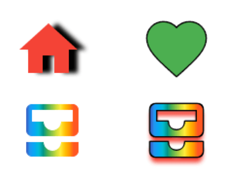
Add decoration capabilities to the Icon widget with borders and gradients. This new DecoratedIcon widget overlap itself with the base Icon widget to provide a more complete decoration system through a IconDecoration property.
pubspec.yamlicon_decoration: any
import 'package:icon_decoration/icon_decoration.dart';

DecoratedIcon(
    icon: Icon(Icons.favorite, color: Colors.green),
    decoration: IconDecoration(border: IconBorder()),
)
Gradients are supported on Flutter Web only with the canvaskit renderer

DecoratedIcon(
    icon: Icon(Icons.all_inbox),
    decoration: IconDecoration(
        gradient: rainbowGradient,
    ),
)

DecoratedIcon(
    icon: Icon(
        Icons.all_inbox,
        shadows: [
            Shadow(
                color: Colors.red,
                blurRadius: 3,
                offset: Offset(0, 2),
            ),
        ],
    ),
    decoration: IconDecoration(
        gradient: _rainbowGradient,
        border: IconBorder(),
    ),
)
IconDecoration.shadows, use Icon.shadows instead.Before
DecoratedIcon(
    icon: Icon(Icons.all_inbox),
    decoration: IconDecoration(
        shadows: [
            Shadow(
                color: Colors.red,
                blurRadius: 3,
                offset: Offset(0, 2),
            ),
        ],
    ),
)
After
Icon(
    Icons.all_inbox,
    shadows: [
        Shadow(
            color: Colors.red,
            blurRadius: 3,
            offset: Offset(0, 2),
        ),
    ],
),
先依使用情境篩選,再比較專案活躍情況,最後到原始儲存庫確認使用要求。
“A repository is the most basic element of GitHub.”
GitHub Docs — About repositories ↗