
 v1.0.1
cupertino_height_picker
此套件提供無縫的 Cupertino 風格高度選擇器,支援公制的公分與英制的英尺/英吋,為使用者提供多樣性與精確度。
8喜歡 200近 30 天下載160Pub 分數
AndroidiOSWebmacOSWindowsLinux
此套件提供無縫的 Cupertino 風格高度選擇器,支援公制的公分與英制的英尺/英吋,為使用者提供多樣性與精確度。

{"sdk":"flutter"}{"sdk":"flutter"}^4.0.0以下為英文專案原文快照,最新內容請造訪 GitHub。
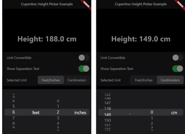
A seamless Cupertino-style height picker widget for Flutter. Supports height selection in both centimeters (metric) and feet/inches (imperial), providing versatility and precision for users.
| Imperial System | Metric System | Automatic Unit Conversion |
|---|---|---|
| Imperial System Demo | Metric System Demo | Unit Conversion Demo |
Add this to your package's pubspec.yaml file:
dependencies:
  cupertino_height_picker: ^1.0.1
You can install packages from the command line:
$ flutter pub get
Now in your Dart code, you can use:
import 'package:cupertino_height_picker/cupertino_height_picker.dart';
Call the default showCupertinoHeightPicker Function which always returns the height in centimeters and has automatic unit conversion enabled by default
screenshot_1await showCupertinoHeightPicker(
context: context,
onHeightChanged: (val) {
setState(() {
heightInCm = val;
});
},
);
Allow Height to be input only from metric system
screenshot_2await showCupertinoHeightPicker(
context: context,
initialSelectedHeightUnit:HeightUnit.cm,
canConvertUnit: false,
onHeightChanged: (val) {
print(val);
},
);
Start from a custom initial height and don't show the separation text between feet and inches
screenshot_3await showCupertinoHeightPicker(
context: context,
initialHeight: 185.5,
showSeparationText: false,
onHeightChanged: (val) {
print(val);
},
);
Customize the Look of the Modal to your liking!
screenshot_4await showCupertinoHeightPicker(
context: context,
modalHeight: 300,
maxModalWidth: 500,
modalBackgroundColor: CupertinoColors.systemTeal,
barrierColor: CupertinoColors.systemGreen.withOpacity(0.5),
onHeightChanged: (val) {
print(val);
},
);
context: (Required) The BuildContext object, which is necessary for rendering the height picker within the widget tree.
onHeightChanged: (Required) A callback function that handles height changes when the user scrolls through different height values. The selected height is returned in centimeters.
initialHeight: Sets the default initial height value when the picker is opened. The default is 150.0 cm.
initialSelectedHeightUnit: Specifies the default height unit (either HeightUnit.inches or HeightUnit.cm) when the picker is opened. The default is HeightUnit.inches.
canConvertUnit: A boolean that determines whether the height picker allows conversion between imperial and metric systems. The default is true.
showSeparationText: A boolean that controls whether a separation text (e.g., 'feet') or a decimal point text is shown between the two sliders. The default is true.
modalHeight: Specifies the height of the modal sheet. The default value is 216.0.
maxModalWidth: Defines the maximum width of the modal sheet. This is useful for responsiveness on larger screens, such as tablets and laptops. If null, the modal takes up the full device width. The default is null.
modalBackgroundColor: Defines the background color of the modal sheet. The default is null.
barrierColor: Sets the color of the screen behind the modal, allowing for a custom background color with reduced opacity. The default is kCupertinoModalBarrierColor.