

 v0.2.2
rolling_bottom_bar
用於顯示動態底部欄並以球形作為指示器的套件。
38喜歡 162近 30 天下載140Pub 分數
AndroidiOSWebmacOSWindowsLinux
ajomuch92/rolling-bottom-bar-flutter open-source repository details.

以下為英文專案原文快照,最新內容請造訪 GitHub。
This packages, based on this demo by Kabo showing a bottom bar with a dynamic ball indicator.
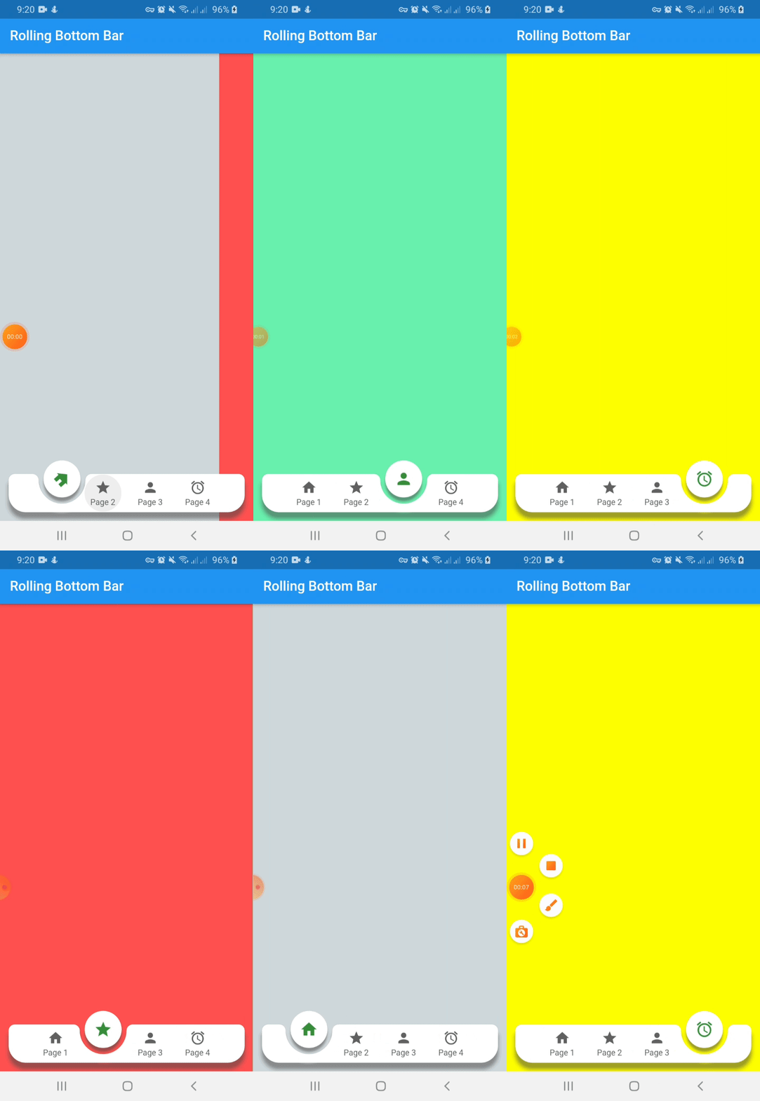
Include rolling_bottom_bar in your pubspec.yaml file:
dependencies:
  flutter:
    sdk: flutter
  rolling_bottom_bar: version
To use this package, just import it into your file, build your bottom bar together with a PageView and enjoy it.
import 'package:rolling_bottom_bar/rolling_bottom_bar.dart';
import 'package:rolling_bottom_bar/rolling_bottom_bar_item.dart';

...

@override
  Widget build(BuildContext context) {
    return Scaffold(
      appBar: AppBar(
        title: Text('Rolling Bottom Bar'),
      ),
      body: PageView(
        controller: _controller,
        children: <Widget>[
          ColoredBox(color: Colors.blueGrey.shade100),
          ColoredBox(color: Colors.redAccent),
          ColoredBox(color: Colors.greenAccent),
          ColoredBox(color: Colors.yellowAccent),
        ],
      ),
      extendBody: true,
      bottomNavigationBar: RollingBottomBar(
        controller: _controller,
        items: [
          RollingBottomBarItem(Icons.home, label: 'Page 1'),
          RollingBottomBarItem(Icons.star, label: 'Page 2'),
          RollingBottomBarItem(Icons.person, label: 'Page 3'),
          RollingBottomBarItem(Icons.access_alarm, label: 'Page 4'),
        ],
        activeItemColor: Colors.green.shade700,
        enableIconRotation: true,
        onTap: (index) {
          _controller.animateToPage(
            index,
            duration: const Duration(milliseconds: 400),
            curve: Curves.easeOut,
          );
        },
      ),
    );
  }
}

...
| Name | Description | Required | Default |
|---|---|---|---|
| iconData | IconData to use as item icon | True | |
| label | String to use as label item | False | |
| activeColor | Color to use when icon is active. Only works with useActiveColorByDefault property of RollingBottomBarItem set on true | False | Colors.green |
| Name | Description | Required | Default |
|---|---|---|---|
| controller | PageView controller to use to move between pages | True | |
| items | List of RollingBottomBarItem to render into bottom bar | True | |
| onTap | Function triggered when an item is tapped | True | |
| color | Color value to use as background | False | Colors.white |
| itemColor | Color value to use with inactive items | False | Colors.grey[700] |
| activeItemColor | Color value to use with active items | False | Colors.green |
| enableIconRotation | Boolean value to indicate when rotation effect is triggered | False | false |
| flat | Boolean value to indicate if the bottom bar has shadow or not | False | false |
| useActiveColorByDefault | Boolean value to indicate when to use individual active color for each child | False | true |
依賴清單 2 項
{"sdk":"flutter"}{"sdk":"flutter"}先依使用情境篩選,再比較專案活躍情況,最後到原始儲存庫確認使用要求。
“A repository is the most basic element of GitHub.”
GitHub Docs — About repositories ↗