
 v0.0.8
square_progress_indicator
您可以建立可自訂的方形進度指示器,類似於原生 Flutter 的 CircularProgressIndicator 小部件。
30喜歡 5040近 30 天下載160Pub 分數
AndroidiOSWebmacOSWindowsLinux
一個庫,用於建立完全可自定義的方型或矩形進度指示器,類似於原生 Flutter CircularProgressIndicator 小工具!

{"sdk":"flutter"}{"sdk":"flutter"}^5.0.0以下為英文專案原文快照,最新內容請造訪 GitHub。
Create fully customizable square or rectangle progress indicators like native flutter CircularProgressIndicator widget!
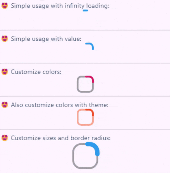
Full example of SquareProgressIndicator
You can check the example project web export on this link: https://amir14a.github.io/square_progress_indicator/ Thanks to Github!❤️
Simple usage:
const SquareProgressIndicator(),
Customize usage:
SquareProgressIndicator(
    value: _value,
    width: 100,
    height: 100,
    borderRadius: 0,
    startPosition: StartPosition.leftCenter,
    strokeCap: StrokeCap.square,
    clockwise: true,
    color: Colors.purple,
    emptyStrokeColor: Colors.purple.withOpacity(.5),
    strokeWidth: 16,
    emptyStrokeWidth: 16,
    strokeAlign: SquareStrokeAlign.center,
    child: Text("${(_value * 100).toStringAsFixed(0)}%"),
),
| Parameter | Type | Default | Info |
|---|---|---|---|
value |
double? | null |
The value of the progress, it should be between 0 and 1. don't pass it to use Indeterminate mode |
width |
double | 38 |
The width of rectangle that the progress line is drawn around it. |
height |
double | 38 |
The height of rectangle that the progress line is drawn around it. |
borderRadius |
double | 8 |
The border radius of the rectangle, it is applied to all four corners. |
color |
Color? | progressIndicatorTheme.color |
The color of the progress line. |
emptyStrokeColor |
Color? | progressIndicatorTheme.circularTrackColor |
The color of the line behind the progress line which show for reminding progress. |
strokeWidth |
double | 4 |
The width of the progress line. |
emptyStrokeWidth |
double | 4 |
The width of the line behind the progress line which show for reminding progress. |
clockwise |
boolean | true |
The direction of turn of progress line, if you pass false, the progress line will be reversed, default value is true. |
startPosition |
double | 0 (StartPosition.topCenter) |
Start position of progress line relative to the topCenter, you can pass a value from [StartPosition] class or custom double value you need. |
strokeAlign |
SquareStrokeAlign | SquareStrokeAlign.inside |
The stroke align of the progress line, pass a value from [SquareStrokeAlign] and read it's documents. see: https://api.flutter.dev/flutter/painting/BorderSide/strokeAlign.html |
strokeCap |
StrokeCap? | StrokeCap.round |
The stroke cap of the progress line and empty line, see: https://api.flutter.dev/flutter/dart-ui/StrokeCap.html |
child |
Widget? | null |
The child widget, it can be a text or everything you need. |
Feel free to create issue or pull requests in github repository!