
 v3.0.1
responsive_ui
responsive ui Flutter 套件可協助您建立響應式與巢狀響應式組件。適用於 Android、iOS 與 Web,支援直向與橫向模式。
104喜歡 170近 30 天下載160Pub 分數
AndroidiOSWebmacOSWindowsLinux
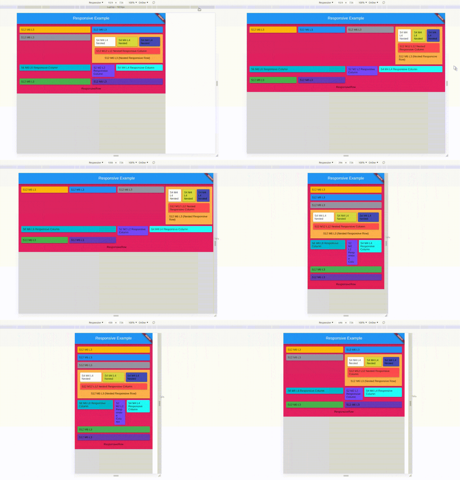
Flutter 響應式組件 - 在所有 Flutter 平台運行

{"sdk":"flutter"}{"sdk":"flutter"}^2.0.1以下為英文專案原文快照,最新內容請造訪 GitHub。
responsive_ui package helps you to create a responsive widget and Nested responsive widgets. Works on all Platforms.
It works as same as Bootstrap / Materialize Row Column method, Splitting screen into 12 columns and placing widget by combining column based on screen size.
    Responsive(
        children: <Widget>[
            Div(
                division:Division(
                    colS: 5,
                    offsetL: 2,
                ),
                child: Card(child: Icon(Icons.game))
            ),
            Div(
                division:Division(
                    colS: 12,
                    colM: 6,
                    colL: 4,
                ),
                child: Text('responsive ui')
            )
        ]
    )
The Responsive UI Package contains two simple widgets.
| Arguments | inputs | if null / default to |
|---|---|---|
child |
Widget | required |
division |
Division | if null defaluts to Division() |
Divison() intakes column sizes and offSets.
| Arguments | inputs | if null / default to |
|---|---|---|
colXS |
(int) 0-12 | 12 |
colS |
(int) 0-12 | colXS value |
colM |
(int) 0-12 | ColS value |
colL |
(int) 0-12 | ColM value |
colXL |
(int) 0-12 | ColL value |
offsetXS |
(int) 0-12 | 0 |
offsetS |
(int) 0-12 | 0 |
offsetM |
(int) 0-12 | 0 |
offsetL |
(int) 0-12 | 0 |
offsetXL |
(int) 0-12 | 0 |
0 - 0.0 width (gone) (replaced with SizedBox.shrink())
12 - full width (provided by parent widget not screen width)
Parent widget should not be a horizontal scroll type widget
To offset, simply add offsetS / offsetM / offsetL to the Div() widget with colS / colM / colL respectively.
Offset works for their respective column sizes.
Responsive intakes List<Widget> or List<Div> with default column/screen size for each widget can be declared.
| Arguments | inputs | if null / default |
|---|---|---|
children |
List / List | not null / required / empty[] |
alignment |
WrapAlignment | WrapAlignment.start |
runAlignment |
WrapAlignment | WrapAlignment.start |
crossAxisAlignment |
WrapCrossAlignment | WrapCrossAlignment.start |
runSpacing |
double | 0.0 |
Responsive widget is a Wrap widget.
Responsive & Div() widget need Finite width to work.
Div() works with vertical scroll not in horizontal scroll, as it calculations are base on width only.
Div() works as expected when it placed as a direct child of Responsive() widget's children.
Sum of the offset and the respective col should be <= to 12
Place a Responsive() widget into a Div().
The nested Responsive() widget takes the width provided by parent Div() widget and not the screen width
| Type | Default Size |
|---|---|
| Xtra small | < 375.0 |
| Small | 375.0 - 596.0 |
| Medium | 596.0 - 897.0 |
| Large | 897.0 - 1232.0 |
| Xtra Large | >1232.0 |
Yes, now you can set your own breakpoints, that applies to all the Responsive & Div widgets.
void main() {
  // sample 1
  Responsive.setGlobalBreakPoints(400.0, 600.0, 997.0, 1380.0);
  // Sample 2
  Responsive.setGlobalBreakPoints(0, 596.0, 897.0, 1232.0);
  // Since the first value is 0 : colXS is always neglected
  runApp(const MyApp());
}
responsive_ui is made simply using Wrap() and LayoutBuilder() with a bits of logics.