
 v7.0.0
flutter_speed_dial
Flutter 插件,用於實現具有標籤、動畫圖示、多方向子項等的美觀且動態的 Material Design 速撥鈕。
1340喜歡 10.4萬近 30 天下載140Pub 分數
AndroidiOSWebmacOSWindowsLinux
實現 Material Design 速度撥號的 Flutter 插件

{"sdk":"flutter"}—以下為英文專案原文快照,最新內容請造訪 GitHub。
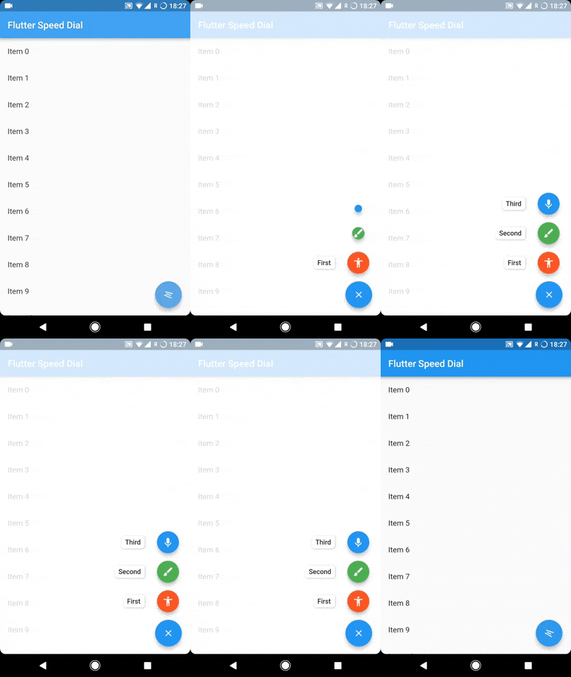
Flutter package to render a Material Design Speed Dial.
To sustain the development of this library we need someone who can help this library either through code or by donating it. Donation will help us to live up in the world of unmaintained open source packages and to dedicate more time in improving this to live up to the mark. We will also add the name of the contributors or the donaters in the README section.
To donate directly you can use below link, don't forget to leave a message there:
Or become a Github sponser by clicking on the Sponser button in this repository.
GitHub release License Classic API Docs Usage
https://user-images.githubusercontent.com/41370460/113670683-0de04700-96d3-11eb-8029-aeadf1797b60.gif
The SpeedDial widget is built to be placed in the Scaffold.floatingActionButton argument, replacing the FloatingActionButton widget.
You can set its position using Scaffold.floatingActionButtonLocation argument.
It can also be used with Scaffold.bottomNavigationBar and Snackbar.
Null safety is available from version 3.0.5 ( It is also backward compatible, meaning you can use it with non null safe code too )
SpeedDial can take any Widget as label SpeedDial will use Extended FloatingActionButton property if label is specified. It also have activeLabel property by which you can specify the label which is shown when SpeedDial is open. It also comes with its labelTransitionBuilder which defaults to fade transition.
Also Every child's button have label property which accepts String which can be styled by using labelStyle. If you want to specify a widget then you can use labelWidget.
If the label parameter is not provided, then the label will be not rendered.
animatedIcon property
animatedIcon takes an AnimatedIconData widgetanimatedIconTheme takes IconThemeDatachild & activeChild property
child takes a widget and is the default placeholder if dial is not open.activeChild takes a widget and is the child's Widget which is used when dial is open, not required.icon & activeIcon property
icon takes a IconData and is the default placeholder if dial is not open.activeIcon takes a IconData and is the child's IconData which is used when dial is open, not required.iconTheme takes its IconThemeData which includes color and size.The package will handle the animation by itself.
There are various properties for SpeedDial by which you can adjust the spacing:
spacing - This parameter handles the space b/w speed dial and its children.
spaceBetweenChildren - As the name suggests, this is used to adjust the space b/w every child element
childPadding - This will adjust the padding of children speed dial button, this will help you to control the size of the children button more effectively.
childMargin - This will help you to adjust the margin b/w children speed dial button and its label.
Closes automatically on back button press, if dial is open.
If you don't want this behaviour then simply change the value of closeDialOnPop to false.
openCloseDial property:isDialOpen:ValueNotifier<bool> isDialOpen = ValueNotifier(false);
openCloseDial to isDialOpen in your SpeedDial:SpeedDial(
...
openCloseDial: isDialOpen,
...
)
isDialOpen.value = false;
See Example Code for more info.
Please file an issue to send feedback or report a bug,
If you want to ask a question or suggest an idea then you can open an discussion.
Thank you!
Every pull request is welcome.