
 v3.0.3
auth_buttons
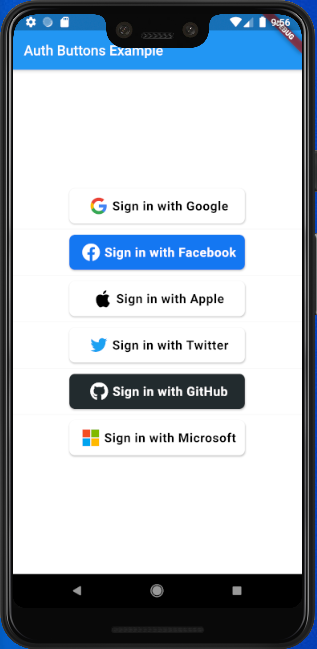
Auth Buttons 是一個 Flutter 小部件庫,包含用於透過最流行的社交網絡(如 Google、Facebook、Apple 和 Twitter)進行身分驗證的按鈕。
198喜歡 3170近 30 天下載140Pub 分數
AndroidiOSWebmacOSWindowsLinux
Auth Buttons 是一個 Flutter 小工具程式庫,包含用於透過最流行的社交網絡進行驗證的按鈕。

{"sdk":"flutter"}^2.0.7^6.2.1^4.0.0{"sdk":"flutter"}以下為英文專案原文快照,最新內容請造訪 GitHub。
Auth Buttons is a flutter widget library, include buttons for authenticating with the most popular social networks like: Google, Facebook, Apple and too other.
dependencies:
  auth_buttons: <^last>
$ flutter pub get
import 'package:auth_buttons/auth_buttons.dart';
We recommend you to using show special when you want use some button.
show help you importing part of library.
import 'package:auth_buttons/auth_buttons.dart'
    show GoogleAuthButton, AuthButtonStyle, AuthButtonType, AuthIconType;
We also recommend you to using the latest version.
From the version 3.0.0
all AuthButtons
are following the system mode.
see ThemeMode
for more info.
From the version 3.0.0 you're able to
regroup AuthButton
s for sharing style properties,
to do this use the already existing AuthButtonGroup.
From the version 2.0.0 disabled state is supported.
There are three Types you can choose between them:
If you plain to use a non existing AuthButton like: Linkedin or any others along with the existing
one,
than make your custom one just use CustomAuthButton this provide you with a fast way to do so.
You need to use just the following code:
GoogleAuthButton(
  onPressed: () {},
),
| Light | Dark |
|---|---|
| default-button-default-icon | dark-default-button-default-icon |
GoogleAuthButton(
  onPressed: () {},
  style: AuthButtonStyle(
    iconType: AuthIconType.outlined,
  ),
),
| Light | Dark |
|---|---|
| default-button-outlined-icon | dark-default-button-outlined-icon |
GoogleAuthButton(
  onPressed: () {},
  style: AuthButtonStyle(
    iconType: AuthIconType.secondary,
  ),
),
| Light | Dark |
|---|---|
| default-button-secondary-icon | dark-default-button-secondary-icon |
GoogleAuthButton(
  onPressed: () {},
  style: AuthButtonStyle(
    buttonType: AuthButtonType.icon,
  ),
),
| Light | Dark |
|---|---|
| icon-button-default-icon | dark-icon-button-default-icon |
GoogleAuthButton(
  onPressed: () {},
  style: AuthButtonStyle(
    buttonType: AuthButtonType.icon,
    iconType: AuthIconType.outlined,
  ),
),
| Light | Dark |
|---|---|
| icon-button-outlined-icon | dark-icon-button-outlined-icon |
GoogleAuthButton(
  onPressed: () {},
  style: AuthButtonStyle(
    buttonType: AuthButtonType.icon,
    iconType: AuthIconType.secondary,
  ),
),
| Light | Dark |
|---|---|
| icon-button-secondary-icon | dark-icon-button-secondary-icon |
GoogleAuthButton(
  onPressed: () {},
  style: AuthButtonStyle(
    buttonType: AuthButtonType.secondary,
  ),
),
| Light | Dark |
|---|---|
| secondary-button-default-icon | dark-secondary-button-default-icon |
GoogleAuthButton(
  onPressed: () {},
  style: AuthButtonStyle(
    buttonType: AuthButtonType.secondary,
    iconType: AuthIconType.outlined,
  ),
),
| Light | Dark |
|---|---|
| secondary-button-outlined-icon | dark-secondary-button-outlined-icon |
GoogleAuthButton(
  onPressed: () {},
  style: AuthButtonStyle(
    buttonType: AuthButtonType.secondary,
    iconType: AuthIconType.secondary,
  ),
),
| Light | Dark |
|---|---|
| secondary-button-secondary-icon | dark-secondary-button-secondary-icon |
| Light | Dark |
|---|---|
| disabled-buttons | dark-disabled-buttons |
Do same think with the other buttons, when you want to customize any button you can do it just passing a property which you want.
Example
auth button group usecaseAuthButtonGroup(
style: const AuthButtonStyle(
width: 180,
height: 50,
borderColor: Colors.purple,
borderWidth: 3.0,
margin: EdgeInsets.only(bottom: 8.0),
),
buttons: [
GoogleAuthButton(),
AppleAuthButton(),
//....
]
),
Secondary | Icon
:-----------------------------------------------------------------------------------------------------------------------------------------------------------------------------------------------------:|:-------------------------: auth button group secondary buttons | auth-button-group-icon-buttons
Full property you can pass:
GoogleAuthButton(
  key: const ValueKey<String>(''),
  onPressed: () {},
  onLongPress: () {},
  onHover: (bool value) {},
  onFocusChange: (bool value) {},
  focusNode: FocusNode(),
  autofocus: false,
  text: 'Sign in with Google',
  isLoading: false,
  themeMode: ThemeMode.system,
  textDirection: TextDirection.ltr,
  materialStyle: ButtonStyle(),
  style: AuthButtonStyle(
    buttonColor: Colors.blue,
    splashColor: Colors.red,
    elevation: 2.0,
    borderRadius: 99.0,
    textStyle: TextStyle(),
    padding: const EdgeInsets.all(8.0),
    margin: const EdgeInsets.all(8.0),
    borderColor: Colors.amber,
    borderWidth: 3.0,
    buttonType: AuthButtonType.secondary,
    width: 300.0,
    height: 50.0,
    iconSize: 40.0,
    separator: 20.0,
    iconBackground: Colors.white,
    iconType: AuthIconType.outlined,
    shadowColor: Colors.pink,
    progressIndicatorColor: Colors.blue,
    progressIndicatorValueColor: Colors.grey[300],
    progressIndicatorStrokeWidth: 2.0,
    progressIndicatorValue: 1.0,
    iconColor: Colors.purple,
    progressIndicatorType: AuthIndicatorType.circular,
    visualDensity: VisualDensity.standard,
    tapTargetSize: MaterialTapTargetSize.shrinkWrap,
),