
 v1.0.3
dropdown_flutter
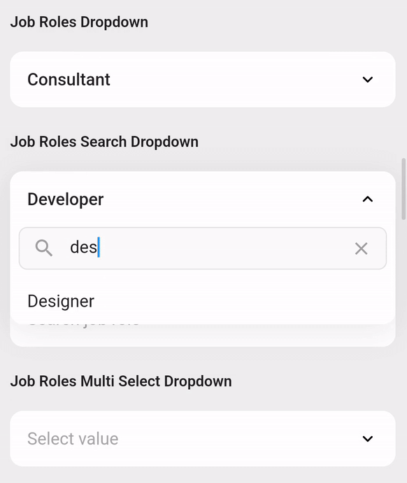
一個用於增強您的應用的 Flutter 套件,提供可自定義的下拉選單,支援清單資料搜尋、網路搜尋和多選功能。
68喜歡 883近 30 天下載150Pub 分數
AndroidiOSWebmacOSWindowsLinux
下拉 Flutter 小部件,專為提升您的 Flutter 應用程式而設計,提供高度可自訂的下拉選單,具備進階功能,包括清單資料搜尋、網路搜尋以及多選功能。

{"sdk":"flutter"}{"sdk":"flutter"}^5.0.0以下為英文專案原文快照,最新內容請造訪 GitHub。
A customizable Flutter dropdown — search, network search, multi-select and form validation built in.
pub version pub points likes license
Simple select, grouped sections and dark theme side by sideRequires Flutter 3.27+ and Dart 3.6+. The original
custom_dropdown.dart import remains supported.
dependencies:
  dropdown_flutter: ^1.3.0
import 'package:dropdown_flutter/dropdown_flutter.dart';

DropdownFlutter<String>(
  hintText: 'Select priority',
  items: const ['Low', 'Medium', 'High', 'Urgent'],
  initialItem: 'Medium',                       // optional
  onChanged: (value) => print(value),
)
That is the whole setup — no builders, controllers or config required.
| Constructor | Use it for |
|---|---|
DropdownFlutter() |
A plain list of items |
.search() |
Filtering a local list as the user types |
.searchRequest() |
Fetching results from an API |
.multiSelect() |
Selecting several items with checkboxes |
.multiSelectSearch() |
Multi-select over a filtered local list |
.multiSelectSearchRequest() |
Multi-select over API results |
Choose the constructor for your data source and selection mode. Search options
apply to search constructors; select-all and list validation apply to multi-select.
The multiSelect* variants report through onListChanged; the rest use
onChanged.
| Multi-select | Grouped | Highlighting | Dark theme |
|---|---|---|---|
| Multi select with avatars and checkboxes | Grouped sections with team headers | Search results with matched text highlighted | Dropdown following a dark theme |
Plain String items search out of the box. For your own type, mix in
CustomDropdownListFilter and decide what counts as a match.
class Member with CustomDropdownListFilter {
  const Member(this.name, this.role);
  final String name;
  final String role;

  // toString() supplies the row label; filter() decides what matches.
  @override
  String toString() => name;

  @override
  bool filter(String q) => name.toLowerCase().contains(q.toLowerCase()) ||
      role.toLowerCase().contains(q.toLowerCase()); // "engineer" finds them all
}

DropdownFlutter<Member>.search(items: members, onChanged: print);

DropdownFlutter<Member>.searchRequest(          // same, but from an API
  futureRequest: (query) async => api.searchMembers(query),
  futureRequestDelay: const Duration(milliseconds: 300),
  onChanged: print,
);
final controller = SingleSelectController<String?>('Medium');
// MultiSelectController<String>(['Medium']) for multi-select

DropdownFlutter<String>(
  items: priorities,
  controller: controller,                       // read and set from anywhere
  validator: (value) => value == null ? 'Required' : null,
  validateOnChange: true,                       // listValidator for multi-select
  onChanged: print,
);

controller.value = 'High';
controller.clear();
toString() gives the default label. For anything richer, supply a
listItemBuilder — headerBuilder, hintBuilder and noResultFoundBuilder
work the same way.
DropdownFlutter<Member>(
  items: members,
  listItemBuilder: (context, item, isSelected, onItemSelect) => Row(
    children: [
      CircleAvatar(child: Text(item.name[0])),
      const SizedBox(width: 12),
      Text(item.name),
    ],
  ),
  onChanged: print,
)
The features below are opt-in. Default surfaces and text follow the app theme;
fields support Tab focus and Enter/Space activation. Escape dismisses a menu and
returns focus to the field. Multi-select menus include a selection count and
Done button by default; choices are applied immediately, and Done closes the menu.
Use doneText to localize its label or showMultiSelectFooter: false to hide it.
| Property | Effect |
|---|---|
groupBy |
Splits the list into labelled sections |
highlightMatchedText |
Emphasises the matched substring in results |
recentSelectionsMaxCount |
Pins recently picked items to the top |
showSelectAll |
Adds a select-all / clear-all row (multi-select) |
selectAllText / clearAllText |
Relabel that row |
enableKeyboardNavigation |
Arrow keys move, Enter selects, Escape closes |
enableHapticFeedback |
Light impact on open, click on select |
animationDuration / animationCurve |
Tunes the open/close animation |
DropdownFlutter<Member>(
  items: members,
  groupBy: (member) => member.team,             // any combination works
  recentSelectionsMaxCount: 3,
  enableKeyboardNavigation: true,
  onChanged: print,
)
decoration covers colors, borders, shadows and text styles; the builders
replace widgets outright. Colors fall back to the ambient ColorScheme, so
dropdowns follow a dark theme with no extra configuration.
DropdownFlutter<String>(
  items: items,
  decoration: CustomDropdownDecoration(
    closedFillColor: const Color(0xFF1E1B33),
    closedBorderRadius: BorderRadius.circular(16),
    headerStyle: const TextStyle(color: Colors.white),
  ),
  onChanged: print,
)

final withIcon = base.copyWith(prefixIcon: const Icon(Icons.person));
Size is controlled by overlayHeight, listItemPadding and listItemHeight
— the last defaults to null so rows fit their content; setting it lets the list
scroll more efficiently. Menus also respect available viewport space and keyboard
insets, including short lists with tall custom rows.
State, and dispose them in your dispose() method.
The dropdown only disposes controllers it creates itself. Controllers may be
replaced or removed during rebuilds.initialItem / initialItems seed an uncontrolled dropdown. Changing these
properties resets its selection; with a controller, set controller.value.
Do not supply both a controller and initial selection.add, remove,
clear, or assign a new list to value; do not mutate controller.value.items. Custom objects should
implement consistent == and hashCode. Replace item lists when data changes.
If a selected item is removed, clear/update the controller explicitly.FormState.reset() restores the initial selection (or the value present when
a controller was attached) and clears errors. Disabled fields do not validate.items. Old requests may finish, but
cannot overwrite newer results or update a disposed dropdown. Before typing,
an empty remote menu shows searchHintText instead of a no-results message.
Failed requests show a Retry action that repeats the current query. Customize
or localize this state with searchRequestErrorBuilder(context, error, retry);
raw exception details are not displayed by the default UI.closeDropDownOnClearFilterSearch closes the menu when its clear button is used.
Reduced-motion settings skip the menu animation.DropdownListItemBuilder<T> and
DropdownHeaderBuilder<T> for reusable builders.flutter pub get
flutter analyze
flutter test
cd example
flutter test
Run the package regression/UX suites and example gallery together on an Android
emulator (from example/):
flutter emulators --launch <emulator-id>
flutter test integration_test/dropdown_flutter_test.dart -d <device-id>
Use flutter emulators and flutter devices to find the IDs.
CI checks the minimum supported Flutter version and stable Flutter.
| Group | Properties |
|---|---|
| Items | items, initialItem / initialItems, excludeSelected, and the onChanged / onListChanged callbacks |
| Text | hintText, searchHintText, noResultFoundText, maxlines (line limit on the closed header) |
| Sizing | listItemHeight, overlayHeight, listItemPadding / itemsListPadding, closedHeaderPadding / expandedHeaderPadding |
| Behaviour | enabled, canCloseOutsideBounds, hideSelectedFieldWhenExpanded, closeDropDownOnClearFilterSearch, visibility |
| Control | controller / multiSelectController, overlayController, itemsScrollController |
| Async | futureRequest / futureRequestDelay, searchRequestLoadingIndicator, searchRequestErrorBuilder |
| Completion | showMultiSelectFooter, doneText |
| Recents | initialRecentItems, onRecentItemsChanged |
| Validation | validator / listValidator, validateOnChange |
| Appearance | decoration / disabledDecoration |
| Builders | listItemBuilder, headerBuilder / headerListBuilder, hintBuilder, noResultFoundBuilder, groupHeaderBuilder |