
 v1.0.2
dot_navigation_bar
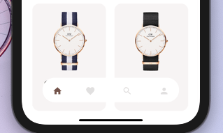
簡單的平滑動畫,提供美觀乾淨的 UI/UX 底部導航列。
435喜歡 912近 30 天下載150Pub 分數
AndroidiOSWebmacOSWindowsLinux
一個你可以根據需求自訂選項的底端導覽列,完全沒有任何限制。你也可以透過簡單的平滑動畫來自訂導覽列的外觀,提供優美且乾淨的使用者介面與體驗。

{"sdk":"flutter"}{"sdk":"flutter"}以下為英文專案原文快照,最新內容請造訪 GitHub。
https://img.shields.io/badge/Maintained%3F-Yes-green?style=for-the-badge
undefined
undefined
undefined
undefined
undefined
undefined
undefined
undefined
undefined
A bottom navigation bar that you can customize with the options you need, without any limits. You can also customize the appearance of the navigation bar with simple smooth animations, providing a nice and clean UI/UX.
style1 Example flutter project
NEW
To install, add it to your pubspec.yaml file:
dependencies:
    dot_navigation_bar:
import 'package:dot_navigation_bar/dot_navigation_bar.dart';
call DotNavigationBar's constructor:
extendBody: true,
if you are not intersted inmaking round nav bar with show body behind the navbar you have to make that
extendBody: false,
Widget build(BuildContext context) {
  return Scaffold(
    body: Center(),
    extendBody: true,//<------like this
    bottomNavigationBar:  DotNavigationBar(
          currentIndex: _SelectedTab.values.indexOf(_selectedTab),
          onTap: _handleIndexChanged,
          dotIndicatorColor: Colors.black,
          // enableFloatingNavBar: false
          items: [


          ],
        ),
  );
}
   Widget build(BuildContext context) {
    return Scaffold(
      body: Container(
        child: Image.asset("assets/IMG.png"),
      ),
      bottomNavigationBar:  DotNavigationBar(
          currentIndex: _SelectedTab.values.indexOf(_selectedTab),
          onTap: _handleIndexChanged,
          // dotIndicatorColor: Colors.black,
          items: [
            /// Home
            DotNavigationBarItem(
              icon: Icon(Icons.home),
              selectedColor: Colors.purple,
            ),

            /// Likes
            DotNavigationBarItem(
              icon: Icon(Icons.favorite_border),
              selectedColor: Colors.pink,
            ),

            /// Search
            DotNavigationBarItem(
              icon: Icon(Icons.search),
              selectedColor: Colors.orange,
            ),

            /// Profile
            DotNavigationBarItem(
              icon: Icon(Icons.person),
              selectedColor: Colors.teal,
            ),

          ],
        ),
    );
  }
The constructor has 18 attributes related to the Widget:
items: A list of tabs to display, ie Home, Profile,Cart, etccurrentIndex: The tab to display.onTap:Returns the index of the tab that was tapped.selectedItemColor:The color of the icon and text when the item is selected.unselectedItemColor: The color of the icon and text when the item is not selected.margin:A convenience field for the margin surrounding the entire widget.itemPadding:The padding of each item.duration: The transition duration.curve: The transition curve.dotIndicatorColor:The color of the Dot indicator.marginR:margin for the bar to give some radius .paddingR:padding for the bar to give some radius.borderRadius:border radius for nav bar.backgroundColor:bgd colors for the nav bar.boxShadow: floating nav bar shadow ,it takes List of BoxShadowenableFloatingNavBar: make Floating nav bar enabled.enablePaddingAnimation: enable the animation on item during item change.splashColor: Color of the item's Splash Color. To disable, use Colors.transparent.marginR = const EdgeInsets.symmetric(horizontal: 50, vertical: 20),
paddingR = const EdgeInsets.only(bottom: 5, top: 10),
borderRadius = 30,
backgroundColor = Colors.white, enableFloatingNavBar=true, enablePaddingAnimation=true
@iamvivekkaushik @buraktabn @Zheng Xiangrui