
 v8.0.0
date_picker_plus
一個 Flutter 庫,提供可自訂的 Material Design 日期和範圍選擇器小部件。
102喜歡 1.9萬近 30 天下載160Pub 分數
AndroidiOSWebmacOSWindowsLinux
一個提供可自定義的 Material Design 日期選擇器元件的 Flutter 庫。

{"sdk":"flutter"}>=0.19.0 <1.0.0^1.1.0{"sdk":"flutter"}>=2.0.0 < 20.0.0以下為英文專案原文快照,最新內容請造訪 GitHub。
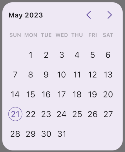
A Flutter package with highly customizable Material date and range pickers.
cellBuilder for custom content inside cells.dependencies:
date_picker_plus: ^8.0.0
import 'package:date_picker_plus/date_picker_plus.dart';
final date = await showDatePickerDialog(
  context: context,
  minDate: DateTime(2020, 1, 1),
  maxDate: DateTime(2030, 12, 31),
);
final range = await showRangePickerDialog(
  context: context,
  minDate: DateTime(2020, 1, 1),
  maxDate: DateTime(2030, 12, 31),
);
SizedBox(
  width: 320,
  height: 400,
  child: DatePicker(
    minDate: DateTime(2020, 1, 1),
    maxDate: DateTime(2030, 12, 31),
    onDateSelected: (date) {},
  ),
);
DatePickerUse this for a full single-date picker with days, months, and years flow.
RangeDatePickerUse this when users must select a start and end date. It supports:
onRangeSelected for the final result.onStartDateChanged and onEndDateChanged for step-by-step tracking.DaysPickerUse this if you want day-only selection UI.
MonthPickerUse this for month-only selection.
YearsPickerUse this for year-only selection.
showDatePickerDialog and showRangePickerDialogUse these when you want ready-made dialogs returning:
Future<DateTime?>Future<DateTimeRange?>In unconstrained layouts (for example inside some Column, Row, or scrollable situations), pickers fall back to internal limits through a LimitedBox (portrait around 328x402, landscape around 328x300). If you need exact behavior, wrap the picker with SizedBox.
SizedBox(
  width: 280,
  height: 360,
  child: DatePicker(
    minDate: DateTime(2020),
    maxDate: DateTime(2050),
  ),
);
The widgets also work at very small sizes (for example 100x100) if your content choices (font size, padding, custom cell UI) fit.
showDatePickerDialog and showRangePickerDialog default to:
328x400328x300You can override with width and height.
There are two different paddings:
padding: outside the dialog widget itself (default EdgeInsets.all(36)).contentPadding: inside the picker content area (default EdgeInsets.all(16)).Use dialogBackground to set the background color of the dialog surface behind the picker:
final date = await showDatePickerDialog(
  context: context,
  minDate: DateTime(2020, 1, 1),
  maxDate: DateTime(2030, 12, 31),
  dialogBackground: Colors.white,
);
It is available on both showDatePickerDialog and showRangePickerDialog. When omitted, the ambient DialogTheme / Material default background applies.
DatePickerPlusTheme is a ThemeExtension.
DatePickerPlusTheme
  +-- headerTheme
  +-- daysPickerTheme
  |     +-- daysOfTheWeekTheme
  +-- monthsPickerTheme
  +-- yearsPickerTheme
  +-- rangePickerTheme
  +-- isEnabled
  +-- locale
Picker theme resolution is merged in this order:
DatePickerPlusTheme.defaults(context) (Material ColorScheme / TextTheme, intl first day of week, optional Material page labels)ThemeData.extensionstheme: argumentMaterialApp(
theme: ThemeData(
extensions: const [
DatePickerPlusTheme(
headerTheme: HeaderTheme(centerLeadingDate: true),
),
],
),
home: const MyHomePage(),
);
InkResponseThemeIf you want to control interaction feel (splash/highlight/focus/hover/radius/border behavior), set inkResponseTheme in the specific picker theme (daysPickerTheme, monthsPickerTheme, yearsPickerTheme, rangePickerTheme). This is useful when your cell shapes are custom and default ripple clipping does not match.
theme: const DatePickerPlusTheme(
  headerTheme: HeaderTheme(enableHeader: false),
)
theme: const DatePickerPlusTheme(
  headerTheme: HeaderTheme(enableArrowKeys: false),
)
theme: const DatePickerPlusTheme(
  headerTheme: HeaderTheme(centerLeadingDate: true),
)
theme: const DatePickerPlusTheme(
  headerTheme: HeaderTheme(
    forwardArrowWidget: Icon(Icons.keyboard_arrow_right_rounded),
    backwardArrowWidget: Icon(Icons.keyboard_arrow_left_rounded),
  ),
)
ShapeDecorationHeaderTheme.forwardButtonDecoration and HeaderTheme.backwardButtonDecoration accept ShapeDecoration (not BoxDecoration). This avoids ink clipping mismatches and guarantees shape-aware splash behavior.
theme: DatePickerPlusTheme(
  headerTheme: HeaderTheme(
    forwardButtonDecoration: ShapeDecoration(
      color: Colors.red,
      shape: RoundedRectangleBorder(borderRadius: BorderRadius.circular(6)),
    ),
    backwardButtonDecoration: ShapeDecoration(
      color: Colors.red,
      shape: RoundedRectangleBorder(borderRadius: BorderRadius.circular(6)),
    ),
  ),
)
headerPadding controls distance around header content.arrowButtonsSpace controls spacing between arrow buttons.forwardButtonWidth / forwardButtonHeight and backward equivalents control button size.By default, the first day comes from locale (for example many en_GB setups start with Monday while many en_US setups start with Sunday). Override it using startOfWeek (ISO 8601 weekday number: 1 Monday ... 7 Sunday):
theme: const DatePickerPlusTheme(
  daysPickerTheme: DaysPickerTheme(
    daysOfTheWeekTheme: DaysOfTheWeekTheme(startOfWeek: DateTime.sunday),
  ),
)
weekdayLength supports:
WeekdayLength.long (Monday)WeekdayLength.short (Mon)WeekdayLength.narrow (M)theme: const DatePickerPlusTheme(
daysPickerTheme: DaysPickerTheme(
daysOfTheWeekTheme: DaysOfTheWeekTheme(
weekdayLength: WeekdayLength.narrow,
),
),
)
cellsPadding is per-cell inner spacing around the decorated cell content.padding on each picker theme is spacing around the entire grid view.Defaults worth knowing:
DaysPickerTheme.cellsPadding defaults to EdgeInsets.zero.MonthsPickerTheme.cellsPadding and YearsPickerTheme.cellsPadding default to EdgeInsets.symmetric(horizontal: 8, vertical: 12).Grid cell width and height are not forced to match. If your custom UI needs taller cells (events under the date number, badges, extra lines), this is supported naturally. If you increase vertical cell content heavily, review the range section below for edge-shape behavior.
cellBuilder gives you precise control over cell UI while preserving picker logic.
cellBuilder receivesYou get a CellData subtype:
WeekDayCell with weekDay (1..7, ISO 8601 weekday number)DayCell with day (DateTime)MonthCell with month and yearYearCell with yeardata.child is the default decorated content for that cell. You can return it unchanged, wrap it, or fully replace it.
data.state can be:
disabledenabledselectedselectedEdgecurrentcurrentAndDisabledPrecedence detail:
currentAndDisabled is used when current date exists but is not selectable.cellBuilder: (context, data) {
if (data case DayCell cell when cell.day.day == 14) {
return Stack(
clipBehavior: Clip.none,
children: [
cell.child,
const Positioned(
right: 4,
top: -2,
child: Badge.count(count: 6),
),
],
);
}
return data.child;
}
cellBuilder: (context, data) {
  if (data case DayCell cell when cell.day.day == 11) {
    return Column(
      mainAxisSize: MainAxisSize.min,
      children: [
        const SizedBox(height: 6),
        const Text('11'),
        const Spacer(),
        Row(
          mainAxisAlignment: MainAxisAlignment.center,
          children: const [
            SizedBox(width: 2, height: 10),
            SizedBox(width: 4),
            Flexible(child: Text('Event', maxLines: 1, overflow: TextOverflow.ellipsis)),
          ],
        ),
      ],
    );
  }
  return data.child;
}
Range theming distinguishes:
selectedEdgeCellDecoration, selectedEdgeCellTextStyleselectedCellsDecoration, selectedCellsTextStyleWhen drawing range background behind edge cells, the package tries to extract color from the resolved in-range decoration. It currently extracts only from ShapeDecoration and BoxDecoration:
if (resolvedDecoration case ShapeDecoration(color: final color) || BoxDecoration(color: final color)) {
  decorationColor = color;
}
If you use any other Decoration implementation, color cannot be extracted automatically. In that case, provide your own resolvePainter.
theme: DatePickerPlusTheme(
  rangePickerTheme: RangePickerTheme(
    selectedCellsDecoration: const MyFancyDecoration(),
    resolvePainter: (textDirection, _, start) {
      return RangeSelectionPainter(
        textDirection: textDirection,
        color: const Color(0xFFCCE5FF), // provide your intended range color
        start: start,
      );
    },
  ),
)
If cells become taller than wide, a circular edge decoration can look visually detached from the full-height range background.
Fix options:
OvalBorder or StadiumBorder for edge shape.cellsPadding to reduce height/width mismatch.selectedEdgeCellDecoration: ShapeDecoration(
color: colorScheme.primary,
shape: const OvalBorder(),
)
Use disabledDayPredicate in DatePicker / DaysPicker:
disabledDayPredicate: (date) {
  return date.weekday == DateTime.saturday || date.weekday == DateTime.sunday;
}
Set DatePickerPlusTheme.isEnabled to false:
theme: const DatePickerPlusTheme(isEnabled: false)
initialPickerType: PickerType.months
// or
initialPickerType: PickerType.years
onDisplayedMonthChanged fires:
It passes the first day of the visible month.
Enable Flutter localization delegates and locales in your app:
MaterialApp(
  localizationsDelegates: GlobalMaterialLocalizations.delegates,
  locale: const Locale('en', 'US'),
  supportedLocales: const [
    Locale('en', 'US'),
    Locale('en', 'GB'),
    Locale('ar'),
    Locale('zh'),
    Locale('ru'),
    Locale('es'),
    Locale('hi'),
  ],
  home: const MyHomePage(),
);
Then optionally override first day of week via DaysOfTheWeekTheme.startOfWeek if locale default is not desired.
theme objectPer-widget visual parameters were removed. Use DatePickerPlusTheme and sub-themes.
// v6 style
DatePicker(
  minDate: minDate,
  maxDate: maxDate,
  slidersColor: Colors.blue,
  centerLeadingDate: true,
  selectedCellDecoration: BoxDecoration(color: Colors.red, shape: BoxShape.circle),
);

// v7 style
DatePicker(
  minDate: minDate,
  maxDate: maxDate,
  theme: const DatePickerPlusTheme(
    headerTheme: HeaderTheme(centerLeadingDate: true),
    daysPickerTheme: DaysPickerTheme(
      selectedCellDecoration: BoxDecoration(color: Colors.red, shape: BoxShape.circle),
    ),
  ),
);
initialDate renamed to displayedDate// v6
showDatePickerDialog(
context: context,
minDate: minDate,
maxDate: maxDate,
initialDate: someDate,
);
// v7
showDatePickerDialog(
context: context,
minDate: minDate,
maxDate: maxDate,
displayedDate: someDate,
);
forwardButtonDecoration and backwardButtonDecoration now use ShapeDecoration.
previousPageSemanticLabel and nextPageSemanticLabel are no longer exposed. Material localizations are used internally.
Contributions are welcome. If you find a bug or want a feature, open an issue or PR on the GitHub repository.
Before creating a PR:
flutter format .).This project is licensed under the MIT License. See LICENSE.