
SnakeBottomNavigationBar
herodotdigital/SnakeBottomNavigationBar open-source repository details.
- 星標
- 211
- 分支
- 51
- 最近推送(UTC)
- 2023年4月10日
- 專案狀態
- 未封存
原始 README
以下為英文專案原文快照,最新內容請造訪 GitHub。
SnakeNavigationBar


A new Flutter SnakeNavigationBar widget package.
BREAKING CHANGES
To separate colors and gradient logic now you have SnakeNavigationBar.color and SnakeNavigationBar.gradient constructors. Changes naming: style => behaviour, snakeColor => snakeViewColor (snakeViewGradient in gradient configuration), onPositionChanged => onTap
Added selectedItemColor and unselectedItemColor (selectedItemGradient and unselectedItemGradient in gradient configuration)
Preview
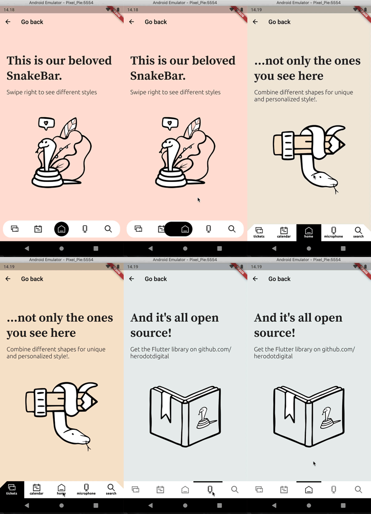
Usage
To use this plugin, add flutter_snake_navigationbar as a dependency in your pubspec.yaml file.
Properties
SnakeNavigationBar has a similar API to BottomNavigationBar and uses BottomNavigationBarItem to show items as well.
     Scaffold(
      bottomNavigationBar: SnakeNavigationBar.color(
        behaviour: snakeBarStyle,
        snakeShape: snakeShape,
        shape: bottomBarShape,
        padding: padding,

        ///configuration for SnakeNavigationBar.color
        snakeViewColor: selectedColor,
        selectedItemColor: snakeShape == SnakeShape.indicator ? selectedColor : null,
        unselectedItemColor: Colors.blueGrey,

        ///configuration for SnakeNavigationBar.gradient
        //snakeViewGradient: selectedGradient,
        //selectedItemGradient: snakeShape == SnakeShape.indicator ? selectedGradient : null,
        //unselectedItemGradient: unselectedGradient,

        showUnselectedLabels: showUnselectedLabels,
        showSelectedLabels: showSelectedLabels,

        currentIndex: _selectedItemPosition,
        onTap: (index) => setState(() => _selectedItemPosition = index),
        items: [
          BottomNavigationBarItem(icon: Icon(Icons.notifications), label: 'tickets'),
          BottomNavigationBarItem(icon: Icon(CustomIcons.calendar), label: 'calendar'),
          BottomNavigationBarItem(icon: Icon(CustomIcons.home), label: 'home'),
          BottomNavigationBarItem(icon: Icon(CustomIcons.podcasts), label: 'microphone'),
          BottomNavigationBarItem(icon: Icon(CustomIcons.search), label: 'search')
        ],
      ),
   final List<BottomNavigationBarItem> items;

  /// If [SnakeBarBehaviour.floating] this color is
  /// used as background color of shaped view.
  /// If [SnakeBarBehaviour.pinned] this color just
  /// a background color of whole [SnakeNavigationBar] view
  final Gradient backgroundGradient;

  /// This color represents a SnakeView and unselected
  /// Icon and label color
  final Gradient snakeViewGradient;

  /// This color represents a selected Icon color
  final Gradient selectedItemGradient;

  /// This color represents a unselected Icon color
  final Gradient unselectedItemGradient;

  /// Whether the labels are shown for the selected [BottomNavigationBarItem].
  final bool showSelectedLabels;

  /// Whether the labels are shown for the selected [BottomNavigationBarItem].
  final bool showUnselectedLabels;

  /// The index into [items] for the current active [BottomNavigationBarItem].
  final int currentIndex;

  ///You can specify custom elevation shadow color
  final Color shadowColor;

  /// Defines the [SnakeView] shape and behavior of a [SnakeNavigationBar].
  ///
  /// See documentation for [SnakeShape] for information on the
  /// meaning of different shapes.
  ///
  /// Default is [SnakeShape.circle]
  final SnakeShape snakeShape;

  /// Defines the layout and behavior of a [SnakeNavigationBar].
  ///
  /// See documentation for [SnakeBarBehaviour] for information on the
  /// meaning of different styles.
  ///
  /// Default is [SnakeBarBehaviour.pinned]
  final SnakeBarBehaviour behaviour;

  /// You can define custom [ShapeBorder] with padding and elevation to [SnakeNavigationBar]
  final ShapeBorder shape;
  final EdgeInsets padding;
  final double elevation;

  /// Called when one of the [items] is pressed.
  final ValueChanged<int> onTap;
!! IMPORTANT !! if you use [SnakeShape.circle] then [showSelectedLabels] parameter will be always [FALSE]

HeroDOT ↗
使用的依賴
依賴清單 3 項
- flutter
{"sdk":"flutter"} - flutter_lints開發依賴
^1.0.4 - flutter_test開發依賴
{"sdk":"flutter"}
如何選擇適合專案的儲存庫?
先依使用情境篩選,再比較專案活躍情況,最後到原始儲存庫確認使用要求。
- 透過儲存庫名稱、作者或描述搜尋,再依技術分類縮小範圍。
- 綜合星標、分支與最近推送比較專案;星標反映社群關注,不保證品質。
- 使用前在 GitHub 確認 README、授權條款與 Issues。
來源與維護
“A repository is the most basic element of GitHub.”
GitHub Docs — About repositories ↗