
 v0.2.0
cupertino_progress_bar
一個非互動式進度條包含一條從左到右填滿的軌道,用於顯示具有已知持續時間的任務進展。
18喜歡 5170近 30 天下載150Pub 分數
AndroidiOSWebmacOSWindowsLinux
適用於 Flutter 的 Cupertino 進度條

{"sdk":"flutter"}{"sdk":"flutter"}以下為英文專案原文快照,最新內容請造訪 GitHub。
pub license: BSD build codecov
A progress bar includes a track that fills from left to right to show the progression of a task with a known duration. Progress bars are non-interactive, although they are often accompanied by a button for canceling the corresponding operation.
| Light | Dark |
|---|---|
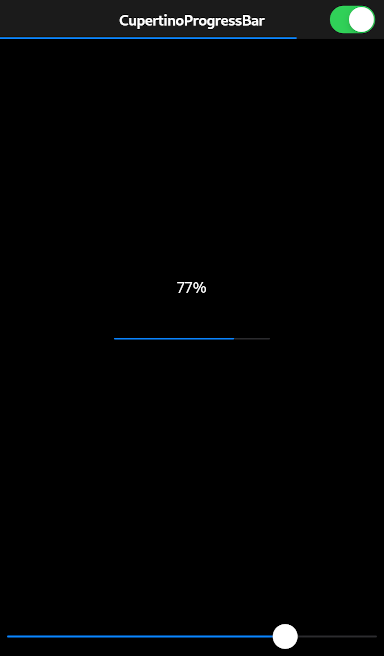
| Light CupertinoProgressBar | Dark CupertinoProgressBar |
CupertinoProgressBar(
  value: 0.77,
)
Always report progress accurately. Don’t display inaccurate progress information just to make your app appear busy. Only use progress bars for tasks that are quantifiable. Otherwise, use an activity indicator.
Use progress bars for tasks with a well-defined duration. Progress bars are great for showing the status of a task, especially when it helps convey how much longer the task needs to complete.
Hide the unfilled portion of track in navigation bars and toolbars. By default, a progress bar’s track includes both filled and unfilled portions. When used in a navigation bar or toolbar, such as to denote a page loading, a progress bar should be configured to hide the unfilled portion of the track.
Consider customizing a progress bar’s appearance to match your app. A progress bar’s appearance can be adjusted to match your app’s design. You can specify, for example, a custom color for both the track and fill.
See also:
To use this package, add cupertino_progress_bar as a dependency in your pubspec.yaml file.