
 v0.0.6
flutter_tabbar_lite
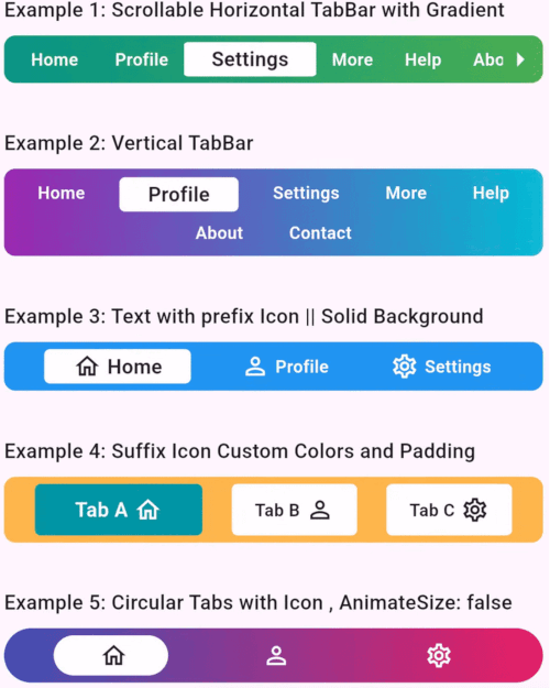
FlutterTabBarLite 是一個帶有動畫、水平與垂直功能的自訂標籤欄小工具。
7喜歡 68近 30 天下載145Pub 分數
AndroidiOSWebmacOSWindowsLinux
一個完全可自定義且帶有動畫效果的標籤欄小部件,適用於Flutter應用。旨在使導航直覺且視覺上吸引人,此套件非常適合建立現代且動態的標籤介面。

{"sdk":"flutter"}{"sdk":"flutter"}以下為英文專案原文快照,最新內容請造訪 GitHub。
A fully customizable and animated tab bar widget for Flutter applications. Designed to make navigation intuitive and visually appealing, this package is perfect for creating modern and dynamic tab interfaces.
FlutterTabBarLite
Add the following to your pubspec.yaml file:
dependencies:
  flutter_tabbar_lite: ^0.0.6
Run the command to fetch the package:
flutter pub get
import 'package:flutter/material.dart';
import 'package:flutter_tab_bar/flutter_tabbar_lite.dart';

void main() => runApp(const MyApp());

class MyApp extends StatelessWidget {
  const MyApp({super.key});

  @override
  Widget build(BuildContext context) {
    return MaterialApp(
      home: Scaffold(
        appBar: AppBar(title: const Text("FlutterTabBarLite Horizontal Example")),
        body: Column(
          children: [
            FlutterTabBarLite.horizontal(
              scrollable: true,
              titles: const [
                "Home",
                "Profile",
                "Settings",
                "More",
                "Help",
                "About",
                "Contact"
              ],
              gradient: const LinearGradient(
                colors: [Colors.teal, Colors.green],
                begin: Alignment.centerLeft,
                end: Alignment.centerRight,
              ),
              onTabChange: (index) {
                print("Scrollable TabBar - Selected Tab: $index");
              },
            ),
          ],
        ),
      ),
    );
  }
}
import 'package:flutter/material.dart';
import 'package:flutter_tab_bar/flutter_tabbar_lite.dart';

void main() => runApp(const MyApp());

class MyApp extends StatelessWidget {
  const MyApp({super.key});

  @override
  Widget build(BuildContext context) {
    return MaterialApp(
      home: Scaffold(
        appBar: AppBar(title: const Text("FlutterTabBarLite Vertical Example")),
        body: Column(
          children: [
            FlutterTabBarLite.vertical(
              itemMargin: const EdgeInsets.symmetric(horizontal: 8, vertical: 2),
              titles: const [
                "Home",
                "Profile",
                "Settings",
                "More",
                "Help",
                "About",
                "Contact"
              ],
              gradient: const LinearGradient(
                colors: [Colors.purple, Colors.cyan],
                begin: Alignment.centerLeft,
                end: Alignment.centerRight,
              ),
              onTabChange: (index) {
                print("Selected Tab: $index");
              },
            ),
          ],
        ),
      ),
    );
  }
}
| Property | Type | Default Value | Description |
|---|---|---|---|
scrollable |
bool |
false |
Enables horizontal scrolling for tabs. |
titles |
List<String> |
["Tab 1", "Tab 2"] |
Titles for each tab. |
prefixIcons |
List<IconData>? |
null |
Icons before titles. |
suffixIcons |
List<IconData>? |
null |
Icons after titles. |
backgroundColor |
Color? |
Colors.blue |
Tab bar background color. |
selectedTextColor |
Color |
Colors.black87 |
Color for the selected tab's text. |
unselectedItemTextColor |
Color |
Colors.white |
Color for unselected tab's text. |
gradient |
LinearGradient? |
null |
Gradient applied to the tab bar. |
borderRadius |
double? |
8.0 |
Border radius for TabBar |
itemBorderRadius |
double? |
4.0 |
Border radius for TabBar Item |
itemMargin |
EdgeInsets? |
null |
Margin for TabBar Item |
onTabChange |
Function(int)? |
null |
Callback function invoked on tab change. |
horizontal |
constructor |
null |
Constructor to use horizontal tab bar |
vertical |
constructor |
null |
Constructor to use vertical TabBar |
Contributions are welcome! Please fork the repository, make changes, and submit a pull request. Refer to the CONTRIBUTING.md for more details.
This project is licensed under the MIT License. See the LICENSE file for details.
Developed with ❤️ by Khandakar Amir Hamza
GitHub Profile | Portfolio:amirhamza.com
Check the example directory for a fully functional implementation. Run it locally using:
cd example
flutter run
If you encounter any issues or have suggestions, please create an issue in the GitHub repository.