






 v0.54.0
not_static_icons
為 Flutter 精心設計的動畫圖示,使用 Lucide 創作——無需 Rive 或 Lottie。
53喜歡 797近 30 天下載160Pub 分數
AndroidiOSWebmacOSWindowsLinux
無需 Rive 或 Lottie 即可為 Flutter 精心製作的動畫圖示

以下為英文專案原文快照,最新內容請造訪 GitHub。
not_static_icons | animated icons for Flutter

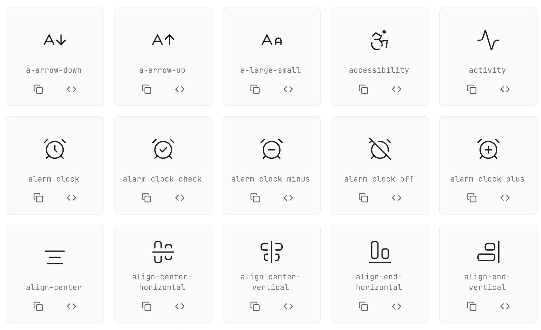
Seamlessly animated Flutter icons — no Rive or Lottie required. Made with Lucide icons inspired by pqoqubbw/icons.

// Simple icon
AirplayIcon()

// Customized icon
AArrowDownIcon(
  size: 45,
  color: Colors.blue,
  animationDuration: Duration(milliseconds: 800),
  strokeWidth: 3.0,
  hoverColor: Colors.red,
  enableTouchInteraction: true,
  infiniteLoop: false,
  reverseOnExit: false,
)
Use onTap instead of wrapping the icon in GestureDetector:
CheckIcon(
  size: 40,
  color: Colors.green,
  onTap: () {
    print('Icon tapped!');
  },
)
Use interactive: false and AnimatedIconController for IconButton integration:
class MyWidget extends StatefulWidget {
  @override
  State<MyWidget> createState() => _MyWidgetState();
}

class _MyWidgetState extends State<MyWidget> {
  final _iconController = AnimatedIconController();

  @override
  Widget build(BuildContext context) {
    return IconButton(
      onPressed: () {
        _iconController.animate(); // Trigger animation
        // Your action here
      },
      icon: HeartIcon(
        size: 32,
        color: Colors.red,
        interactive: false, // Disable internal gesture handlers
        controller: _iconController,
      ),
    );
  }
}
final _iconController = AnimatedIconController();

InkWell(
  onTap: () {
    _iconController.animate();
    // Your action here
  },
  child: Padding(
    padding: EdgeInsets.all(8),
    child: CopyIcon(
      size: 24,
      interactive: false,
      controller: _iconController,
    ),
  ),
)
ActivityIcon(
  size: 48.0,                                    // Icon size
  color: Colors.black87,                         // Default color
  hoverColor: Colors.blue,                       // Hover color
  animationDuration: Duration(milliseconds: 600), // Animation duration
  strokeWidth: 2.0,                              // Stroke width
  reverseOnExit: true,                           // Reverse animation on exit
  enableTouchInteraction: true,                  // Enable touch interaction
  infiniteLoop: false,                           // Enable infinite loop
  resetToStartOnComplete: false,                 // Reset after animation completes
  onTap: () {},                                  // Tap callback
  interactive: true,                             // Enable/disable internal gestures
  controller: AnimatedIconController(),          // External animation controller
)
| Method | Description |
|---|---|
animate() |
Triggers the animation to play forward |
stop() |
Stops the current animation |
reset() |
Resets the animation to its initial state |

Each icon has its own unique animation:
Contributions are welcome! Please feel free to submit a Pull Request.





Icons based on Lucide Icons inspired by pqoqubbw/icons
依賴清單 4 項
{"sdk":"flutter"}{"sdk":"flutter"}^6.0.0^1.9.1先依使用情境篩選,再比較專案活躍情況,最後到原始儲存庫確認使用要求。
“A repository is the most basic element of GitHub.”
GitHub Docs — About repositories ↗