
 v1.1.0
emoji_alert
Flutter Emoji Alert,讓您能夠建立美觀又簡單的警告對話方塊與底部表單模態框
23喜歡 68近 30 天下載150Pub 分數
AndroidiOSWebmacOSWindowsLinux
koukibadr/Emoji_Alert open-source repository details.

{"sdk":"flutter"}{"sdk":"flutter"}^1.0.4以下為英文專案原文快照,最新內容請造訪 GitHub。
enter image description here
A new Stylish Emoji Alert with a wide variety of emojis, simple to implement and full customizable.
Single line basic alert with default emoji
Add dynamic widgets not only text any widget you want
Add buttons with their onPress handlers
Choose the alert display behavior : Normal Alert or Bottom Sheet dialog
Choose an emoji from a variety of emojis
Animations when displaying the alert popup
To add emoji_alert to your project add this line to your pubspec.yaml
dependencies:
	emoji_alert:  1.1.0
Or you can reference the github repository directly
	dependencies:
		emoji_alert:
			git: https://github.com/koukibadr/Emoji_Alert.git
| Attribute | Type | Default | Required | Description |
|---|---|---|---|---|
| description | Widget | N/A | True | The alert body content |
| alertTitle | Widget | N/A | False | The alert top content |
| enableMainButton | bool | False | False | Display or not the popup's main button |
| enableSecondaryButton | bool | False | False | Whether display or not the secondary button |
| onSecondaryButtonPressed | Function | null | False | The function that will be invoked on pressing the secondary button |
| onMainButtonPressed | Function | null | False | The function that will be invoked on pressing the main button |
| onMainButtonPressed | Function | null | False | The function that will be invoked on pressing the main button |
| emojiType | EMOJI_TYPE | HAPPY | False | the emoji that will be displayed possible values: [ANGRY, CONFUSED, COOL, HAPPY, JOYFUL, LAUGHING, SAD, SCARED, SHOCKED, SMILE, WINK] |
| height | double | 200 | False | the height of the popup |
| emojiSize | double | 80 | False | the size of the emoji |
| background | Color | White | False | the popup background color |
| mainButtonColor | Color | Blue | False | The main button background color |
| secondaryButtonColor | Color | Blue | False | the secondary button color, PS: an opacity value will be added to this color |
| mainButtonText | Text | Text("Confirm") |
False | the main button text |
| secondaryButtonText | Text | Text("Cancel") |
False | the secondary button text |
| buttonSize | double | 200 | False | buttons width size |
| cancelButtonColorOpacity | double | 0.2 | False | an opacity will be added to the secondary button background color |
| cancelable | bool | True | False | Whether the popup can be dismissed on pressing outside it or not |
| cornerRadiusType | CORNER_RADIUS_TYPES | BOTTOM_ONLY | False | the border radius type, possible values: [BOTTOM_ONLY, TOP_ONLY, ALL_CORNERS, NONE] |
| width | double | null | False | the popup width by default it's null |
| animationType | ANIMATION_TYPE |
ANIMATION_TYPE.NONE |
False | the animation type that will be applied on the emoji [NONE, FADEIN, TRANSITION, ROTATION] |
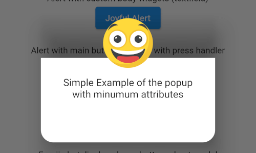
Simple alert with just a text in the body content
EmojiAlert(

description:  Column(

children: [

Text("Simple Example of the popup"),

Text("with minumum attributes"),

],

)).displayAlert(context);
first_example_alert.png
Example with custom widget in the popup content body
EmojiAlert(
	alertTitle:  Text("Joyful Alert", style:  TextStyle(fontWeight:  FontWeight.bold)),
	description:  Column(
		children: [
		Text("You can add also any widget"),
		Container(
			width:  200,
			child:  TextField(
				decoration:  InputDecoration(hintText:  "Input field example"),
			)),
	]
	),
	cancelable:  true,
	emojiType:  EMOJI_TYPE.JOYFUL,
	height:  300,
).displayAlert(context);
second_example_alert.png
EmojiAlert(
	alertTitle:  Text("Angry Alert", style:  TextStyle(fontWeight:  FontWeight.bold)),
	description:  Column(
		children: [
			Text("You can add a main button"),
		],
	),
	enableMainButton:  true,
	mainButtonColor:  Colors.red,
	onMainButtonPressed: () {
		print("Hello");
		Navigator.pop(context);
	},
	cancelable:  false,
	emojiType:  EMOJI_TYPE.ANGRY,
	height:  300,
).displayAlert(context);
third_example_alert.png
to display it as bottom sheet modal you need to use displayBottomSheet function
And you can display it as a bottom sheet modal, the code below is an example
EmojiAlert(
	alertTitle:  Text("Bottom Sheet Modal",
	style:  TextStyle(fontWeight:  FontWeight.bold)),
	description:  Column(
		children: [
			Text("And this is a bottom sheet modal with different Radius",
				style:  TextStyle(color:  Colors.blue),
				textAlign:  TextAlign.center,
			),
		],
	),
	enableMainButton:  true,
	cornerRadiusType:  CORNER_RADIUS_TYPES.TOP_ONLY,
	mainButtonColor:  Colors.green,
	mainButtonText:  Text("Save"),
	onMainButtonPressed: () {
		Navigator.pop(context);
	},
	cancelable:  true,
	emojiType:  EMOJI_TYPE.SMILE,
	width:  300,
	height:  300,
).displayBottomSheet(context);
fifth_example_alert.png
in this example we used TRANSITION animation but you can choose any other built-in animations (see attributes description above)
EmojiAlert(
	description:  Column(
		children: [
			Text("Simple Example with animation"),
			Text("This is a transition animation"),
		],
	),
	animationType:  ANIMATION_TYPE.TRANSITION
).displayAlert(context);
the result:
animation_example.gif
Of course the project is open source, and you can contribute to it repository link
If you found a bug, open an issue.
If you have a feature request, open an issue.
If you want to contribute, submit a pull request.