
 v2.16.0
motion_toast
一個設計優美的帶動畫的吐司,包含多種內建樣式,並讓您自訂吐司
467喜歡 3590近 30 天下載160Pub 分數
AndroidiOSWebmacOSWindowsLinux
koukibadr/Motion-Toast open-source repository details.

{"sdk":"flutter"}^1.1.0{"sdk":"flutter"}^2.0.1以下為英文專案原文快照,最新內容請造訪 GitHub。
A beautifully designed toast notification widget with smooth animations for Flutter. Built with Material 3 support, null safety, and full customization in mind.
Pub Version Flutter Platform License
Motion Toast Demo| Success | Warning |
|---|---|
| success_mt.png | warning_mt.png |
| Info | Error |
|---|---|
| info_mt.png | error_mt.png |
Motion Toast provides an elegant and customizable notification system for your Flutter applications. Display status messages with smooth animations, built-in toast types, and extensive theming options.
Perfect for:
Add this to your package's pubspec.yaml file:
dependencies:
  motion_toast: ^2.16.0
Or install from the command line:
flutter pub add motion_toast
The simplest way to show a success toast:
MotionToast.success(
  title: const Text("Success"),
  description: const Text("Your action was successful"),
).show(context);
MotionToast.success(
  title: const Text("Success Motion Toast"),
  description: const Text("Example of success motion toast"),
).show(context);
MotionToast.warning(
  title: const Text("Warning Motion Toast"),
  description: const Text("This is a warning message"),
).show(context);
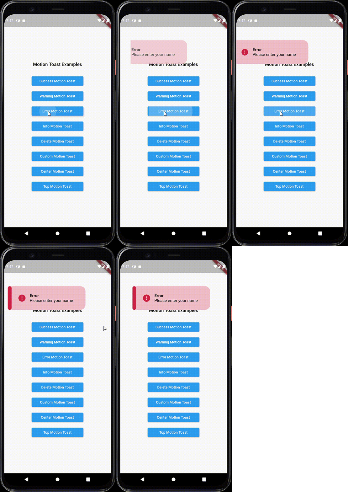
MotionToast.error(
  title: const Text("Error"),
  description: const Text("Please enter your name"),
).show(context);
MotionToast.info(
  title: const Text("Info Motion Toast"),
  description: const Text("Example of info toast"),
).show(context);
MotionToast.delete(
  title: const Text("Deleted"),
  description: const Text("Item has been deleted"),
).show(context);
Create a fully customized toast with your own colors and icons:
MotionToast(
  icon: Icons.alarm,
  primaryColor: Colors.pink,
  title: const Text("Custom Toast"),
  description: const Text("You can customize the toast!"),
  width: 300,
  height: 100,
).show(context);
MotionToast.success(
  title: const Text("Top Motion Toast"),
  description: const Text("Displayed at the top"),
  toastAlignment: Alignment.topCenter,
  animationType: AnimationType.slideInFromTop,
).show(context);
MotionToast.success(
  title: const Text("Center Motion Toast"),
  description: const Text("Displayed in the center"),
  toastAlignment: Alignment.center,
).show(context);
MotionToast.success(
  title: const Text("Bottom Motion Toast"),
  description: const Text("Displayed at the bottom"),
  toastAlignment: Alignment.bottomCenter,
).show(context);
For Arabic, Hebrew, and other RTL languages:
MotionToast.success(
  title: const Text("من اليمين"),
  description: const Text("هذا مثال بالعربية"),
  layoutOrientation: TextDirection.rtl,
  animationType: AnimationType.slideInFromRight,
  width: 300,
).show(context);
Use primary and secondary colors for visual emphasis:
MotionToast(
  icon: Icons.zoom_out,
  primaryColor: Colors.orange[500]!,
  secondaryColor: Colors.grey,
  title: const Text("Two Color Motion Toast"),
  description: const Text("Primary and secondary colors"),
  toastAlignment: Alignment.topCenter,
  animationType: AnimationType.slideInFromTop,
  height: 100,
  width: 300,
).show(context);
MotionToast(
  icon: Icons.zoom_out,
  primaryColor: Colors.grey[400]!,
  secondaryColor: Colors.yellow,
  opacity: 0.4,
  title: const Text("Transparent Toast"),
  description: const Text("Semi-transparent background"),
  toastAlignment: Alignment.center,
  height: 100,
  width: 300,
).show(context);
MotionToast(
  icon: Icons.zoom_out,
  primaryColor: Colors.orange[500]!,
  secondaryColor: Colors.grey,
  title: const Text("Custom Style Toast"),
  description: const Text("No sidebar with visible border"),
  displayBorder: true,
  displaySideBar: false,
).show(context);
Display toasts one after another using the onClose callback:
MotionToast.success(
  title: const Text("User Data"),
  description: const Text("Your data has been saved"),
  onClose: () {
    MotionToast.info(
      title: const Text("Info"),
      description: const Text("Next notification"),
    ).show(context);
  },
).show(context);
Store the toast instance and dismiss it programmatically:
MotionToast toast = MotionToast(
  icon: Icons.alarm,
  primaryColor: Colors.blue,
  title: const Text("Custom Toast"),
  description: const Text("This toast can be dismissed"),
).show(context);

// Later, dismiss it programmatically
Future.delayed(const Duration(seconds: 2), () {
  toast.dismiss();
});
| Parameter | Type | Default | Description |
|---|---|---|---|
description |
Widget |
Required | The main text content of the toast |
title |
Widget? |
null |
Optional title text (not rendered if null) |
icon |
IconData? |
Varies | Toast icon (required for custom toasts) |
primaryColor |
Color |
Varies | Main background and accent color |
secondaryColor |
Color? |
primaryColor |
Sidebar and icon color |
width |
double? |
250 |
Toast width (null for responsive) |
height |
double? |
null |
Toast height (null for content-based) |
constraints |
BoxConstraints? |
null |
Size constraints for responsive design |
iconSize |
double |
40 |
Icon size in pixels |
enableAnimation |
bool |
true |
Enable heartbeat animation on icon |
layoutOrientation |
TextDirection |
ltr |
Text direction (ltr or rtl) |
animationType |
AnimationType |
slideInFromBottom |
Entry animation type |
animationDuration |
Duration |
1.5s |
Animation duration |
toastDuration |
Duration |
3s |
How long toast displays |
animationCurve |
Curve |
Curves.ease |
Animation timing curve |
toastAlignment |
Alignment |
bottomCenter |
Position on screen |
borderRadius |
double |
20 |
Border radius in pixels |
onClose |
Function? |
null |
Callback when toast closes |
dismissable |
bool |
false |
Allow manual dismissal |
barrierColor |
Color |
transparent |
Barrier overlay color |
margin |
EdgeInsetsGeometry |
0 |
Outer padding |
contentPadding |
EdgeInsetsGeometry |
0 |
Inner padding |
displayBorder |
bool |
false |
Show border around toast |
displaySideBar |
bool |
true |
Show colored sidebar |
opacity |
double |
0.9 |
Background opacity (0-1) |
enum AnimationType {
  slideInFromBottom,  // Default
  slideInFromLeft,
  slideInFromRight,
  slideInFromTop,
}
show(BuildContext context)Display the toast on screen and return the MotionToast instance for later control.
MotionToast toast = MotionToast.success(
  title: const Text("Success"),
  description: const Text("Action completed"),
).show(context);
dismiss()Programmatically close the toast before its duration expires.
toast.dismiss();
For better responsive behavior across different screen sizes:
MotionToast.success(
  title: const Text("Responsive Toast"),
  description: const Text("Adapts to screen size"),
  constraints: const BoxConstraints(
    minWidth: 200,
    maxWidth: 400,
    minHeight: 80,
    maxHeight: 150,
  ),
).show(context);
Execute actions when the toast completes or is dismissed:
MotionToast.success(
  title: const Text("Done"),
  description: const Text("Operation complete"),
  onClose: () {
    print("Toast was closed");
    // Execute your logic here
  },
).show(context);
.show(context) on the MotionToast instancecontext is from a widget within a MaterialApp or CupertinoApptoastDuration is sufficient to see the toastanimationDuration for slower/faster animationsanimationCurve to experiment with different timingenableAnimation is true if you want the heartbeat effectonClose callback to show toasts sequentiallytoastAlignment values to position toasts in different areastoastDuration to give toasts time to displayContributions are welcome! Please feel free to submit a Pull Request. For major changes, open an issue first to discuss what you would like to change.
See the CHANGELOG.md for version history and updates.
This project is licensed under the MIT License - see the LICENSE file for details.