
flutter_intro
為您的 Flutter 專案引入新功能以及逐步使用者指南的更好方式。

- 星標
- 57
- 分支
- 43
- 最近推送(UTC)
- 2024年10月24日
- 專案狀態
- 未封存
原始 README
以下為英文專案原文快照,最新內容請造訪 GitHub。
flutter_intro

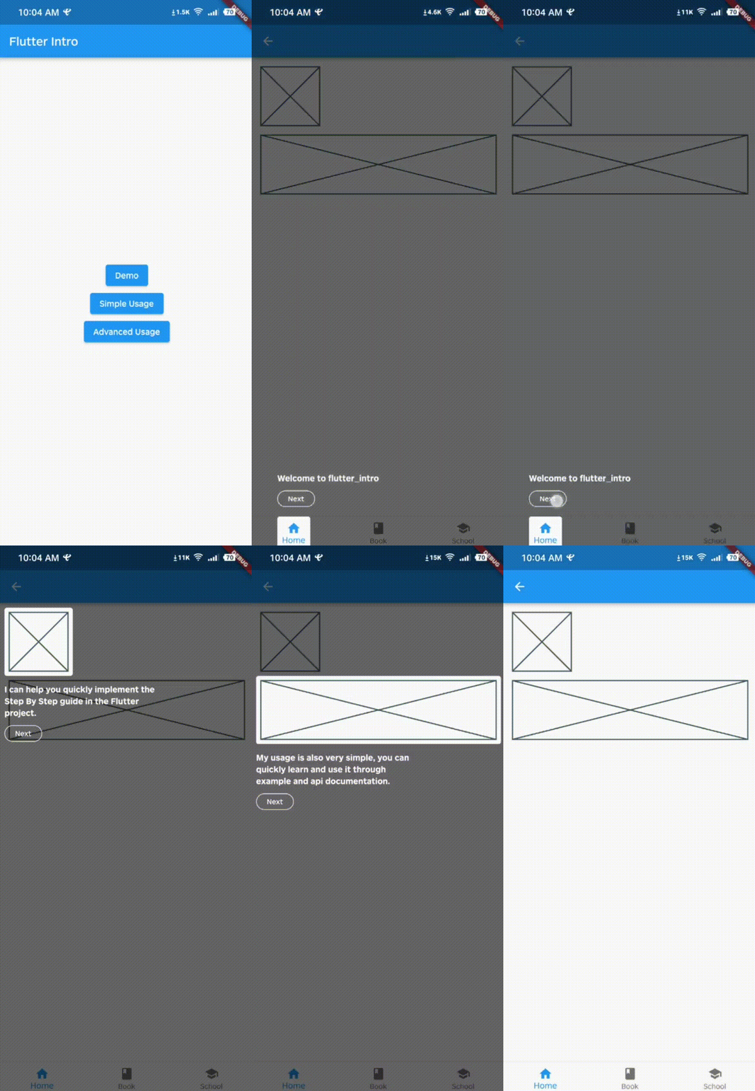
A better way for new feature introduction and step-by-step user guide for your Flutter project.
 |
 |
|---|---|
 |
 |
Features
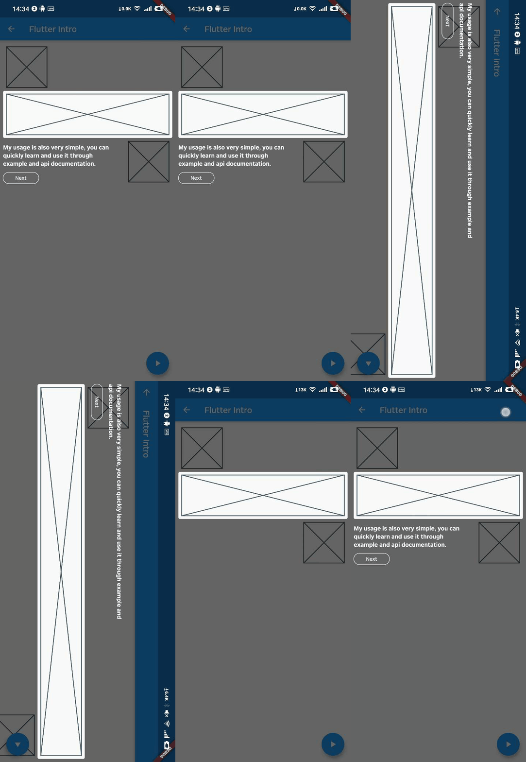
- The guide widget is capable of adapting to device orientation.
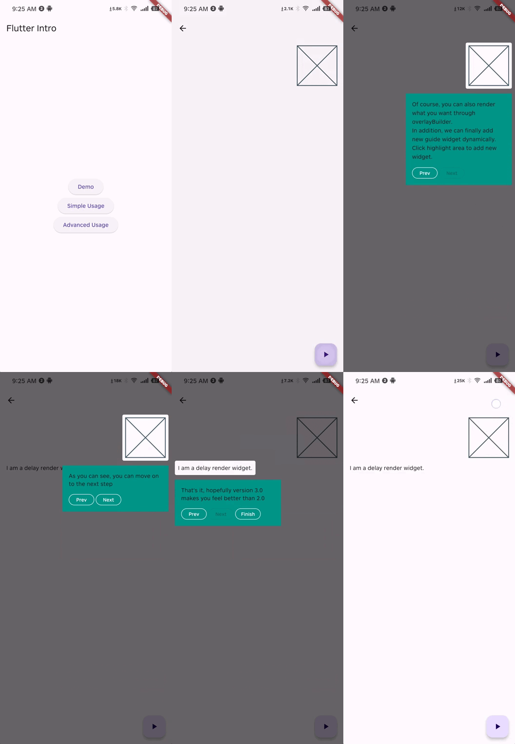
- Supports custom rendering of the guide widget overlay content.
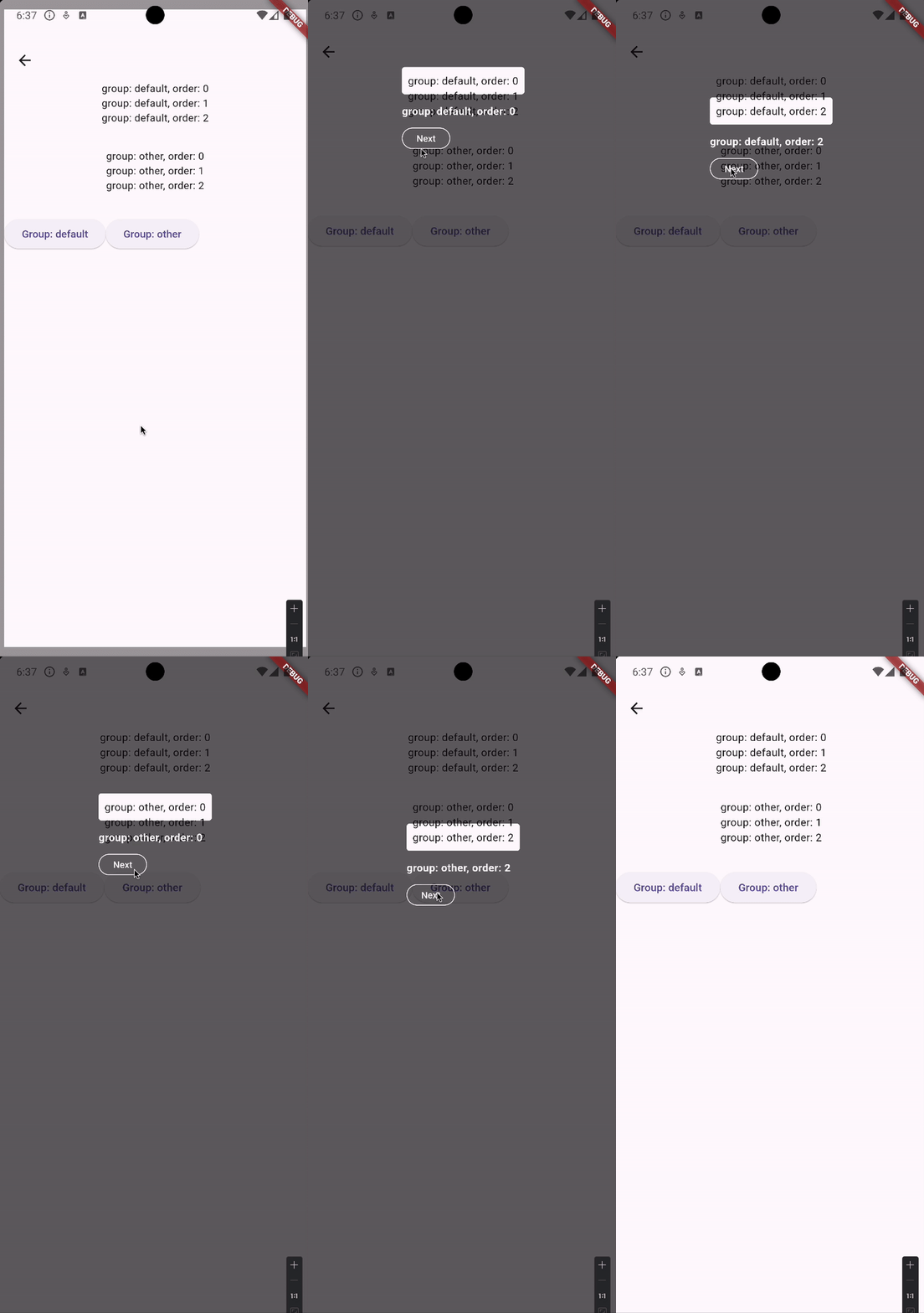
- Supports grouping of guide pages, facilitating the display of multiple guide groups on a single page.
- Supports guiding widgets that are rendered with a delay.
Usage
To use this package, add flutter_intro as a dependency in your pubspec.yaml file.
Init
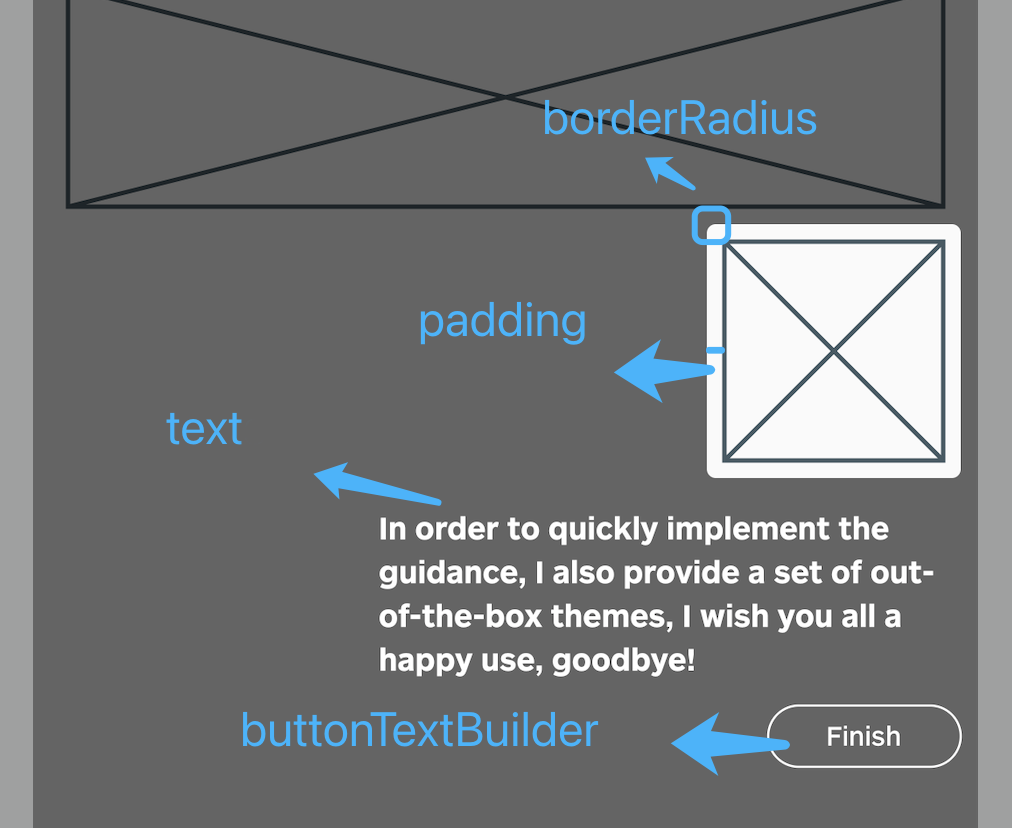
Wrap the app root widget with Intro. You can also set some global properties on Intro as seen
below.
import 'package:flutter_intro/flutter_intro.dart';

Intro(
  /// Padding of the highlighted area and the widget
  padding: const EdgeInsets.all(8),

  /// Border radius of the highlighted area
  borderRadius: BorderRadius.all(Radius.circular(4)),

  /// The mask color of step page
  maskColor: const Color.fromRGBO(0, 0, 0, .6);

  /// Toggle animation
  noAnimation: false;

  /// Toggle whether the mask can be closed
  maskClosable: false;

  /// Build custom button
  buttonBuilder: (order) {
    return IntroButtonConfig(
      text: order == 3 ? 'Custom Button Text' : 'Next',
      height: order == 3 ? 48 : null,
      fontSize: order == 3 ? 24 : null,
      style: order == 3
        ? OutlinedButton.styleFrom(
            backgroundColor: Colors.red,
        )
        : null,
    );
  },

  /// High-level widget
  child: const YourApp(),
)
Add guided widget
Wrap a widget with IntroStepBuilder, placing the original widget inside builder and applying the
key so it can be found.
order must be defined uniquely per route so that the unique key can be generated.
/// See docs for full list of properties, some of which override [Intro] ones
IntroStepBuilder(
  /// Required: use unique int for each step to set guide order
  order: 1,

  /// Use either `text` or `overlayBuilder` to create guide content (see "Advanced Usage" for latter
  /// example).

  /// Use text to quickly add leading text
  text: 'Use this widget to...',

  /// Required: provide function that returns a `Widget` with the key
  builder: (BuildContext context, GlobalKey key) => NeedGuideWidget(
    /// Bind the key to whatever is returned
    key: key,
  ),
)
Run
That's it!
Intro.of(context).start();
Advanced Usage
/// See `example/lib/advanced_usage.dart` for more details
IntroStepBuilder(
  order: 2,

  /// Create a customized guide widget
  overlayBuilder: (StepWidgetParams params) {
    return YourCustomOverlay();
  },
)
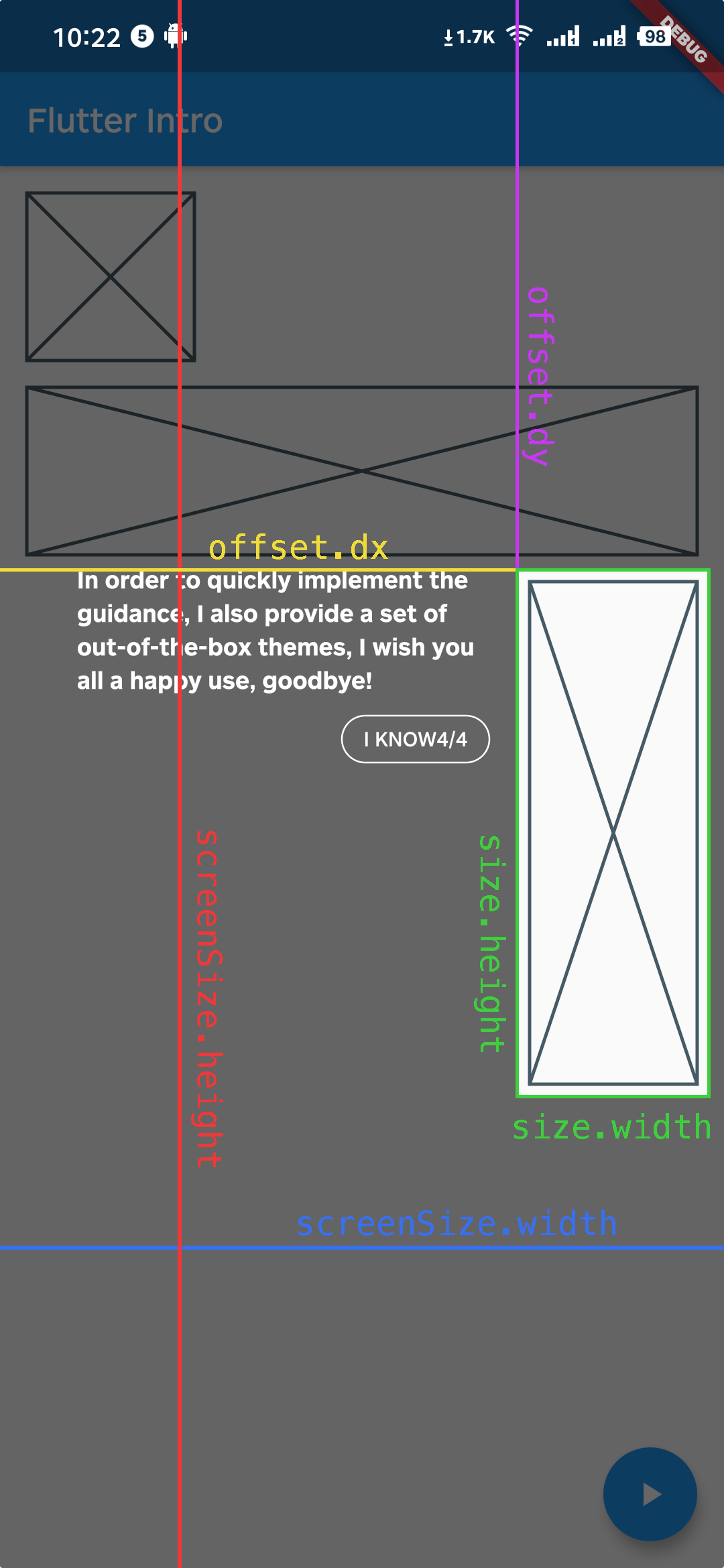
StepWidgetParams provides many useful parameters to generate the guide overlay, as seen below.
Troubleshooting
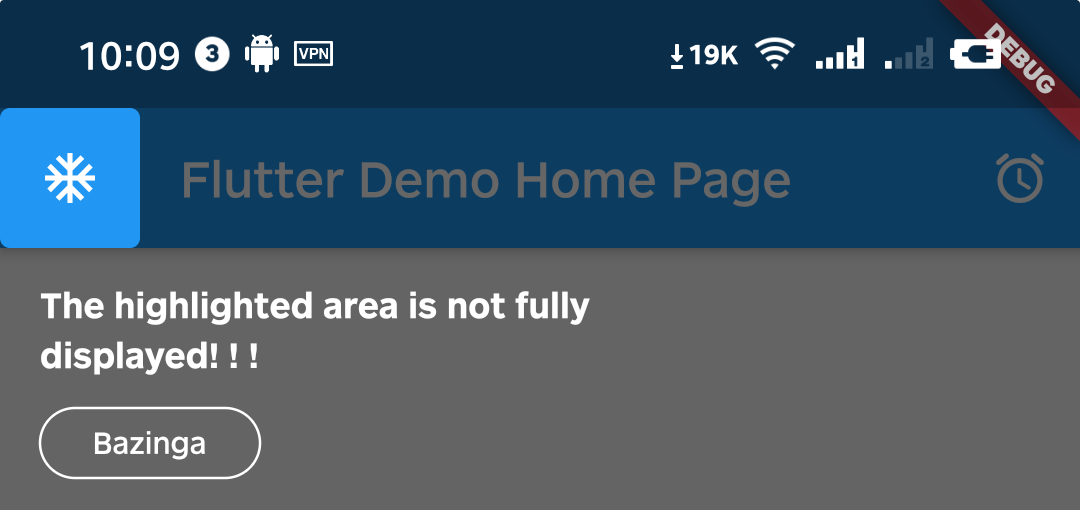
Q1. What if the highlighted area is not displayed completely?
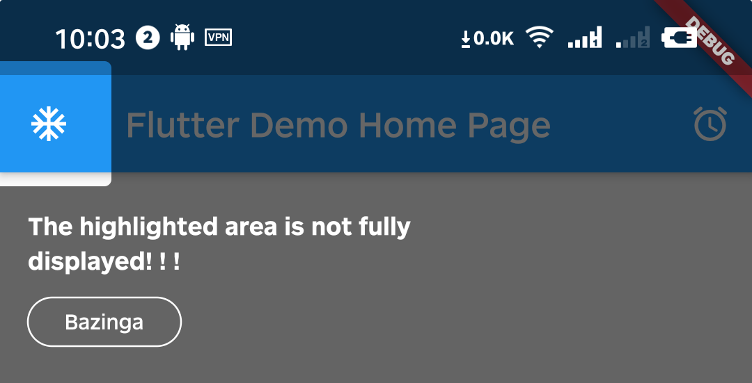
A1. That's because Intro provides 8px padding by default.
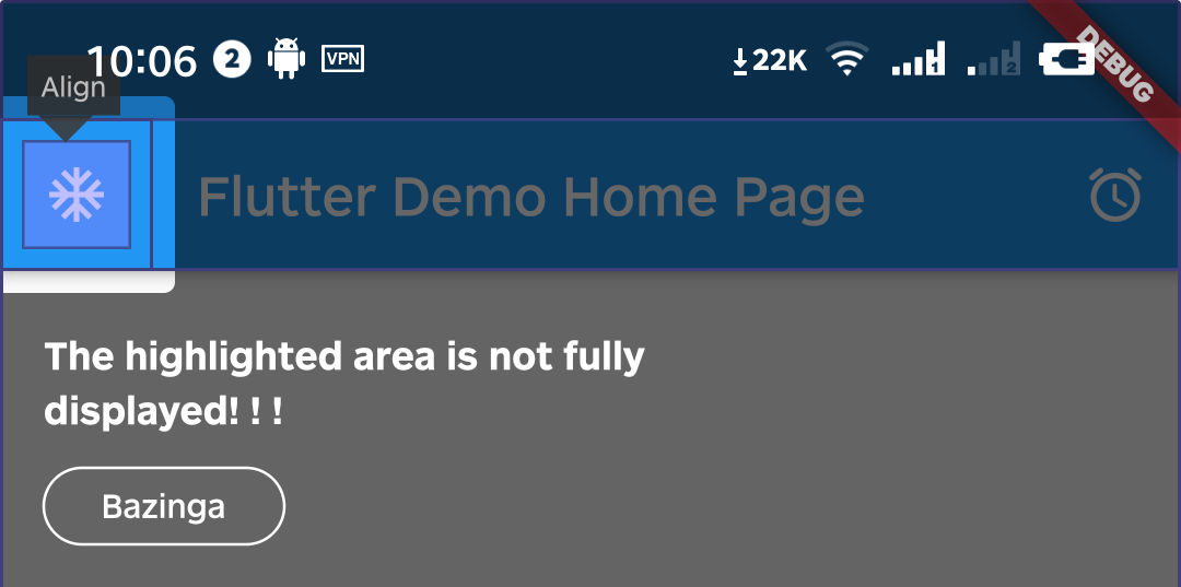
We can change it by setting the value of padding.
Intro(
  /// Set padding to zero (or negative) to reduce highlight size
  padding: EdgeInsets.zero,
  child: const YourApp(),
);
Q2. Can I set different configurations for each step?
A2. Yes, you can configure every IntroStepBuilder.
IntroStepBuilder(
  order: 3,
  padding: const EdgeInsets.symmetric(vertical: 5, horizontal: 5),
  borderRadius: const BorderRadius.all(Radius.circular(64)),
  builder: (context, key) => YourWidget(),
)
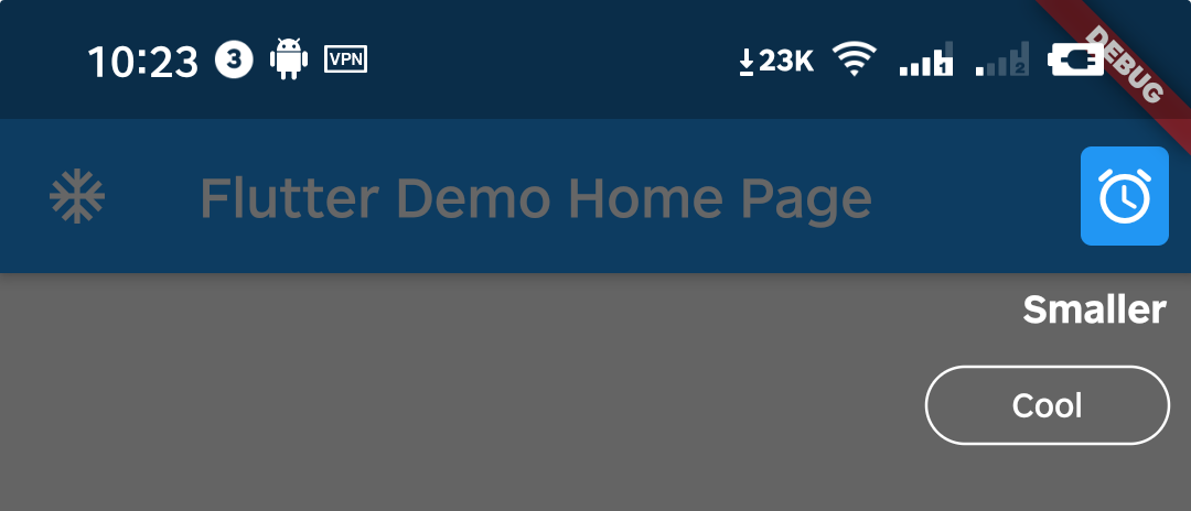
Q3. Can I make the highlight area smaller?
A3. Yes, can do it by setting padding to a negative number.
IntroStepBuilder(
  order: 4,
  /// Reduce highlight size further
  padding: const EdgeInsets.symmetric(
    vertical: -5,
    horizontal: -5,
  ),
  builder: (context, key) => YourWidget(),
)
Q4. If the user presses or gestures "back", an exception happens. How do I avoid this?
A4. You can call the dispose method of the intro instance.
WillPopScope(
  child: Scaffold(...),
  onWillPop: () async {
    final Intro intro = Intro.of(context);

    if (intro.status.isOpen == true) {
      intro.dispose();
      return false;
    }
    return true;
  },
)
Q5. WillPopScope is deprecated, is there any better solution?
A5. As of v3.1.0, you can use ValueNotifier<IntroStatus> statusNotifier.
You can achieve the same effect through the following sample code.
ValueListenableBuilder(
  valueListenable: intro.statusNotifier,
  builder: (context, value, child) {
    return PopScope(
      canPop: !value.isOpen,
      onPopInvoked: (didPop) {
        if (!didPop) {
          intro.dispose();
        }
      },
      child: Scaffold(...),
    );
  },
)
Example
Please check the example in example/lib/main.dart.

Minax ↗
使用的依賴
依賴清單 5 項
- collection
^1.18.0 - flutter
{"sdk":"flutter"} - flutter_test開發依賴
{"sdk":"flutter"} - flutter_lints開發依賴
^5.0.0 - lints開發依賴
^5.0.0
如何選擇適合專案的儲存庫?
先依使用情境篩選,再比較專案活躍情況,最後到原始儲存庫確認使用要求。
- 透過儲存庫名稱、作者或描述搜尋,再依技術分類縮小範圍。
- 綜合星標、分支與最近推送比較專案;星標反映社群關注,不保證品質。
- 使用前在 GitHub 確認 README、授權條款與 Issues。
來源與維護
“A repository is the most basic element of GitHub.”
GitHub Docs — About repositories ↗