
 v1.0.1
carousel_nerdzlab
自訂 PageView,帶有邊緣對齊元素和置中對齊
0喜歡 48近 30 天下載150Pub 分數
AndroidiOSWebmacOSWindowsLinux
自訂 PageView,帶有邊緣對齊元素和置中對齊
以下為英文專案原文快照,最新內容請造訪 GitHub。
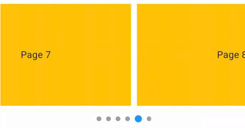
This package provides a custom implementation of the CenteredPageView widget that behaves like the default PageView, but with padEnds: false while centered elements, and an optional dot indicator.
Package CenteredPageView. Items snap to a centered position.
Default PageView. Elements align based on scroll position but are not centered.
CenteredPageView widget that centers items while retaining the default properties of the PageView.CenteredPageView.Here's how to implement CenteredPageView in your Flutter app:
CenteredPageView.builder(
  itemCount: 9,
  controller: PageController(viewportFraction: 0.8),
  showIndicator: true, // Set to 'false' if you do not want to display the dot indicator
  indicatorStyle: const IndicatorStyle(
      indicatorWidth: 100, unselectedSize: Size(8, 8)),
  itemBuilder: (context, index) => Container(
      width: MediaQuery.of(context).size.width,
      margin: const EdgeInsets.symmetric(horizontal: 5.0),
      padding: const EdgeInsets.symmetric(horizontal: 16),
      decoration: const BoxDecoration(color: Colors.amber),
      child: Align(
        child: Text(
          'Page $index',
          style: const TextStyle(fontSize: 16.0),
        ),
      )),
),
Customizing the Dot Indicator
showIndicator property is a boolean that controls the visibility of the dot indicator.indicatorStyle property allows you to customize the appearance of the dot indicator.
依賴清單 3 項
{"sdk":"flutter"}{"sdk":"flutter"}^4.0.0先依使用情境篩選,再比較專案活躍情況,最後到原始儲存庫確認使用要求。
“A repository is the most basic element of GitHub.”
GitHub Docs — About repositories ↗