
輸入數量
用於輸入物品數量的 Flutter 小部件
- 星標
- 13
- 分支
- 27
- 最近推送(UTC)
- 2026年6月14日
- 專案狀態
- 未封存
原始 README
以下為英文專案原文快照,最新內容請造訪 GitHub。
Input Quantity







Flutter widget for quantity input. Increase or decrease the input value by pressing the button. It's built with text fields, so InputQty also supports manually typing quantities. Very flexible for large quantities. For example, if the user wants to enter the value 19243, it will be very difficult to only rely on buttons.
Set input limits so that input values automatically return to predefined maximum/minimum values.
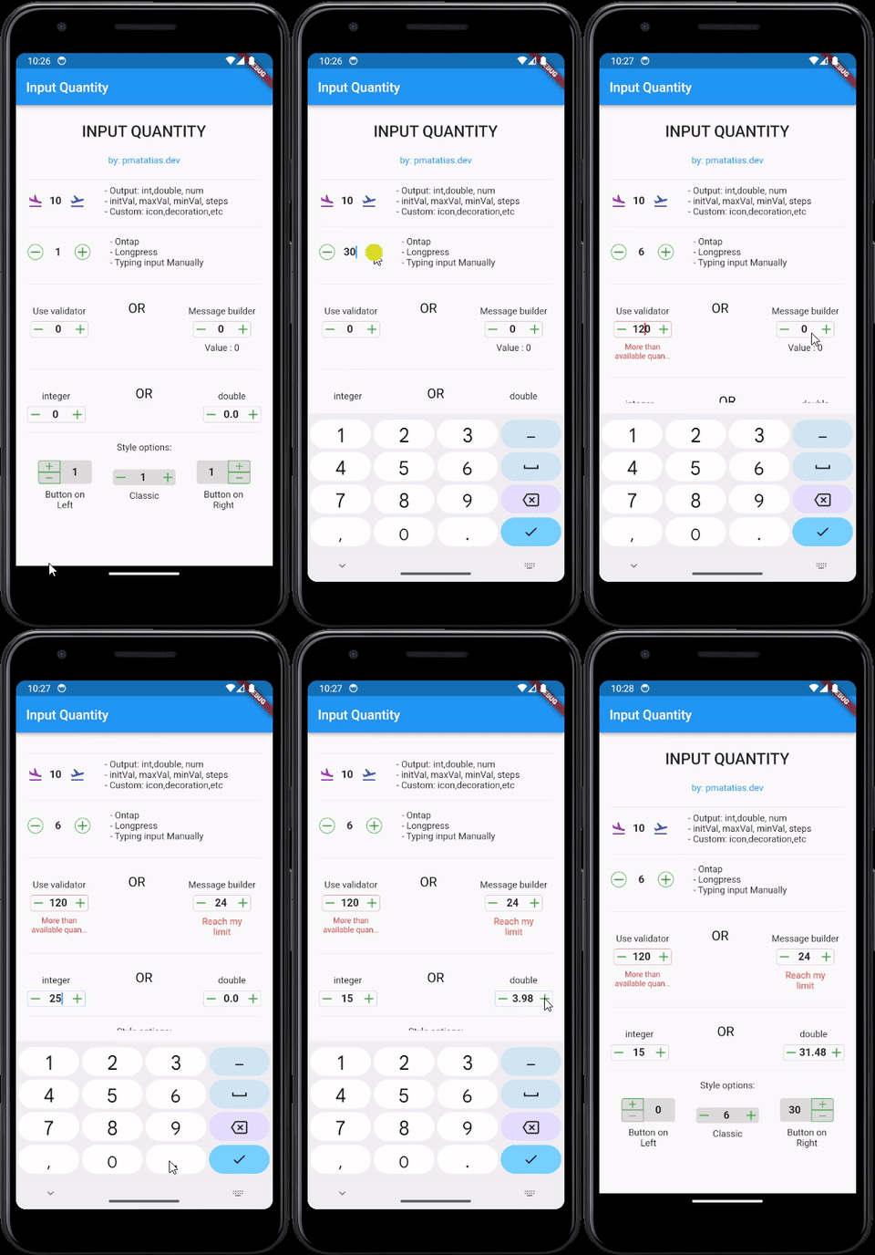
Features
- Simple and easy to use
- Customizable
- Output:
int,double, ornum - Style options: classic, button on the left or button on the right
- Tap once to update the value,
longpressfor update the value continuously, or type the value manually. - Add validator form, or use custom message builder
Installation
To use this package, add input_quantity as a dependency in your pubspec.yaml file.
dependencies:
  input_quantity: ^2.5.0
Then, run flutter pub get to install the package.
Usage
Basic Usage
import 'package:input_quantity/input_quantity.dart';

InputQty(
  maxVal: 100,
  initVal: 0,
  minVal: -100,
  steps: 10,
  onQtyChanged: (val) {
    print(val);
  },
)
Typing Manually
If you want to prevent typing manually, you can disable it from enableTyping.
InputQty(
  qtyFormProps: QtyFormProps(enableTyping: false),
  ...
)
Output Types
By default, the output will be as a num.
InputQty(
  onQtyChanged: (val) {
    print(val.runtimeType); // num
  },
)
To specify the output type as int:
InputQty.int(
  onQtyChanged: (val) {
    print(val.runtimeType); // int
  },
)
To specify the output type as double:
InputQty.double(
  onQtyChanged: (val) {
    print(val.runtimeType); // double
  },
)
Customizing Appearance and Behavior
Using QtyFormProps
You can customize the appearance and behavior of the input field using QtyFormProps.
InputQty(
  qtyFormProps: QtyFormProps(
    textAlign: TextAlign.center,
    style: TextStyle(fontWeight: FontWeight.bold),
    cursorColor: Colors.red,
    enableTyping: true,
  ),
)
Using QtyDecorationProps
You can customize the decoration of the input field using QtyDecorationProps.
InputQty(
  decoration: QtyDecorationProps(
    borderShape: BorderShapeBtn.circle,
    btnColor: Colors.blue,
    fillColor: Colors.grey[200],
    isBordered: true,+
  ),
)
Validation
You can use the validator property to validate the input value.
InputQty(
  validator: (value) {
    if (value == null) {
      return "Required field";
    } else if (value >= 200) {
      return "More than available quantity";
    }
    return null;
  },
)
Custom Messages
You can use the messageBuilder property to display custom messages based on the input value.
InputQty(
  messageBuilder: (minVal, maxVal, value) {
    if (value == null) return null;
    if (value < -20) {
      return Text(
        "Reach my limit",
        style: TextStyle(color: Colors.red),
        textAlign: TextAlign.center,
      );
    } else if (value > 20) {
      return Text(
        "Reach my limit",
        style: TextStyle(color: Colors.red),
        textAlign: TextAlign.center,
      );
    } else {
      return Text("Value : $value", textAlign: TextAlign.center);
    }
  },
)
Controlling Input Value Programmatically
You can use TextEditingController to control the input value programmatically.
final TextEditingController _controller = TextEditingController();

InputQty(
  qtyFormProps: QtyFormProps(
    controller: _controller,
  ),
)
Button Orientation
You can change the orientation of the buttons using ButtonOrientation.
InputQty(
  decoration: QtyDecorationProps(
    orientation: ButtonOrientation.horizontal,
  ),
)
Button Position
You can change the position of the buttons using QtyStyle.
InputQty(
  decoration: QtyDecorationProps(
    qtyStyle: QtyStyle.btnOnRight,
  ),
)
Examples
For more examples, check the example directory.
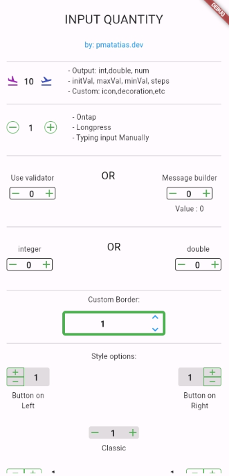
Contributons
To contribute to this project, please follow the guidelines in the CONTRIBUTING.md file.
Thank you to all contributors for their valuable contributions!
 |
 |
 |
 |
 |
 |
Additional Information
- Want to thank me? You can buy me a coffee.


Matatias Situmorang (Petra) ↗
分類
使用的依賴
依賴清單 4 項
- flutter
{"sdk":"flutter"} - test
^1.24.3 - flutter_test開發依賴
{"sdk":"flutter"} - flutter_lints開發依賴
^2.0.0
如何選擇適合專案的儲存庫?
先依使用情境篩選,再比較專案活躍情況,最後到原始儲存庫確認使用要求。
- 透過儲存庫名稱、作者或描述搜尋,再依技術分類縮小範圍。
- 綜合星標、分支與最近推送比較專案;星標反映社群關注,不保證品質。
- 使用前在 GitHub 確認 README、授權條款與 Issues。
來源與維護
“A repository is the most basic element of GitHub.”
GitHub Docs — About repositories ↗