
動畫師
Flutter 的動畫套件,靈感來自 Animate.css
- 星標
- 149
- 分支
- 19
- 最近推送(UTC)
- 2022年6月7日
- 專案狀態
- 未封存
原始 README
以下為英文專案原文快照,最新內容請造訪 GitHub。
animator
Enables you to create stunning flutter animations, faster, efficient and with less code.
Null safety:
For null safety please use flutter_animator: ^3.1.0, without null safety: flutter_animator: 2.1.0
Flutter 3:
For flutter>=3 please use flutter_animator: ^3.2.2
Partly inspired by the amazing Animate.css package by Dan Eden. Please note, although it's inspired by Animate.css, this still is a Flutter package, meaning it will be available for all flutter-supported platforms.
Features:
- Combine and chain Tweens with multiple easing-curves.
- Less boilerplate code by using a widget which directly handles the controller, animations etc.
- Automatically (re)starts animations on hot-reload after saving.
- Animate your project with ease using the Animate.css based Widgets.
Please press the like button if you like this package, or star it on github.
Getting Started
Note: To see all of the animated widgets in action be sure to run the app in the demo_app package, or view them on the Animate.css page.
Put the dependency inside your pubspec.yml and run packages get.
Using one of the Animate.css style widgets:
import 'package:flutter/widgets.dart';
import 'package:flutter_animator/flutter_animator.dart';

class TestAnimatedWidget extends StatelessWidget {
  @override
  Widget build(BuildContext context) {
    return RubberBand(
      child: Text(
        'Rubber',
        style: TextStyle(fontSize: 20),
      ),
    );
  }
}
Please note that you can use the magnitude property in the AnimationPreferences to control the magnitude of the animations.
Using a GlobalKey to enable play/stop/reverse animations from code:
import 'package:flutter/widgets.dart';
import 'package:flutter_animator/flutter_animator.dart';

class TestAnimatedWidget extends StatefulWidget {
  @override
  _TestAnimatedWidgetState createState() => _TestAnimatedWidgetState();
}
class _TestAnimatedWidgetState extends State<TestAnimatedWidget> {
  //Register a key in your state:
  GlobalKey<AnimatorWidgetState> _key = GlobalKey<AnimatorWidgetState>();

  @override
  Widget build(BuildContext context) {
    return Column(
      children: <Widget>[
        Expanded(
            //Render the widget using the _key
            child: RubberBand(
              key: _key,
              child: Text(
                'Rubber',
                style: TextStyle(fontSize: 60),
              ),
            ),
        ),
        Padding(
            padding: EdgeInsets.fromLTRB(10, 10, 10, 30),
            child: IconButton(
              icon: Icon(
                Icons.play_arrow,
                color: Colors.green,
              ),
              //Use _key.currentState to forward/stop/reverse
              onPressed: () => _key.currentState.forward(),
            ),
        ),
      ],
    );
  }
}
Create your own:
Below is the code (with extra comments) from the actual FadeInDown animated widget. It should give you a clear insight on how to animate with the Animator using the AnimatorWidget.
import 'package:flutter/widgets.dart';

import '../../flutter_animator.dart';

///Firstly, we create an _AnimationDefinition_.
///This is the actual animation part, which gets driven by the _AnimatorWidget_.
class FadeInDownAnimation extends AnimationDefinition {
  FadeInDownAnimation({
  ///[AnimationPreferences] allows us to use the animation with different parameters for:
  ///offset, duration, autoPlay and an animationStatusListener.
    AnimationPreferences preferences = const AnimationPreferences(),
  }) : super(
          preferences: preferences,
          ///If you want to use the size of the widget, you need to define it here. (needsScreenSize is also available)
          needsWidgetSize: true,
          ///The opacity to use on the first render when using screenSize or widgetSize.
          ///In some cases 'flickering' may appear when this isn't set to 1.0 or 0.0 respectively.
          preRenderOpacity: 0.0,
        );

  ///Use the build function to actually render the animated values.
  ///Performance-wise it's better to use a FadeTransition for opacity animation.
  ///Use AnimatedBuilder to update te animation and it's values.
  @override
  Widget build(BuildContext context, Animator animator, Widget child) {
    return FadeTransition(
      ///Use animator.get([KEY]) to get to the Animation object.
      opacity: animator.get("opacity"),
      child: AnimatedBuilder(
        ///[Animator] exposes the AnimationController via animator.controller.
        animation: animator.controller,
        child: child,
        builder: (BuildContext context, Widget child) => Transform.translate(
          child: child,
          ///Use animator.get([KEY]).value to get the animated value.
          offset: Offset(0.0, animator.get("translateY").value),
        ),
      ),
    );
  }

  ///Inside the getDefinition method we return the actual animation.
  @override
  Map<String, TweenList> getDefinition({Size screenSize, Size widgetSize}) {
    return {
      ///Define a [KEY] and a list of Animated values from 0 to 100 percent.
      ///Please not that you can also define an animation curve inside the [TweenPercentage] class:
      ///TweenPercentage(percent: 0, value: 0.0, curve: Curves.ease),
      "opacity": TweenList<double>(
        [
          TweenPercentage(percent: 0, value: 0.0),
          TweenPercentage(percent: 100, value: 1.0),
        ],
      ),
      "translateY": TweenList<double>(
        [
          TweenPercentage(percent: 0, value: -widgetSize.height),
          TweenPercentage(percent: 100, value: 0.0),
        ],
      ),
    };
  }
}

///To use the AnimationDefinition we just created we could do the following:
///For a single animation:
/// AnimatorWidget(child: [child], definition: FadeInDownAnimation());
///
///For In & Out Animations:
///  InOutAnimation(child: [child), inDefinition: FadeInDownAnimation(), outDefinition: ...);
///
Available default animations:
Attention Seekers
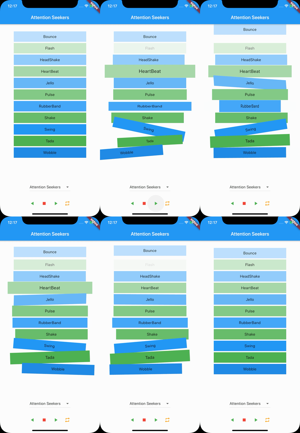
- Bounce
- Flash
- HeadShake
- HeartBeat
- Jello
- Pulse
- RubberBand
- Shake
- Swing
- Tada
- Wobble
Bouncing Entrances
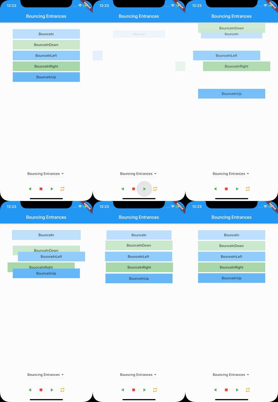
- BounceIn
- BounceInDown
- BounceInLeft
- BounceInRight
- BounceInUp
Bouncing Exits
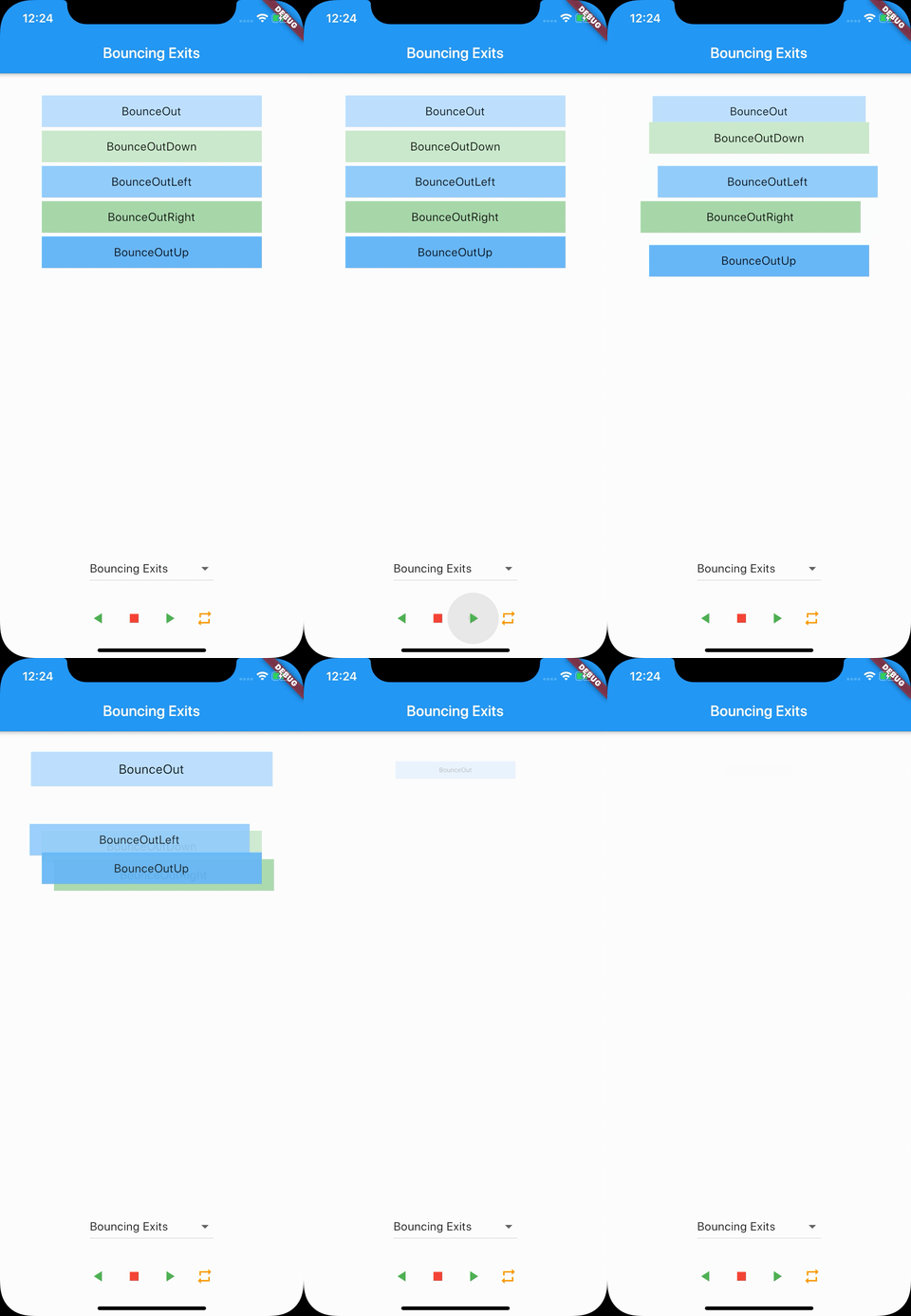
- BounceOut
- BounceOutDown
- BounceOutLeft
- BounceOutRight
- BounceOutUp
Fading Entrances
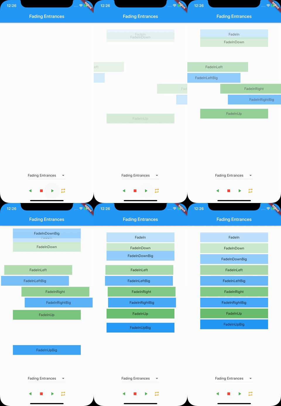
- FadeIn
- FadeInDown
- FadeInDownBig
- FadeInLeft
- FadeInLeftBig
- FadeInRight
- FadeInRightBig
- FadeInUp
- FadeInUpBig
Fading Exits
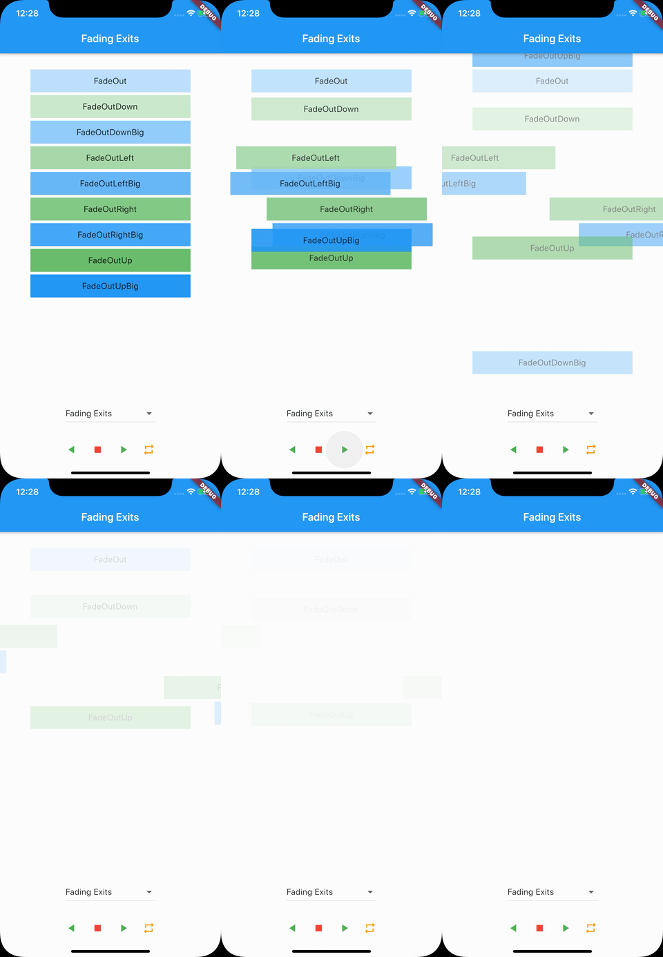
- FadeOut
- FadeOutDown
- FadeOutDownBig
- FadeOutLeft
- FadeOutLeftBig
- FadeOutRight
- FadeOutRightBig
- FadeOutUp
- FadeOutUpBig
Flippers
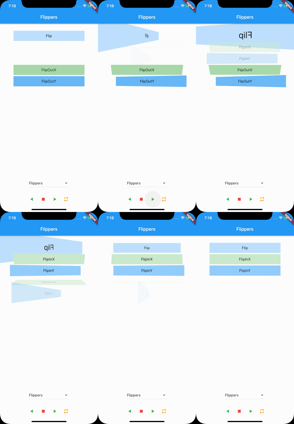
- Flip
- FlipInX
- FlipInY
- FlipOutX
- FlipOutY
Lightspeed
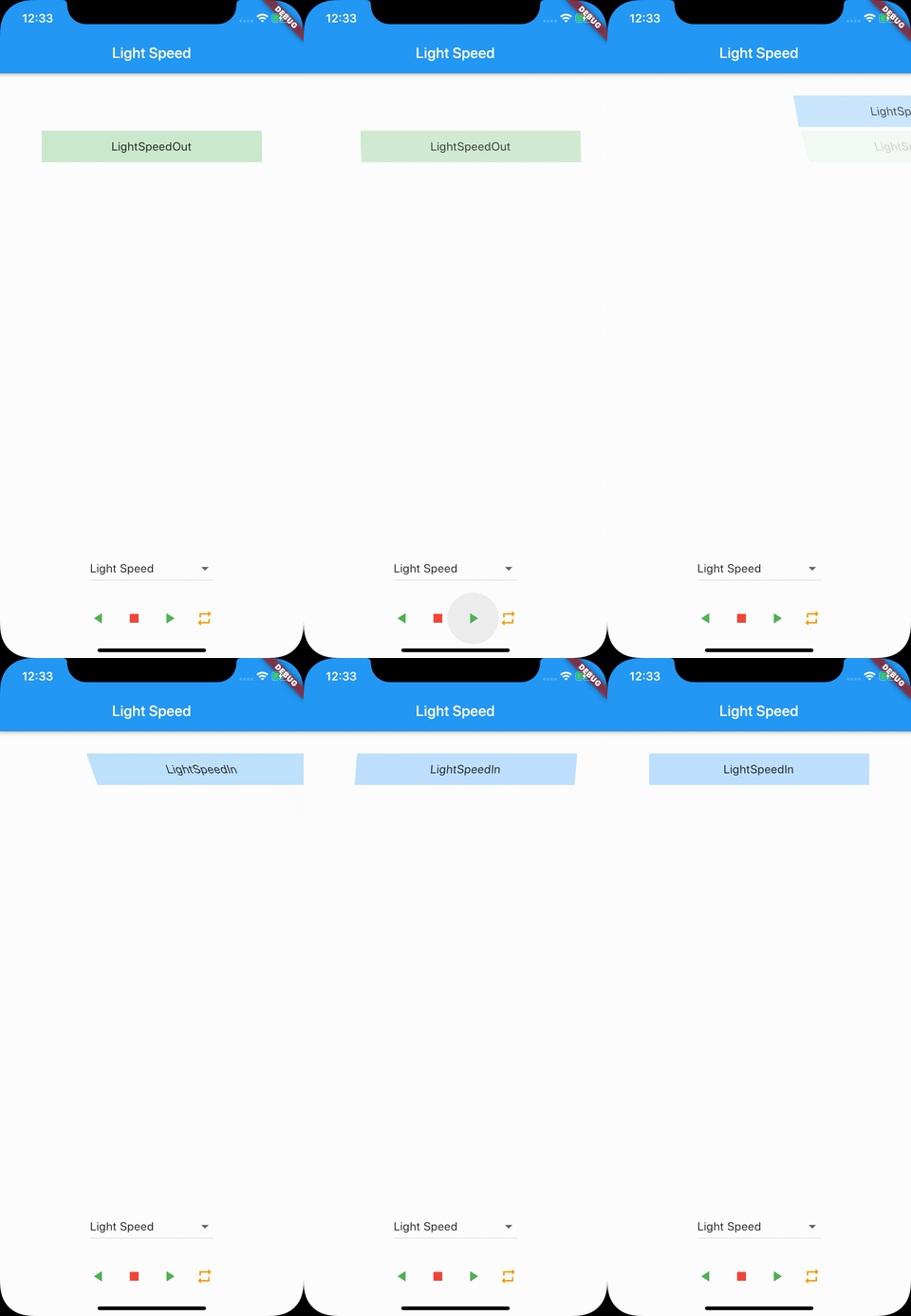
- LightSpeedIn
- LightSpeedOut
Rotating Entrances
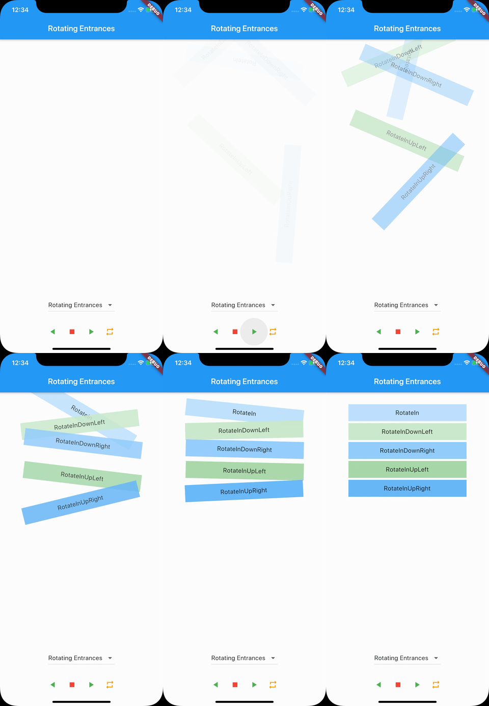
- RotateIn
- RotateInDownLeft
- RotateInDownRight
- RotateInUpLeft
- RotateInUpRight
Rotating Exits
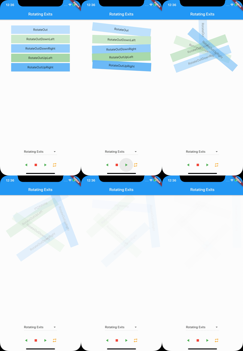
- RotateOut
- RotateOutDownLeft
- RotateOutDownRight
- RotateOutUpLeft
- RotateOutUpRight
Sliding Entrances
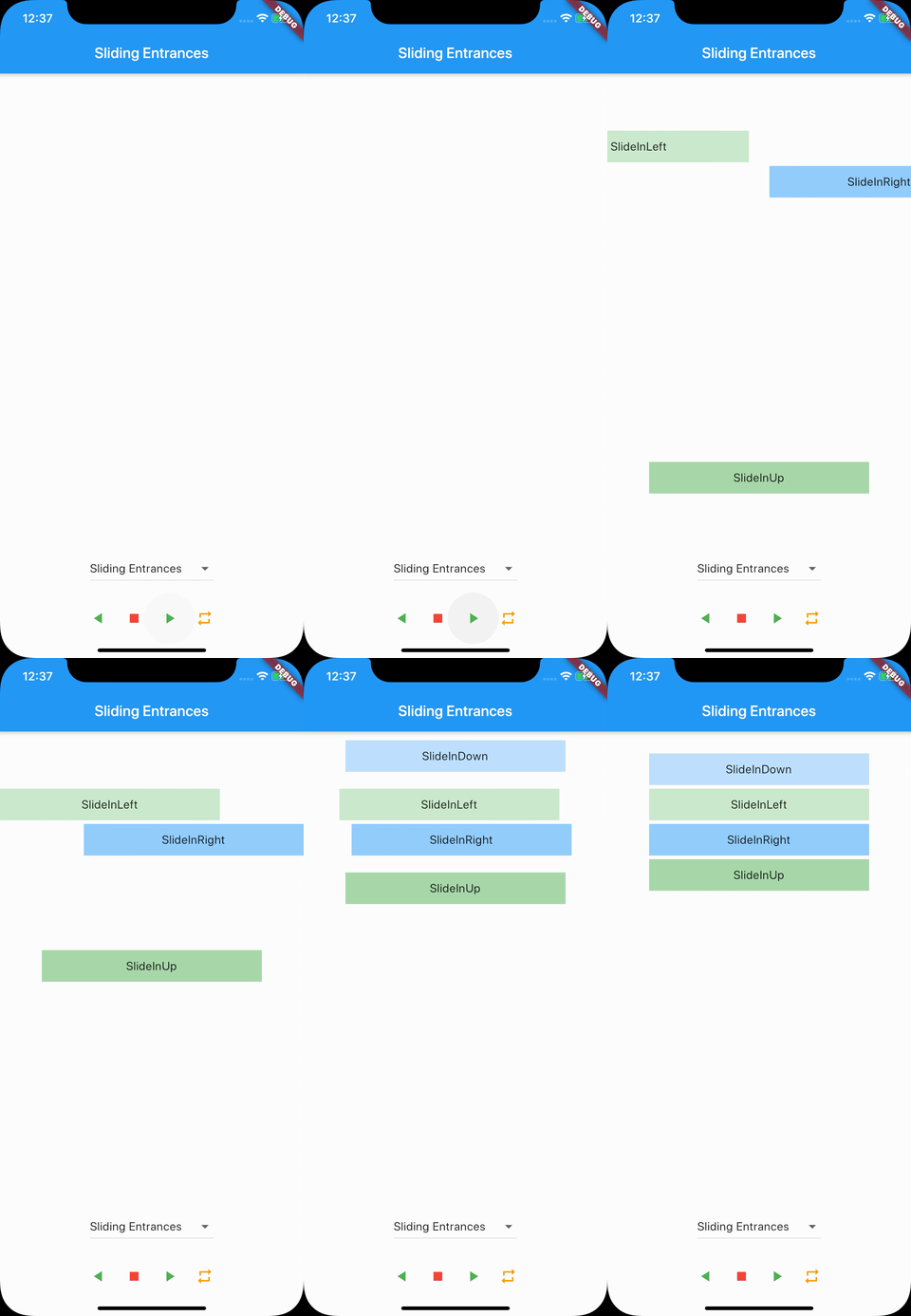
- SlideInDown
- SlideInLeft
- SlideInRight
- SlideInUp
Sliding Exits
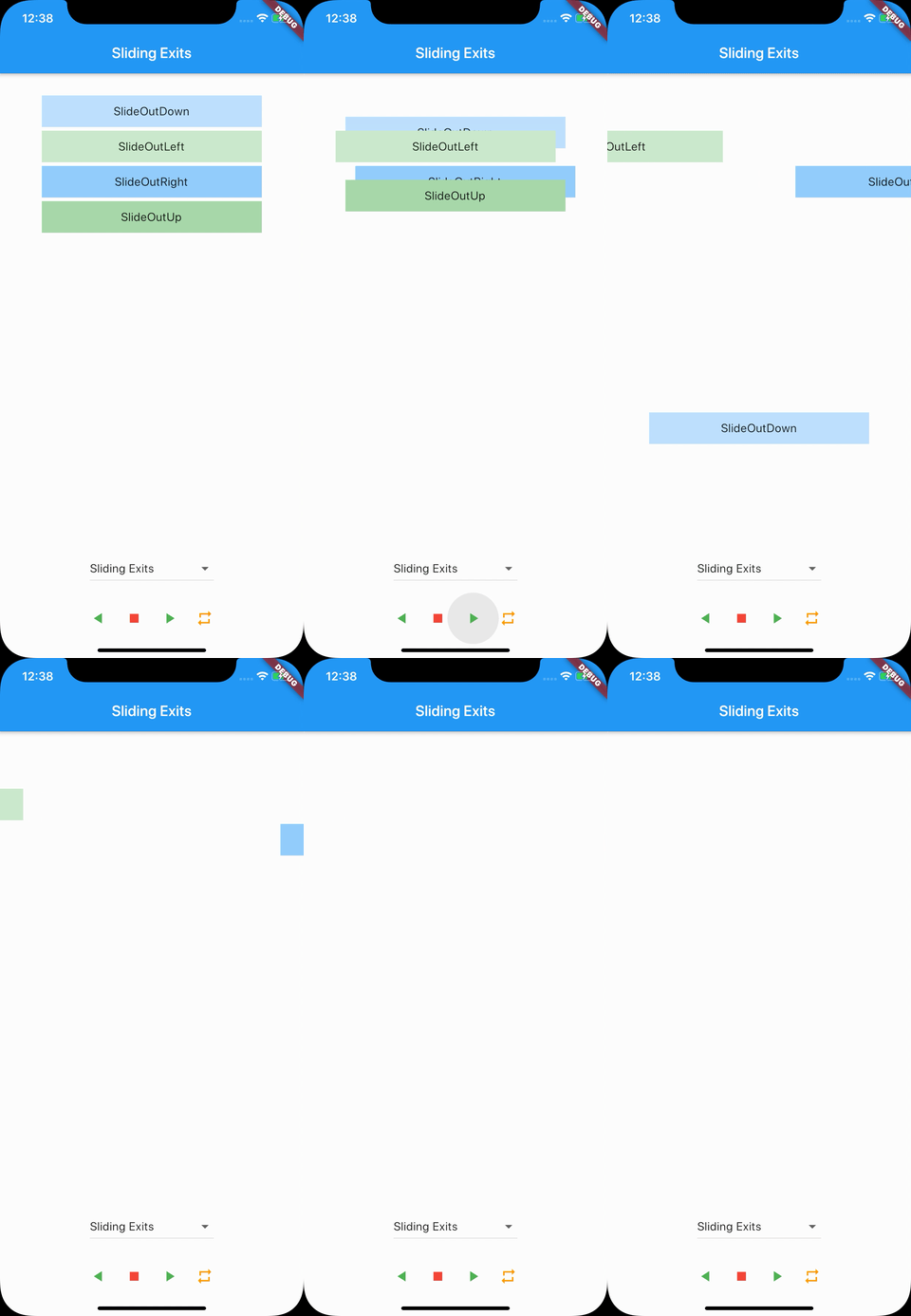
- SlideOutDown
- SlideOutLeft
- SlideOutRight
- SlideOutUp
Slit Entrances
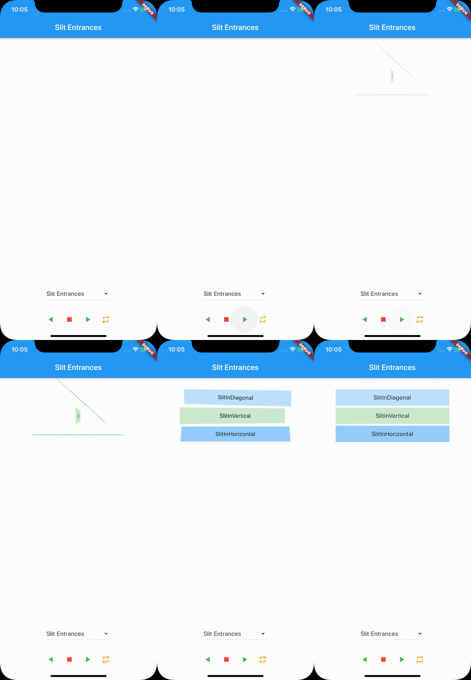
- SlitInDiagonal
- SlitInHorizontal
- SlitInVertical
Slit Exits
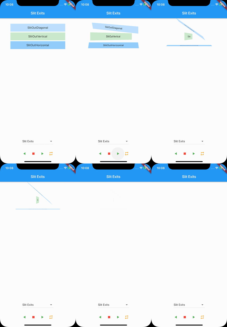
- SlitOutDiagonal
- SlitOutHorizontal
- SlitOutVertical
Specials
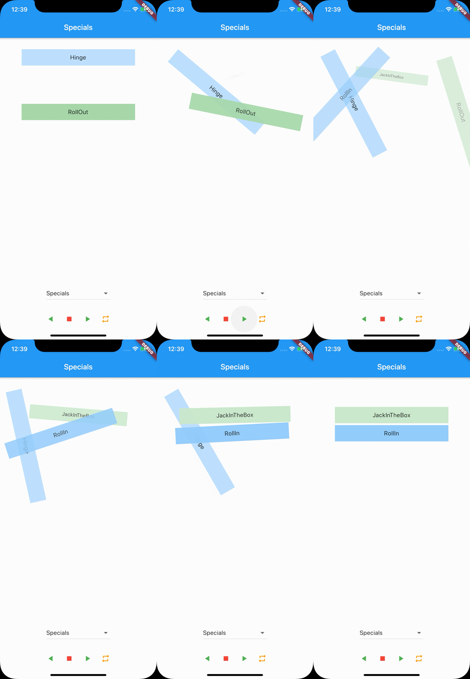
- CrossFadeAB (*not in preview)
- Hinge
- JackInTheBox
- RollIn
- RollOut
Zooming Entrances
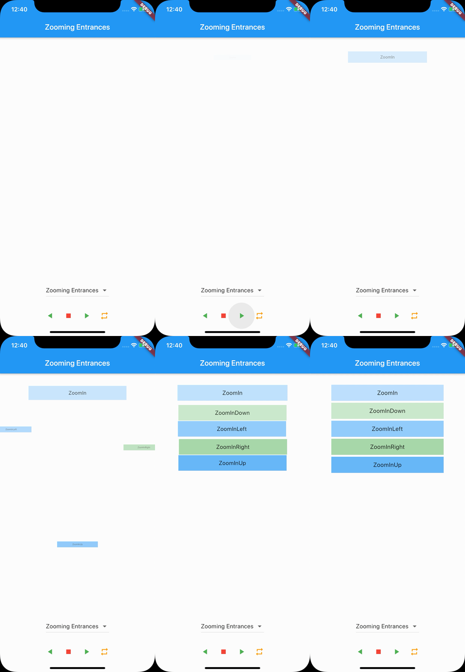
- ZoomIn
- ZoomInDown
- ZoomInLeft
- ZoomInRight
- ZoomInUp
Zooming Exits
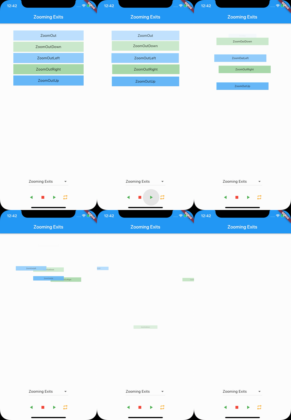
- ZoomOut
- ZoomOutDown
- ZoomOutLeft
- ZoomOutRight
- ZoomOutUp

Sjoerd van Den Berg ↗
使用的依賴
依賴清單 3 項
- flutter
{"sdk":"flutter"} - vector_math
^2.1.0 - flutter_test開發依賴
{"sdk":"flutter"}
如何選擇適合專案的儲存庫?
先依使用情境篩選,再比較專案活躍情況,最後到原始儲存庫確認使用要求。
- 透過儲存庫名稱、作者或描述搜尋,再依技術分類縮小範圍。
- 綜合星標、分支與最近推送比較專案;星標反映社群關注,不保證品質。
- 使用前在 GitHub 確認 README、授權條款與 Issues。
來源與維護
“A repository is the most basic element of GitHub.”
GitHub Docs — About repositories ↗