
 v2.0.8
flutter_layout_grid
一個強大的網格佈局系統,針對複雜的使用者介面設計進行優化。
883喜歡 13.6萬近 30 天下載160Pub 分數
AndroidiOSWebmacOSWindowsLinux
一個基於網格的 Flutter 平面系統,靈感來自 CSS 網格佈局

{"sdk":"flutter"}^1.15.0^3.0.0^3.0.0{"sdk":"flutter"}以下為英文專案原文快照,最新內容請造訪 GitHub。
A powerful grid layout system for Flutter, optimized for complex user interface design.
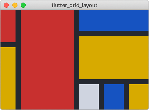
Piet painting recreated using Flutter Layout Grid Periodic table rendered using Flutter Layout Grid Scrabble board rendered using Flutter Layout GridClick images to see their code
✨Featuring:✨
Directionality or configurationInspired by (and largely based on), the excellent CSS Grid Layout spec.
All the terminology used in this library is shared with the CSS Grid Layout spec. If youʼre unfamiliar, I recommend taking a look at MDNʼs glossary of grid terms.
For inclusion in your pubspec, see pub.dev, or copy the code below:
dependencies:
  flutter_layout_grid: ^2.0.0
import 'package:flutter_layout_grid/flutter_layout_grid.dart';

class App extends StatelessWidget {
  @override
  Widget build(BuildContext context) {
    return Container(
      color: background,
      child: LayoutGrid(
        // ASCII-art named areas 🔥
        areas: '''
          header header  header
          nav    content aside
          nav    content .
          footer footer  footer
        ''',
        // Concise track sizing extension methods 🔥
        columnSizes: [152.px, 1.fr, 152.px],
        rowSizes: [
          112.px,
          auto,
          1.fr,
          64.px,
        ],
        // Column and row gaps! 🔥
        columnGap: 12,
        rowGap: 12,
        // Handy grid placement extension methods on Widget 🔥
        children: [
          Header().inGridArea('header'),
          Navigation().inGridArea('nav'),
          Content().inGridArea('content'),
          Aside().inGridArea('aside'),
          Footer().inGridArea('footer'),
        ],
      ),
    );
  }
}
This example is available at
example/app_layout.dart.
For a similar example that includes responsive behavior, check out
example/responsive_app_layout.dart.
The sizes of the gridʼs columns and rows are set using
LayoutGrid.columnSizes and LayoutGrid.rowSizes.
Hereʼs what a 4⨉3 grid might look like (4 columns, 3 rows):
LayoutGrid(
  columnSizes: [4.5.fr, 100.px, auto, 1.fr],
  rowSizes: [
    auto,
    100.px,
    1.fr,
  ],
)
Each element of columnSizes and rowSizes represents the function used to
size a column or row (collectively known as "track sizes").
There are currently three way to size rows and columns:
| Class Name | Description | Usage |
|---|---|---|
FixedTrackSize |
Occupies a specific number of pixels on an axis | FixedTrackSize(64)fixed(64)64.px |
FlexibleSizeTrack |
Fills remaining space after the initial layout has completed | FlexibleTrackSize(1.5)flexible(1.5)1.5.fr |
IntrinsicContentTrackSize |
Sized to contain its itemsʼ contents. Will also expand to fill available space, once FlexibleTrackSize tracks have been given the opportunity. |
IntrinsicContentTrackSize()intrinsic()auto |
Technically, you can also define your own, but probably shouldnʼt as the API
will likely be evolving as I tackle
(#25)
(minmax()
support).
A gridʼs rows and columns can be sliced into areas — rectangular regions
containing one or more grid cells. These areas can be named (optionally), and
used to place gridʼs children. The areas are named using an ASCII-art string
provided to the areas parameter.
LayoutGrid(
  areas: '''
    header header
    nav    content
    footer footer
  ''',
  // ...
)
Note: We use the same format as CSSʼs
grid-template-areas, except we use a multiline string.
If an areas argument has been provided to a grid, you must specify the same
number of sizes using columnSizes and rowSizes elements. For the example
above:
LayoutGrid(
  areas: '''
    header header
    nav    content
    footer footer
  ''',
  // 2 columns, 3 rows, just like the areas string
  columnSizes: [
    auto, // contributes width to [nav, header, footer]
    1.fr, // contributes width to [content, header, footer]
  ],
  rowSizes: [
    96.px, // contributes height to [header]
    1.fr,  // contributes height to [nav, content]
    72.px, // contributes height to [footer]
  ],
  children: [
    // ...
  ],
)
Grid children can be assigned to named areas using the NamedAreaGridPlacement
widget. For more information, see assigning the child to a named
area.
LayoutGridOnce you have a grid, you have to tell its children which rows and columns
they should occupy. There are three ways of doing this:
A gridʼs child can be instructed to occupy a specific set of columns and rows
by using the GridPlacement widget.
For example, letʼs say you had a 4⨉3 grid, and you wanted a widget to be positioned from column 1–4 and row 0–2:
LayoutGrid(
  columnSizes: [1.fr, 1.fr, 1.fr, 1.fr],
  rowSizes: [
    1.fr,
    1.fr,
    1.fr,
  ],
  children: [
    GridPlacement(
      columnStart: 1,
      columnSpan: 3,
      rowStart: 0,
      rowSpan: 2,
      child: MyWidget(),
    ),
    // Alternatively, an extension method on Widget is available
    MyWidget().withGridPlacement(
      columnStart: 1,
      columnSpan: 3,
      rowStart: 0,
      rowSpan: 2,
    ),
  ],
)
GridPlacement also has a super power — all of its parameters are optional.
If, for example, you do not specify a rowStart, the automatic placement
algorithm will attempt to place the child in the
first vacant spot that it can find.
If your grid has named areas defined, you can
place children in those areas using the NamedAreaGridPlacement widget. For
example:
LayoutGrid(
  areas: '''
    red red blue
    red red blue
     .   .  blue
  ''',
  // Note that the number of columns and rows matches the grid above (3x3)
  columnSizes: [64.px, 64.px, 64.px],
  rowSizes: [
    64.px,
    64.px,
    64.px,
  ],
  children: [
    // Using NamedAreaGridPlacement constructor
    NamedAreaGridPlacement(
      areaName: 'red',
      child: Container(color: Colors.red),
    ),
    // Alternatively, an extension method on Widget is available
    Container(color: Colors.red).inGridArea('red'),
  ],
)
NOTE: If a NamedAreaGridPlacement references a named area that doesnʼt
exist, it will not be displayed in the grid. This can be helpful when switching
between responsive layouts.
Grid children can be placed into rows and columns automatically based on partial or non-existent placement information.
The algorithm responsible for automatic placement has several modes, selected
through the LayoutGrid.autoPlacement parameter. The behavior of these modes
are identical to those supported by CSSʼs grid, described described
here.
If a child is provided to the grid without being wrapped in a GridPlacement or
NamedAreaGridPlacement, it will be allotted a single cell (1⨉1), and placed
into the first vacant cell in the grid.
All of the GridPlacement widgetʼs parameters are optional. By specifying
additional positioning or spanning information with
columnStart/columnSpan/rowStart/rowSpan parameters, more
constraints are fed into the placement algorithm.
For example, if columnStart is provided, but not rowStart, the placement
algorithm will walk across the gridʼs rows until it finds a vacant area, in the
specified column, that accommodates the child.
Read more about CSSʼs grid placement algorithm
Take note that the meaning you convey visually through placement may not be clear when presented by assitive technologies, as Flutter defaults to exposing information in source order.
In situations where your semantic (visual) ordering differs from ordering in the
source, the ordering can be configured via the Semantics widgetʼs
sortKey
parameter.
For an example of this in practice, see example/semantic_ordering.dart.
Automatic semantic ordering is currently being explored in #50.
Things in CSS Grid Layout that are not supported:
Differences:
flutter_layout_grid, flexible tracks do not account for their contentʼs
base sizes as they do in CSS. Itʼs expensive to measure, and I opted for
speed.