


 v0.8.7
animated_toggle_switch
完全可自訂、可拖曳且帶有動畫效果的開關,支援多種選擇和流暢的載入動畫。提供預建構造函數以實現滾動和尺寸動畫。
1010喜歡 7.1萬近 30 天下載160Pub 分數
AndroidiOSWebmacOSWindowsLinux
完全可自訂、可拖曳且帶有動畫效果的 Flutter 開關,支援多種選擇和流暢的載入動畫。它提供預建構造函數以實現滾動和大小動畫。

以下為英文專案原文快照,最新內容請造訪 GitHub。






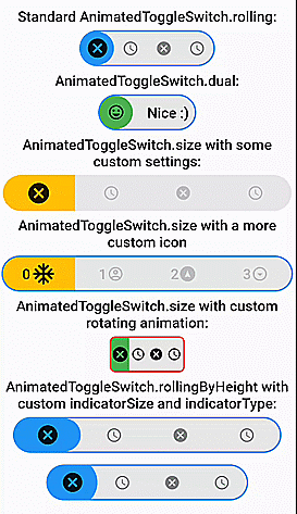
Fully customizable, draggable and animated switch with multiple choices and smooth loading animation. It has prebuilt constructors for rolling and size animations, but it also allows you to create your own switches with CustomAnimatedToggleSwitch.
LTR and RTL are both supported.
Switches without an (initial) selection and vertical switches are also possible.
Most builder arguments of AnimatedToggleSwitch have standard and a custom version. This ensures that you can get started easily and still customize a lot if necessary. There are several options for styling it.
For a slider with a similar look you can check out action_slider.

AnimatedToggleSwitch.dual()

Switch inspired by lite_rolling_switch (made with AnimatedToggleSwitch.dual())
Switch inspired by toggle_switch (made with AnimatedToggleSwitch.size())
Switch inspired by crazy-switch (made with CustomAnimatedToggleSwitch())
Switch inspired by load_switch (made with CustomAnimatedToggleSwitch())
AnimatedToggleSwitch.rolling()


You can build any other switch with CustomAnimatedToggleSwitch()

AnimatedToggleSwitch.size()
AnimatedToggleSwitch.size() with custom rolling animation

AnimatedToggleSwitch.rolling() with custom indicatorSize, borderRadius and indicatorBorderRadius


Easy to use and highly customizable.
AnimatedToggleSwitch<int>.rolling(
  current: value,
  values: [0, 1, 2, 3],
  onChanged: (i) => setState(() => value = i),
  iconBuilder: iconBuilder,
  // iconList: [...], you can use iconBuilder, customIconBuilder or iconList
  style: ToggleStyle(...), // optional style settings
  ... // many more parameters available
)
style, styleBuilder, customStyleBuilder and styleList can be used to style an AnimatedToggleSwitch.
For the general look of the switch, you can use style.
For parameters that should change with the selection, you can use styleBuilder or styleList.
If you need additional parameters, you can use customStyleBuilder.
AnimatedToggleSwitch<int>.rolling(
  ...
  style: ToggleStyle(backgroundColor: Colors.red), // backgroundColor is set independently of the current selection
  styleBuilder: (value) => ToggleStyle(indicatorColor: value.isEven ? Colors.yellow : Colors.green)), // indicatorColor changes and animates its value with the selection
  ...
)
You can also add ToggleStyle to ThemeData.
This overwrites the default ToggleStyle values in all AnimatedToggleSwitch widgets in your MaterialApp.
MaterialApp(
  theme: ThemeData(..., extensions: [ToggleStyle(...)]),
  ...
)
After that, you can access this ToggleStyle anywhere in your MaterialApp:
import 'package:animated_toggle_switch/animated_toggle_switch.dart';
...

Theme.of(context).toggleStyle

To use the loading animation, you simply have to return a Future in onChanged or onTap.
You can alternatively control the loading manually with the loading parameter.
Hence, to disable the loading animation, loading: false must be set.
AnimatedToggleSwitch<int>.rolling(
  current: value,
  values: [0, 1, 2, 3],
  onChanged: (i) async {
    setState(() => value = i);
    await Future.delayed(Duration(seconds: 3));
  },
  loading: false, // for deactivating loading animation
  iconBuilder: iconBuilder,
  ... // many more parameters available
)
To use this feature, you simply have to set allowUnlistedValues to true.
AnimatedToggleSwitch<int?>.rolling(
   allowUnlistedValues: true,
   current: nullableValue, // no selection if nullableValue is not contained in values
   values: const [0, 1, 2, 3],
   onChanged: (i) => setState(() => nullableValue = i),
   iconBuilder: iconBuilder,
   indicatorAppearingBuilder: ..., // appearing animation is fully customizable (optional)
)
You can get a vertical version of any switch by calling vertical() on it.
AnimatedToggleSwitch<int>.rolling(...).vertical()
CustomAnimatedToggleSwitchCustomAnimatedToggleSwitch<int>(
current: value,
values: [0, 1, 2, 3],
wrapperBuilder: ..., // the builder for the wrapper around the whole switch
iconBuilder: ..., // the builder for the icons
foregroundIndicatorBuilder: ..., // a builder for an indicator in front of the icons
backgroundIndicatorBuilder: ..., // a builder for an indicator behind the icons
... // many more parameters available
)
AnimatedToggleSwitch.size with some settingsAnimatedToggleSwitch<int>.size(
textDirection: TextDirection.rtl,
current: value,
values: const [0, 1, 2, 3],
iconOpacity: 0.2,
indicatorSize: const Size.fromWidth(100),
iconBuilder: iconBuilder,
borderWidth: 4.0,
iconAnimationType: AnimationType.onHover,
style: ToggleStyle(
borderColor: Colors.transparent,
borderRadius: BorderRadius.circular(10.0),
boxShadow: [
BoxShadow(
color: Colors.black26,
spreadRadius: 1,
blurRadius: 2,
offset: Offset(0, 1.5),
),
],
),
styleBuilder: (i) => ToggleStyle(indicatorColor: colorBuilder(i)),
onChanged: (i) => setState(() => value = i),
)
foregroundIndicatorIconBuilder)
AnimatedToggleSwitch<int>.size(
  current: value,
  values: const [0, 1, 2, 3],
  iconOpacity: 1.0,
  selectedIconScale: 1.0,
  indicatorSize: const Size.fromWidth(25),
  foregroundIndicatorIconBuilder: (context, global) {
    double pos = global.position;
    double transitionValue = pos - pos.floorToDouble();
    return Transform.rotate(
      angle: 2.0 * pi * transitionValue,
      child: Stack(children: [
        Opacity(
          opacity: 1 - transitionValue,
          child: iconBuilder(pos.floor(), global.indicatorSize)),
        Opacity(
          opacity: transitionValue,
          child: iconBuilder(pos.ceil(), global.indicatorSize))
        ]));
  },
  iconBuilder: iconBuilder,
  style: ToggleStyle(
    borderColor: Colors.red,
    borderRadius: BorderRadius.circular(8.0),
    indicatorBorderRadius: BorderRadius.zero,
  ),
  styleBuilder: (i) => ToggleStyle(indicatorColor: i.isEven == true ? Colors.green : Colors.tealAccent),
  onChanged: (i) => setState(() => value = i),
)
依賴清單 5 項
{"sdk":"flutter"}^6.0.0{"sdk":"flutter"}^1.0.4any先依使用情境篩選,再比較專案活躍情況,最後到原始儲存庫確認使用要求。
“A repository is the most basic element of GitHub.”
GitHub Docs — About repositories ↗