
 v0.2.1
photox
用於顯示互動式圖像的全方位解決方案。
7喜歡 56近 30 天下載120Pub 分數
AndroidiOSWebmacOSWindowsLinux
📸 用於顯示互動式圖像的一體化解決方案

^3.2.3^1.17.0{"sdk":"flutter"}^0.15.0{"sdk":"flutter"}^4.0.0以下為英文專案原文快照,最新內容請造訪 GitHub。
An all-in-one solution for displaying interactive images
https://user-images.githubusercontent.com/70937274/216778063-619e86a5-a512-4cf0-af08-6bc35eb75bf6.gif https://user-images.githubusercontent.com/70937274/216778074-3660e543-92a7-48b8-a8c7-65d181eb609e.gif
Add photox as a dependency in your pubspec.yaml file
flutter pub add photox
Import PhotoX:
import 'package:photox/photox.dart';
@override
Widget build(BuildContext context) {
  return Container(
    height: 400,
    width: 400,
    child: PhotoX(
      items: [
        PhotoXItem(
          id: "1", resource: "assets/img1.jpg", isAsset: true),
        PhotoXItem(
          id: "2", resource: "assets/img2.jpeg", isAsset: true),
      ]
    )
  );
}
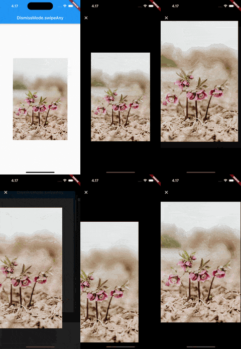
DismissMode.swipeAny |
DismissMode.swipeVertical |
|---|---|
| https://user-images.githubusercontent.com/70937274/218322920-97a5040f-40ad-4052-9ef0-7ee4a176efe3.gif | https://user-images.githubusercontent.com/70937274/218322933-cac41507-6faa-4608-a2d0-1e640f1a562a.gif |
⚠️ DismissMode.swipeAny can only be used when provided with a single PhotoXItem
Whether to show the page indicator in the thumbnail gallery for multiple PhotoXItems
The alignment of the page indicator relative to the gallery
The color of the active bubble in the page indicator
The color of the inactive bubbles in the page indicator
The background color of the page indicator
The radius of the indicator bubbles in the page indicator
The padding between the bubbles in the page indicator
The TextStyle for the AppBar title in the fullscreen gallery
A custom widget to use as the leading widget in the fullscreen gallery AppBar