
 v0.0.6
calendar_appbar
用於自訂 AppBar 的 Flutter 套件,帶有完整的日曆檢視與許多新功能!
241喜歡 53近 30 天下載140Pub 分數
AndroidiOSWebmacOSWindowsLinux
帶有日曆的自定義 AppBar 小部件的 Flutter 套件

{"sdk":"flutter"}^0.17.0{"sdk":"flutter"}以下為英文專案原文快照,最新內容請造訪 GitHub。
Flutter package for custom AppBar with calendar view.
The package is currently optimized for mobile devices, therefore used only for mobile devices is prefered. It also works for larger screens, although it does not follow the rules of good UI. It is planned to be optimized shortly.
| Image | Image | Image |
|---|
Add to pubspec.yaml:
dependencies:
  calendar_appbar: ^0.0.6
Then import it to your project:
import 'package:calendar_appbar/calendar_appbar.dart';
Finaly add CalendarAppBar in Scaffold:
@override
Widget build(BuildContext context) {
  return Scaffold(
      appBar: CalendarAppBar(
        onDateChanged: (value) => print(value),
        firstDate: DateTime.now().subtract(Duration(days: 140)),
        lastDate: DateTime.now(),
      ),
    );
}
There are three required attributes of class CalendarAppBar. Attribute onDateChange is a function, which defines what happens when the user selects a date. firstDate attribute defines the first date, which will be available for selection. The date saved in lastDate attribute is the last date available for selection. At first initialization of the object, the date provided as lastDate will be selected, but will not be returned with onDateChange function.
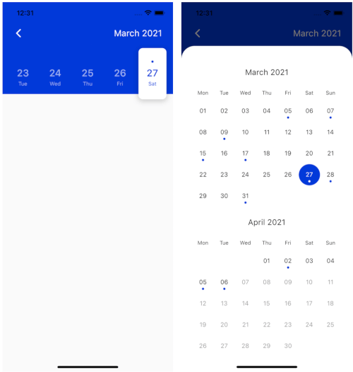
This package enables the usage of a full-screen calendar view. It is displayed when the user presses on month and year text in the top right corner of the AppBar. It comes in two different versions. If the first and last date are part of the same month the full-screen calendar will be displayed as seen on the third image at the top of this file. In the other way, it will be displayed as seen in the second image. It is possible to disable the full-screen view (which is enabled by default) by adding the following code:
fullCalendar: false,
You can define your custom color scheme by defining white, black and accent color. Those three colors are set to Colors.white, Colors.black87 and Color(0xFF0039D9) by default. It is possible to customize those three colors as shown below.
    white: Colors.white,
    black: Colors.black,
    accent: Colors.blue,
The design is currently optimized for light mode and therefore also suggested to be used in that way to achieve better UX. Dark mode will be added soon.
The horizontal padding can be customized (default it is set to 25px) by adding the following code:
padding: 10.0,
It is possible to provide the list of dates of type List<DateTime>, which will be marked on calendar view with a dot.
    events: List.generate(
            10, (index) => DateTime.now().subtract(Duration(days: index * 2))),
The code above will generate the list of 10 dates for every second day from today backwards.
The last attribute of CalendarAppbar is backButton, which is default set to true. Customize that feature by setting this attribute to false.
backButton: false,
The newest feature the CalendarAppbar package is offering is local support for different languages. Use atribute locale to customize the language used for the plugin by adding the language code as shown below. If this atribute is not set, English language will be used.
locale: 'en',
Special thanks goes to all contributors to this package. Make sure to check them out.
Make sure to check out example project. If you find this package useful, star my GitHub repository.
For help getting started with Flutter, view Flutter official documentation online documentation, which offers tutorials, samples, guidance on mobile development, and a full API reference.