Englischer Projektschnappschuss. Aktuelle Inhalte auf GitHub.
Custom Dropdown
A highly customizable, animated dropdown widget for Flutter — with search, network search + infinite scroll, multi-selection, a floating label, configurable open/close animations, and form validation.
If you like this package, please leave a like on pub.dev and star on GitHub.
Features
Lots of properties to use and customize dropdown widget as per your need. Also usable under Form widget for required validation.
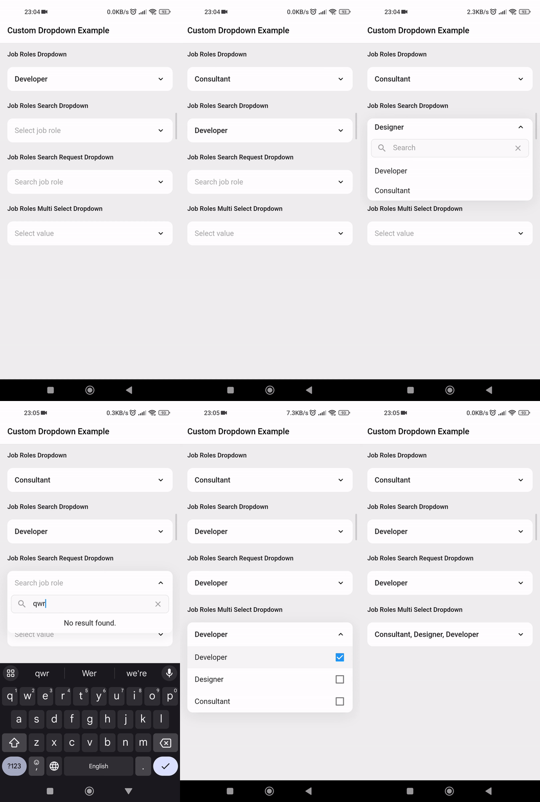
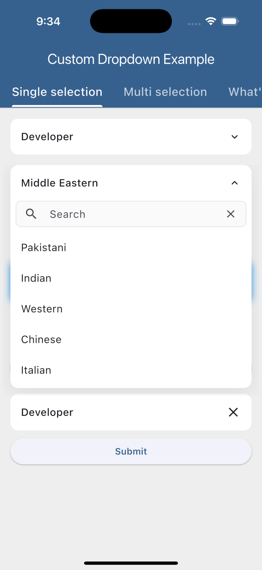
Custom dropdown using constructor CustomDropdown().
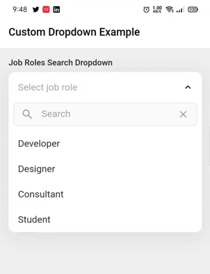
Custom dropdown with search field using named constructor CustomDropdown.search().
Custom dropdown with search request field using named constructor CustomDropdown.searchRequest().
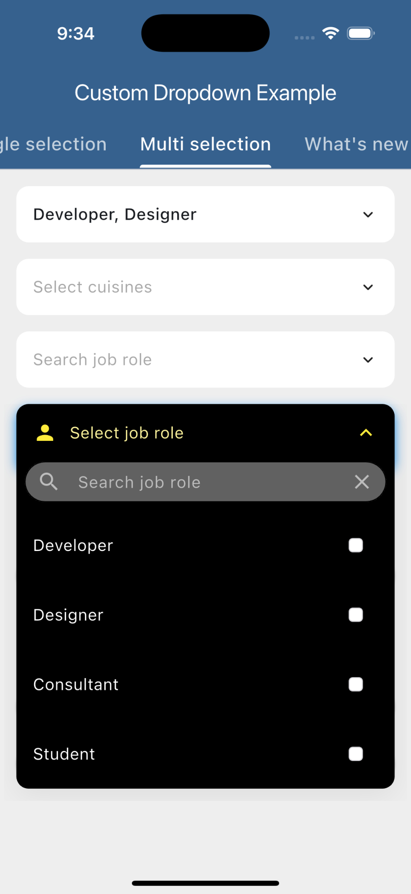
Multi select custom dropdown using named constructor CustomDropdown.multiSelect().
Multi select custom dropdown with search field using named constructor CustomDropdown.multiSelectSearch().
Multi select custom dropdown with search request field using named constructor CustomDropdown.multiSelectSearchRequest().
Configurable open/close overlay animations (animation) with built-in transitions, a custom-transition builder, and an optional staggered list-item entrance.
Infinite scroll / pagination for async search (paginatedRequest).
Material-style floating label (labelText), clear button (canClearSelection), text alignment (textAlign) and forced overlay direction (overlayDirection).
Keyboard-aware overlay positioning, initiallyOpen, autofocusOnSearch, and searchRequestMinChars.
Preview
Getting started
Add the latest version of package to your pubspec.yaml (and run flutter pub get):
dependencies:
  animated_custom_dropdown: 4.0.0
Import the package and use it in your Flutter App.
Whenever you are going to work with custom type model T, your model must override the default toString() method and return the property inside that you want to display as list item otherwise the dropdown list item would show Instance of [model name].
By default the search matches against each item's toString() value, so custom model classes are searchable out of the box as long as toString() returns the text you want to match. If the filter on the object is more complex (e.g. matching multiple fields), add the CustomDropdownListFilter mixin to it, which gives you access to the filter(query) method, and by this the items of the list will be filtered.
For the search constructors (CustomDropdown.search(), CustomDropdown.searchRequest() and their multi-select variants), the open overlay automatically stays clear of the on-screen keyboard: it flips above the field when the keyboard would cover it and repositions whenever the keyboard shows or hides. If the field lives inside a scrollable (e.g. a ListView), it is also scrolled back into view so the overlay never disappears.
For this to work the field must be able to move above the keyboard. This is handled automatically when you keep the Scaffold default resizeToAvoidBottomInset: true and either:
place the dropdown inside a scrollable (ListView / SingleChildScrollView), or
use a layout that can reflow (e.g. a Column with a Spacer / MainAxisAlignment.end).
If you set resizeToAvoidBottomInset: false or use a non-reflowable layout, a field pinned to the bottom can't be moved out of the keyboard's area, so part of the overlay may remain covered.
Customization
For a complete customization of the package, go to the example.
Contributors
Issues & Feedback
Please file an issue to send feedback or report a bug. PRs are always welcome. Thank you!








 v4.0.0