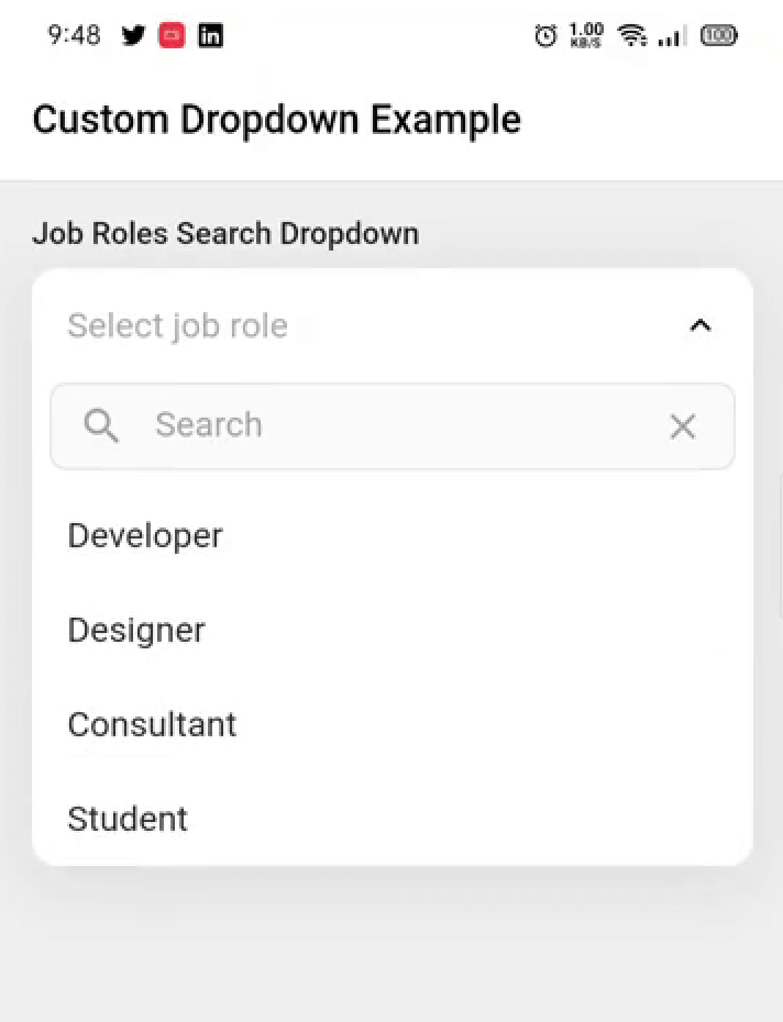
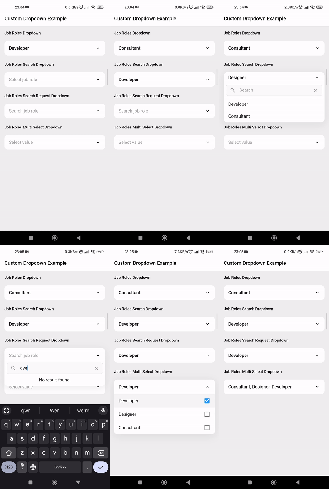
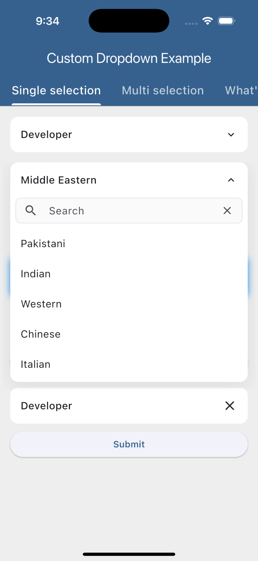
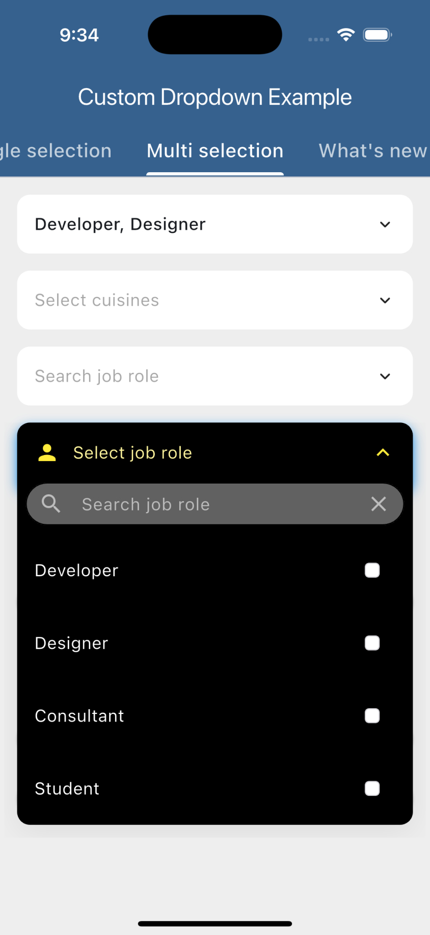
Das benutzerdefinierte Dropdown-Widget ermöglicht es Ihnen, ein hochgradig anpassbares Dropdown-Widget in Ihre Projekte einzufügen. Zu den Funktionen gehören Suche in Listen-Daten, Netzwerk-Suche, Mehrfachauswahl und vieles mehr.
Aus öffentlichen Paketdaten erstellte Orientierung.
Animated Custom Dropdown ist ein hochgradig anpassbarer Flutter-Widget, der Entwicklern ermöglicht, anspruchsvolle Dropdowns mit Funktionen wie durchsuchbare Listen, netzwerkbasierte Suche und Mehrfachauswahl zu erstellen. Es unterstützt mehrere Plattformen wie Android, iOS, Web, macOS, Windows und Linux. Das Paket verbessert die Benutzererfahrung durch flüssige Animationen und flexible Anpassungsmöglichkeiten für Design und Verhalten. Ideal für Formulare und Daten-Auswahloberflächen, die erweiterte Dropdown-Funktionen erfordern.
Anwendungsfälle
Formulareingaben mit dynamischen Optionen
Mehrfachauswahl-Menüs
netzwerkgestützte Autovervollständigung
Benutzerdefinierte Benutzeroberfläche für Auswahlmenüs
Dynamische Filterung großer Datensätze
Hauptmerkmale
Suchbare Dropdown-Liste
Netzwerk-Suchintegration
Mehrfachauswahl-Unterstützung
Glatte Animationen
Hochgradig anpassbare Erscheinung
Plattformübergreifende Kompatibilität
Geeignet für
Entwickler, die komplexe Formulare erstellen
Apps, die eine dynamische Datenauswahl benötigen
Projekte, die benutzerdefinierte Dropdown-Designs erfordern
Teams, die wiederverwendbare UI-Komponenten wollen
Anwendungen mit großen oder entfernten Datenquellen
Hinweise
Erfordert sorgfältige Zustandsverwaltung für Netzwerksuche
Kann zusätzliche Stilisierung erfordern, um ein konsistentes Aussehen zu gewährleisten
Leistungseinbußen bei sehr großen Datensätzen
Beschränkte Dokumentation über die grundlegende Verwendung hinaus
Nicht für extrem hohe Aktualisierungsintervalle optimiert
Original-README
Originaler README-Schnappschuss aus dem verknüpften Quell-Repository. Aktuelle Inhalte finden Sie im Repository.
Custom Dropdown
A highly customizable, animated dropdown widget for Flutter — with search, network search + infinite scroll, multi-selection, a floating label, configurable open/close animations, and form validation.
If you like this package, please leave a like on pub.dev and star on GitHub.
Features
Lots of properties to use and customize dropdown widget as per your need. Also usable under Form widget for required validation.
Custom dropdown using constructor CustomDropdown().
Custom dropdown with search field using named constructor CustomDropdown.search().
Custom dropdown with search request field using named constructor CustomDropdown.searchRequest().
Multi select custom dropdown using named constructor CustomDropdown.multiSelect().
Multi select custom dropdown with search field using named constructor CustomDropdown.multiSelectSearch().
Multi select custom dropdown with search request field using named constructor CustomDropdown.multiSelectSearchRequest().
Configurable open/close overlay animations (animation) with built-in transitions, a custom-transition builder, and an optional staggered list-item entrance.
Infinite scroll / pagination for async search (paginatedRequest).
Material-style floating label (labelText), clear button (canClearSelection), text alignment (textAlign) and forced overlay direction (overlayDirection).
Keyboard-aware overlay positioning, initiallyOpen, autofocusOnSearch, and searchRequestMinChars.
Preview
Getting started
Add the latest version of package to your pubspec.yaml (and run flutter pub get):
dependencies:
  animated_custom_dropdown: 4.0.0
Import the package and use it in your Flutter App.
Whenever you are going to work with custom type model T, your model must override the default toString() method and return the property inside that you want to display as list item otherwise the dropdown list item would show Instance of [model name].
By default the search matches against each item's toString() value, so custom model classes are searchable out of the box as long as toString() returns the text you want to match. If the filter on the object is more complex (e.g. matching multiple fields), add the CustomDropdownListFilter mixin to it, which gives you access to the filter(query) method, and by this the items of the list will be filtered.
For the search constructors (CustomDropdown.search(), CustomDropdown.searchRequest() and their multi-select variants), the open overlay automatically stays clear of the on-screen keyboard: it flips above the field when the keyboard would cover it and repositions whenever the keyboard shows or hides. If the field lives inside a scrollable (e.g. a ListView), it is also scrolled back into view so the overlay never disappears.
For this to work the field must be able to move above the keyboard. This is handled automatically when you keep the Scaffold default resizeToAvoidBottomInset: true and either:
place the dropdown inside a scrollable (ListView / SingleChildScrollView), or
use a layout that can reflow (e.g. a Column with a Spacer / MainAxisAlignment.end).
If you set resizeToAvoidBottomInset: false or use a non-reflowable layout, a field pinned to the bottom can't be moved out of the keyboard's area, so part of the overlay may remain covered.
Customization
For a complete customization of the package, go to the example.
Contributors
Issues & Feedback
Please file an issue to send feedback or report a bug. PRs are always welcome. Thank you!