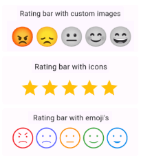
Customizable rating bars with emojis, icons, custom images with half/full rating and dynamic feedback alerts.
https://raw.githubusercontent.com/DevCodeSpace/rating_and_feedback_collector/main/assets/banner1.png
Features
- Custom icon rating
- Smiley emojis rating
- Custom image rating
- Feedback alert box for low ratings
- Redirect to store for high ratings
- Customizable UI & contents
- Submission callback
Getting started
Add dependency to your pubspec.yaml file & run Pub get
dependencies:
  rating_and_feedback_collector: ^0.0.4
And import package into your class file
import 'package:rating_and_feedback_collector/rating_and_feedback_collector.dart';
Usage
double _rating = 0.0;
- Rating Bar with Icons (with full & half rating option)
  RatingBar(
    iconSize: 40, // Size of the rating icons
    allowHalfRating: true, // Allows selection of half ratings
    filledIcon: Icons.star, // Icon to display for a filled rating unit
    halfFilledIcon: Icons.star_half, // Icon to display for a half-filled rating unit
    emptyIcon: Icons.star_border, // Icon to display for an empty rating units
    filledColor: Colors.amber, // Color of filled rating units
    emptyColor: Colors.grey, // Color of empty rating units
    currentRating: _rating, // Set initial rating value
    onRatingChanged: (rating) { // Callback triggered when the rating is changed
      setState(() { _rating = rating; });
    },
  ),
- Rating bar default emoji images
  RatingBarEmoji(
    imageSize: 45, // Size of image in the rating bar.
    currentRating: _rating, // Set initial rating value
    onRatingChanged: (rating) { // Callback triggered when the rating is changed
      setState(() { _rating = rating;  });
    },
  ),
- Rating Bar with Custom Image
  RatingBarCustomImage(
    imageSize: 45, // Size of image in the rating bar.
    currentRating: _rating, // Set initial rating value
    activeImages: const [
                      AssetImage('assets/Images/ic_angry.png'),
                      AssetImage('assets/Images/ic_sad.png'),
                      AssetImage('assets/Images/ic_neutral.png'),
                      AssetImage('assets/Images/ic_happy.png'),
                      AssetImage('assets/Images/ic_excellent.png'),  ],
    deActiveImages: const [
                        AssetImage('assets/Images/ic_angryDisable.png'),
                        AssetImage('assets/Images/ic_sadDisable.png'),
                        AssetImage('assets/Images/ic_neutralDisable.png'),
                        AssetImage('assets/Images/ic_happyDisable.png'),
                        AssetImage('assets/Images/ic_excellentDisable.png'),  ],
    onRatingChanged: (rating) { // Callback triggered when the rating is changed
      setState(() { _rating = rating; });
    },
  ),
Properties
| Property |
Types |
Description |
| currentRating |
double |
set initial rating value |
| filledIcon (only for RatingBar) |
IconData? |
Icon to display for a filled rating unit |
| halfFilledIcon (only for RatingBar) |
IconData? |
Icon to display for a half-filled rating unit. |
| emptyIcon (only for RatingBar) |
IconData? |
Icon to display for an empty rating units. |
| filledColor (only for RatingBar) |
Color? |
Color of filled rating units. |
| emptyColor (only for RatingBar) |
Color? |
Color of empty rating units. |
| iconSize |
double? |
Size of the rating icons. |
| onRatingChanged |
return double |
Callback triggered when the rating is changed. |
| allowHalfRating (only for RatingBar) |
bool? |
Allows selection of half ratings. |
| isGoogleFont |
bool? |
set it true if you want to use google fonts else false |
| fontFamilyName |
String? |
set your custom font family name or google font family name |
| feedbackUIType |
FeedbackUIType? |
want to show feedback box in alert view or in bottom sheet |
| showFeedbackForRatingsLessThan |
double? |
Threshold rating value below which feedback box is shown. |
| feedbackBoxTitle |
String? |
Title for the feedback box |
| lowRatingFeedbackTitle |
String? |
Title for feedback options in the low rating feedback box. |
| lowRatingFeedback |
List<String>? |
List of feedback strings for low ratings. |
| showDescriptionInput |
bool? |
Option to show input box for user descriptions in the feedback dialog. |
| descriptionTitle |
String? |
Title for the description input box in the feedback dialog. |
| descriptionPlaceHolder |
String? |
Placeholder text for the description input box. |
| descriptionCharacterLimit |
int? |
Character limit for the description input. |
| submitButtonTitle |
String? |
Title for the submit button in the feedback dialog. |
| onSubmitTap |
returns selectedFeedback(with index & text) & description |
Callback function triggered on submission of feedback. |
| showRedirectToStoreForRatingsGreaterThan |
double? |
Threshold rating value above which the app redirects to the store for a review. |
| androidPackageName |
String? |
Android package name for the app, used in the store redirect. |
| iosBundleId |
String? |
iOS bundle ID for the app, used in the store redirect. |
| innerWidgetsBorderRadius |
double? |
Border radius for the feedback dialog widgets. |
| alertDialogBorderRadius |
double? |
Border radius for the feedback dialog. |
Code Contributors
Rating And Feedback Collector contributors
Made with ❤️ by the DevCodeSpace


 v0.0.3