Aus öffentlichen Paketdaten erstellte Orientierung.
Ein anpassbares Flutter-Paket zur Erfassung von Benutzerbewertungen und Feedback mit Unterstützung für Emojis, Symbole und benutzerdefinierte Bilder. Es ermöglicht Halb- und Vollbewertungen, dynamische Feedback-Warnungen und eine responsive Gestaltung über alle Plattformen hinweg. Ideal für Apps, die durch visuelle Feedback-Mechanismen eine intuitive Nutzerinteraktion fördern möchten. Das Paket ist einfach zu integrieren und unterstützt mehrere Plattformen wie Mobile, Web und Desktop. Entwickler können Aussehen und Verhalten an die Markenidentität und UX-Anforderungen der App anpassen.
Anwendungsfälle
Verbesserung der Benutzererfahrung
App-Store-Bewertungserfassung
Kundenzufriedenheitsumfragen
In-App-Fehlerberichte
Produktmerkmalebewertung
Echtzeit-Benachrichtigungen für Feedback
Hauptmerkmale
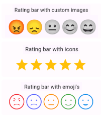
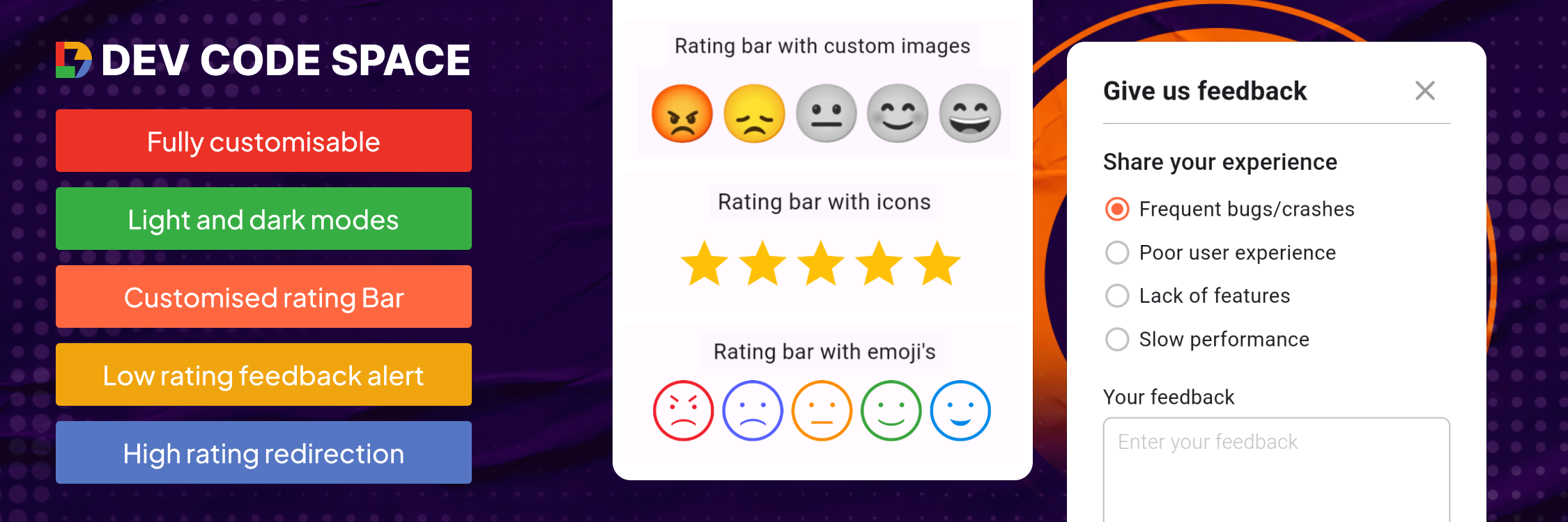
Emoji-basierte Bewertungsindikatoren
Benutzerdefinierte Bild- und Symbolunterstützung
Halb-Stern-Genauigkeit
Dynamisches Feedback-Alarm-System
Plattformübergreifende Kompatibilität
Konfigurierbare Benutzeroberflächenthemen
Geeignet für
Mobile und Web-Anwendungen
UX-Forschungstools
Feedback-getriebene Produktentwicklung
Integration von Kundenservice
Interaktive Umfragekomponenten
Hinweise
Benötigt Anpassung für Markenorientierung
Möglicherweise sind zusätzliche Stile für komplexe Layouts erforderlich
Beschränkt auf bewertungsbezogene Interaktionen
Abhängig von der plattformspezifischen Rendering-Konsistenz
Am besten geeignet für Apps mit häufiger Benutzerinteraktion
Original-README
Originaler README-Schnappschuss aus dem verknüpften Quell-Repository. Aktuelle Inhalte finden Sie im Repository.
Customizable rating bars with emojis, icons, custom images with half/full rating and dynamic feedback alerts.
Features
Custom icon rating
Smiley emojis rating
Custom image rating
Feedback alert box for low ratings
Redirect to store for high ratings
Customizable UI & contents
Submission callback
Getting started
Add dependency to your pubspec.yaml file & run Pub get
Rating Bar with Icons (with full & half rating option)
RatingBar(
iconSize: 40, // Size of the rating icons
allowHalfRating: true, // Allows selection of half ratings
filledIcon: Icons.star, // Icon to display for a filled rating unit
halfFilledIcon: Icons.star_half, // Icon to display for a half-filled rating unit
emptyIcon: Icons.star_border, // Icon to display for an empty rating units
filledColor: Colors.amber, // Color of filled rating units
emptyColor: Colors.grey, // Color of empty rating units
currentRating: _rating, // Set initial rating value
onRatingChanged: (rating) { // Callback triggered when the rating is changedsetState(() { _rating = rating; });
},
),
Rating bar default emoji images
RatingBarEmoji(
imageSize: 45, // Size of image in the rating bar.
currentRating: _rating, // Set initial rating value
onRatingChanged: (rating) { // Callback triggered when the rating is changedsetState(() { _rating = rating; });
},
),
Rating Bar with Custom Image
RatingBarCustomImage(
imageSize: 45, // Size of image in the rating bar.
currentRating: _rating, // Set initial rating value
activeImages: const [
AssetImage('assets/Images/ic_angry.png'),
AssetImage('assets/Images/ic_sad.png'),
AssetImage('assets/Images/ic_neutral.png'),
AssetImage('assets/Images/ic_happy.png'),
AssetImage('assets/Images/ic_excellent.png'), ],
deActiveImages: const [
AssetImage('assets/Images/ic_angryDisable.png'),
AssetImage('assets/Images/ic_sadDisable.png'),
AssetImage('assets/Images/ic_neutralDisable.png'),
AssetImage('assets/Images/ic_happyDisable.png'),
AssetImage('assets/Images/ic_excellentDisable.png'), ],
onRatingChanged: (rating) { // Callback triggered when the rating is changedsetState(() { _rating = rating; });
},
),
Properties
Property
Types
Description
currentRating
double
set initial rating value
filledIcon (only for RatingBar)
IconData?
Icon to display for a filled rating unit
halfFilledIcon (only for RatingBar)
IconData?
Icon to display for a half-filled rating unit.
emptyIcon (only for RatingBar)
IconData?
Icon to display for an empty rating units.
filledColor (only for RatingBar)
Color?
Color of filled rating units.
emptyColor (only for RatingBar)
Color?
Color of empty rating units.
iconSize
double?
Size of the rating icons.
onRatingChanged
return double
Callback triggered when the rating is changed.
allowHalfRating (only for RatingBar)
bool?
Allows selection of half ratings.
isGoogleFont
bool?
set it true if you want to use google fonts else false
fontFamilyName
String?
set your custom font family name or google font family name
feedbackUIType
FeedbackUIType?
want to show feedback box in alert view or in bottom sheet
showFeedbackForRatingsLessThan
double?
Threshold rating value below which feedback box is shown.
feedbackBoxTitle
String?
Title for the feedback box
lowRatingFeedbackTitle
String?
Title for feedback options in the low rating feedback box.
lowRatingFeedback
List<String>?
List of feedback strings for low ratings.
showDescriptionInput
bool?
Option to show input box for user descriptions in the feedback dialog.
descriptionTitle
String?
Title for the description input box in the feedback dialog.
descriptionPlaceHolder
String?
Placeholder text for the description input box.
descriptionCharacterLimit
int?
Character limit for the description input.
submitButtonTitle
String?
Title for the submit button in the feedback dialog.
onSubmitTap
returns selectedFeedback(with index & text) & description
Callback function triggered on submission of feedback.
showRedirectToStoreForRatingsGreaterThan
double?
Threshold rating value above which the app redirects to the store for a review.
androidPackageName
String?
Android package name for the app, used in the store redirect.
iosBundleId
String?
iOS bundle ID for the app, used in the store redirect.