custom_date_range_picker
custom_date_range_picker
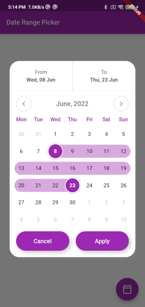
https://raw.githubusercontent.com/El-Mazouzi/custom_date_range_picker/master/screenshot.jpg
Usage
...
  floatingActionButton: FloatingActionButton(
        onPressed: () {
          showCustomDateRangePicker(
            context,
            dismissible: true,
            minimumDate: DateTime.now().subtract(const Duration(days: 30)),
            maximumDate: DateTime.now().add(const Duration(days: 30)),
            endDate: endDate,
            startDate: startDate,
            backgroundColor: Colors.white,
            primaryColor: Colors.green,
            onApplyClick: (start, end) {
              setState(() {
                endDate = end;
                startDate = start;
              });
            },
            onCancelClick: () {
              setState(() {
                endDate = null;
                startDate = null;
              });
            },
          );
        },
        tooltip: 'choose date Range',
        child: const Icon(Icons.calendar_today_outlined, color: Colors.white),
      ),
Function: showCustomDateRangePicker
This function displays a custom date range picker dialog box.
Parameters
context (required): The context in which to show the dialog.dismissible (required): A boolean value indicating whether the dialog can be dismissed by tapping outside of it.minimumDate (required): A DateTime object representing the minimum allowable date that can be selected in the date range picker.maximumDate (required): A DateTime object representing the maximum allowable date that can be selected in the date range picker.startDate (optional): A nullable DateTime object representing the initial start date of the date range selection.endDate (optional): A nullable DateTime object representing the initial end date of the date range selection.onApplyClick (required): A function that takes two DateTime parameters representing the selected start and end dates, respectively, and is called when the user taps the "Apply" button.onCancelClick (required): A function that is called when the user taps the "Cancel" button.backgroundColor (required): The background color of the dialog.primaryColor (required): The primary color of the dialog.fontFamily (optional): The font family to use for the text in the dialog.
Usage
Inside the function, a FocusNode is requested to take focus away from any input field that might be in focus. A showDialog function is then called to show the CustomDateRangePicker dialog box. The CustomDateRangePicker widget is built with the parameters passed to showCustomDateRangePicker, and then passed as the builder parameter of the showDialog function.
When the user interacts with the CustomDateRangePicker dialog box, the onApplyClick and onCancelClick functions are called accordingly.
Many Thanks to the creator of this Repo https://github.com/mitesh77/Best-Flutter-UI-Templates
Getting Started
For help getting started with Flutter, view our online documentation.
For help on editing package code, view the documentation.


 v1.2.0