
Pakete, Repositories und App-Kategorien suchen

Cover von custom_date_range_picker
Paketdetailsv1.2.0

custom_date_range_picker

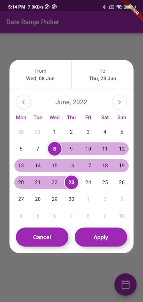
Ein Flutter-Paket für Android und iOS, das einen anpassbaren Datumsbereichsauswähler mit ansprechender Benutzeroberfläche und fließenden Animationen bereitstellt.

AndroidiOSWebmacOSWindowsLinux
30-Tage-Downloads
5480
Likes
85
Pub-Punkte
160

Paket installieren

flutter pub add custom_date_range_picker

Paketübersicht

Aus öffentlichen Paketdaten erstellte Orientierung.

Ein Flutter-Paket, das eine hochgradig anpassbare Datumsbereichsauswahl für Android, iOS, Web, macOS, Windows und Linux bietet. Es verfügt über eine elegante Benutzeroberfläche mit fließenden Animationen, sodass Entwickler das Erscheinungsbild und Verhalten des Pickers an das Design ihrer App anpassen können. Die Auswahl unterstützt intuitive Datumsauswahl mit visueller Rückmeldung und ist ideal für Buchungssysteme, Terminplanungs-Apps und Datenfilter-Schnittstellen. Aufgrund der Fokussierung auf plattformübergreifende Kompatibilität sorgt es für eine konsistente Benutzererfahrung über alle Geräte hinweg.

Anwendungsfälle

  • Buchungs- und Reservierungssysteme
  • Datenfilterung nach Datumsbereich
  • Event-Scheduling-Apps
  • Reiseplanungstools
  • Benutzerdefinierte Kalenderintegrationen

Hauptmerkmale

  • Plattformübergreifende Unterstützung
  • Glatte Animationen
  • Hochgradig anpassbare Benutzeroberfläche
  • Intuitive Datumsauswahl
  • Visuelle Rückmeldung für ausgewählte Bereiche

Geeignet für

  • Entwickler, die Reise- oder Buchungs-Apps erstellen
  • Teams, die konsistente Datumsauswahlfelder über Plattformen hinweg benötigen
  • Apps, die benutzerdefinierte Kalenderdesigns erfordern
  • Projekte, die sich auf Benutzererfahrung und Ästhetik konzentrieren

Hinweise

  • Erfordert die Integration mit bestehender Datumsverarbeitungslogik
  • Könnte zusätzliche Styling für komplexe Themen benötigen
  • Beschränkt auf Datumsbereichsauswahl (kein Zeitkomponente)
  • Abhängig von der Flutter SDK-Version-Kompatibilität
Original-README

Originaler README-Schnappschuss aus dem verknüpften Quell-Repository. Aktuelle Inhalte finden Sie im Repository.

custom_date_range_picker

custom_date_range_picker

Usage

...
  floatingActionButton: FloatingActionButton(
        onPressed: () {
          showCustomDateRangePicker(
            context,
            dismissible: true,
            minimumDate: DateTime.now().subtract(const Duration(days: 30)),
            maximumDate: DateTime.now().add(const Duration(days: 30)),
            endDate: endDate,
            startDate: startDate,
            backgroundColor: Colors.white,
            primaryColor: Colors.green,
            onApplyClick: (start, end) {
              setState(() {
                endDate = end;
                startDate = start;
              });
            },
            onCancelClick: () {
              setState(() {
                endDate = null;
                startDate = null;
              });
            },
          );
        },
        tooltip: 'choose date Range',
        child: const Icon(Icons.calendar_today_outlined, color: Colors.white),
      ),

Function: showCustomDateRangePicker

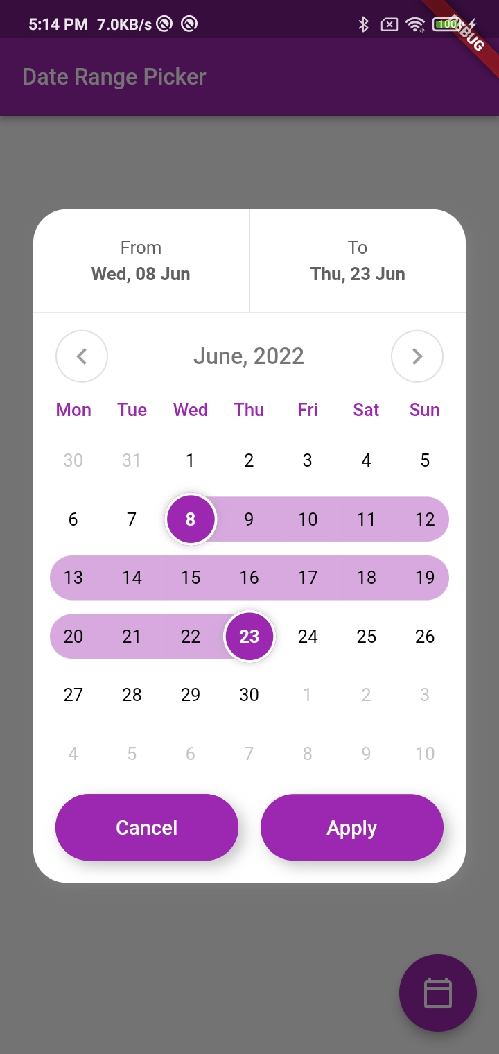
This function displays a custom date range picker dialog box.

Parameters

  • context (required): The context in which to show the dialog.
  • dismissible (required): A boolean value indicating whether the dialog can be dismissed by tapping outside of it.
  • minimumDate (required): A DateTime object representing the minimum allowable date that can be selected in the date range picker.
  • maximumDate (required): A DateTime object representing the maximum allowable date that can be selected in the date range picker.
  • startDate (optional): A nullable DateTime object representing the initial start date of the date range selection.
  • endDate (optional): A nullable DateTime object representing the initial end date of the date range selection.
  • onApplyClick (required): A function that takes two DateTime parameters representing the selected start and end dates, respectively, and is called when the user taps the "Apply" button.
  • onCancelClick (required): A function that is called when the user taps the "Cancel" button.
  • backgroundColor (required): The background color of the dialog.
  • primaryColor (required): The primary color of the dialog.
  • fontFamily (optional): The font family to use for the text in the dialog.

Usage

Inside the function, a FocusNode is requested to take focus away from any input field that might be in focus. A showDialog function is then called to show the CustomDateRangePicker dialog box. The CustomDateRangePicker widget is built with the parameters passed to showCustomDateRangePicker, and then passed as the builder parameter of the showDialog function.

When the user interacts with the CustomDateRangePicker dialog box, the onApplyClick and onCancelClick functions are called accordingly.

Many Thanks to the creator of this Repo https://github.com/mitesh77/Best-Flutter-UI-Templates

Getting Started

For help getting started with Flutter, view our online documentation.

For help on editing package code, view the documentation.

Kategorien

Abhängigkeiten

Abhängigkeiten 1 Einträge

Quell-Repository

Projekte, die dieses Paket verwenden