
 v0.2.0
carousel_custom_slider
Dies ist ein einfaches Slider-Paket, bei dem Sie die Position des Indikators und des Textes darauf platzieren und anpassen können.
29Likes 10630-Tage-Downloads150Pub-Punkte
AndroidiOSWebmacOSWindowsLinux
SwanFlutter/carousel_custom_slider open-source repository details.

{"sdk":"flutter"}^2.0.1^1.1.0{"sdk":"flutter"}^6.0.0Englischer Projektschnappschuss. Aktuelle Inhalte auf GitHub.
Pub Points Popularity Pub Likes GitHub issues GitHub forks
This is a simple slider package, you can put the position of the indicator and text on it and personalize it.
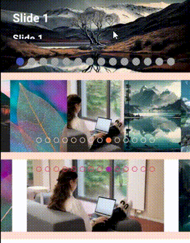
✔️ Ability to zoom with double tab. ✔️ The possibility of choosing several effects for the indicator. ✔️ Display text for title and body and specify its position. ✔️ Select the position of the slider indicator. ✔️ Download images in blur.
A scroll-driven circular gallery inspired by CSS scroll-driven animations. Cards are arranged in a full circle. Scrolling rotates the wheel one step at a time. The focused card is sharp and full-color; others become grayscale, blurred and transparent. Supports light/dark theme automatically.
CarouselCustomSlider.wheelGallery(
  items: [
    WheelGalleryItem(
      src: 'https://picsum.photos/id/634/1200/1200',
      title: 'A Misty Morning',
    ),
    WheelGalleryItem(
      src: 'https://picsum.photos/id/228/1200/1200',
      title: 'Harvest',
    ),
  ],
  cardAspectRatio: 4 / 6,
  maxBlur: 7.0,
  showScrollHint: true,
  onFocusChanged: (i) => print('focused: $i'),
)
A 3D rotating ring carousel. Use Carousel3DType to select the style.
| Type | Description |
|---|---|
Carousel3DType.standard |
Large cards in a fixed container, no shader |
Carousel3DType.alt |
Compact cards with a closer camera |
Carousel3DType.shader |
Large cards with lateral ShaderMask fade at edges |
// Standard
CarouselCustomSlider.carousel3D(
  carousel3DType: Carousel3DType.standard,
  images: myUrls,
  containerWidth: 500,
  containerHeight: 350,
)

// Shader fade
CarouselCustomSlider.carousel3D(
  carousel3DType: Carousel3DType.shader,
  images: myUrls,
)

// Compact
CarouselCustomSlider.carousel3D(
  carousel3DType: Carousel3DType.alt,
  config: CarouselConfig(cardWidth: 200, cardCount: 8),
)
A Cover Flow effect carousel with 3D Y-axis rotation and scale. Cards fan out on either side of the active card, giving a realistic depth feel. Tap a side card to navigate to it.
CarouselCustomSlider.coverflowCarousel(
  items: [
    CoverflowItem(src: 'https://i.pravatar.cc/300?img=1', title: 'urban exploration'),
    CoverflowItem(src: 'https://i.pravatar.cc/300?img=2', title: 'night scene'),
    CoverflowItem(src: 'https://i.pravatar.cc/300?img=3', title: 'yellow wildflowers'),
    CoverflowItem(src: 'https://i.pravatar.cc/300?img=4', title: 'street with mount fuji'),
    CoverflowItem(src: 'https://i.pravatar.cc/300?img=5', title: 'bridgestone bicycle shop'),
    CoverflowItem(src: 'https://i.pravatar.cc/300?img=6', title: 'train window view'),
  ],
  cardWidth: 200,
  cardAspectRatio: 3 / 4,
  rotationDegrees: 55,
  inactiveScale: 0.82,
  overlapFactor: 0.52,
  animationDuration: Duration(milliseconds: 450),
  animationCurve: Curves.easeOutCubic,
  onIndexChanged: (i) => print('active: $i'),
)
20240418_08190020240418_081732
20240419_094517
CarouselCustomSlider(
autoPlay: true,
isVerticalIndicator: false,
dragStartBehavior: DragStartBehavior.down,
scrollDirection: Axis.vertical,
alignmentPositionIndicator: Alignment.bottomCenter,
viewportFraction: 1,
viewportFractionPadingvertical: 0,
sliderList: sliderListImage,

effect: SwapEffect(
dotHeight: 12.0,
dotWidth: 12.0,
paintStyle: PaintingStyle.fill,
 type: SwapType.yRotation,
activeDotColor: Theme.of(context).primaryColor,
dotColor: Theme.of(context).colorScheme.inversePrimary,
childrenStackBuilder: (index) {
    return Text(
      sliderTitlePost[index],
      style: const TextStyle(
       fontSize: 30,
       fontWeight: FontWeight.bold,
      color: Colors.white),
   );
  }
 ),
  ),
https://github.com/user-attachments/assets/87345dfc-7b3d-48e8-8c22-a9a735ca2ebb
https://github.com/user-attachments/assets/3fe1a666-8e7e-40f9-842d-b52dfc23d847
https://github.com/user-attachments/assets/5bcdae52-4cf5-4e0a-a734-5ddc9454ced7
https://github.com/user-attachments/assets/21d3da6a-61fe-4a47-aebd-2bdeb55ba9aa
CarouselCustomSlider(
 animatedBuilderSettings: AnimatedBuilderSettings(
  animatedBuilderType: AnimatedBuilderType.normalScale,
    useAnimatedBuilder: true,
      ),
      backgroundColor: Colors.blueAccent.shade100,
      doubleTapZoom: true,
       clipBehaviorZoom: true,
       autoPlay: true,
          height: 350,
            viewportFraction: 0.25,
          initialPage: 3,
        sliderList: img,
      viewportFractionPaddingHorizontal: 5,
    viewportFractionPaddingVertical: 5,
  autoPlayCurve: Curves.ease,
),
carousel
CarouselCustomSlider.advancedCarouselSlider(
                slides: listSlide,
                height: 90,
                viewportFraction: 0.8,
                childrenStackBuilder: (int index) {
                  return Column(
                    mainAxisAlignment: MainAxisAlignment.end,
                    crossAxisAlignment: CrossAxisAlignment.start,
                    children: [
                      Text(
                        slides[index]['title']!,
                        style: const TextStyle(
                          fontSize: 24,
                          color: Colors.white,
                          fontWeight: FontWeight.bold,
                        ),
                      ),
                      Text(
                        slides[index]['subtitle']!,
                        style: const TextStyle(
                          fontSize: 18,
                          color: Colors.white,
                        ),
                      ),
                      Text(
                        slides[index]['description']!,
                        style: const TextStyle(
                          fontSize: 14,
                          color: Colors.white,
                        ),
                      ),
                    ],
                  );
                },
              ),

  List<Map<String, String>> slides = [
  {
    "image":
        "https://devloop01.github.io/voyage-slider/images/scotland-mountains.jpg",
    "title": "Highlands",
    "subtitle": "Scotland",
    "description": "The mountains are calling"
  },
  {
    "image": "https://devloop01.github.io/voyage-slider/images/machu-pichu.jpg",
    "title": "Machu Pichu",
    "subtitle": "Peru",
    "description": "Adventure is never far away"
  },
  {
    "image": "https://devloop01.github.io/voyage-slider/images/chamonix.jpg",
    "title": "Chamonix",
    "subtitle": "France",
    "description": "Let your dreams come true"
  },
              ];
Reflection baner you can use web, windows, mac, linux.
reflaction_slider
CarouselCustomSlider.reflection(
                  sliderList: listImage,
                  showReflection: true,
                  width: MediaQuery.of(context).size.width,
                  height: MediaQuery.of(context).size.height * 0.3,
                  fit: BoxFit.fill,
                  onTap: () {
                    Navigator.push(
                      context,
                      MaterialPageRoute(
                        builder: (context) => const CardPage(),
                      ),
                    );
                  },
                  children: [
                    IgnorePointer(
                      child: Padding(
                        padding: EdgeInsets.only(
                          left: 25.0,
                          right: 70.0,
                          top: MediaQuery.of(context).size.height * 0.15,
                        ),
                        child: Row(
                          mainAxisAlignment: MainAxisAlignment.end,
                          childrenStackBuilder(int index){
                            Icon(
                              Icons.arrow_forward,
                              color: Theme.of(context).primaryColor,
                              size: 50,
                            ),
                            const SizedBox(width: 10),
                            Text(
                              "View All",
                              style: TextStyle(
                                color: Theme.of(context).primaryColor,
                                fontSize: 35,
                                fontWeight: FontWeight.bold,
                              ),
                            )
                          },
                        ),
                      ),
                    )
                  ],
                ),
20240422_115507
 CarouselCustomSlider.autoScrollingWheel(
        autoPlay: false,
        height: 150,
        backgroundImageUrls: listImage,
        children: children,
      ),
20240512_074358
CarouselCustomSlider.parallax(
          imageUrl: sliderListImage,
          // height: 400,
          showBackgroundImage: true,
          borderRadius: BorderRadius.circular(16.0),
          border: Border.all(color: Colors.white, width: 5.0),
          customCurve: Curves.easeInOutBack,
          shadowColor: Colors.pink,
          horizontalTransform: 250,

          ///You may sometimes get container box error, you need to change [viewportFraction] , [valueScalingFactor] , [horizontalTransform] , [dynamicHeight] value to match with one another,
          /// most of the time the problem is solved by changing these two [viewportFraction] , [valueScalingFactor] .
          valueScalingFactor: 0.4,
          viewportFraction: 0.8,
          dynamicHeight: 600,
          childrenStackBuilder(int index) {
            const Positioned(
              left: 25,
              bottom: 25.0,
              child: Text(
                'Parallax$index',
                style: TextStyle(color: Colors.white, fontSize: 30.0),
              ),
            ),
          },
        ),
identity
CarouselCustomSlider.transformed3DCardlider(
              imageUrl: sliderListImage,
              transformType3d: TransformType3d.identity,
              showBackgroundImage: false,
            ),
identity1
CarouselCustomSlider.transformed3DCardlider(
              imageUrl: sliderListImage,
              transformType3d: TransformType3d.identity1,
              showBackgroundImage: false,
            ),
inverted
CarouselCustomSlider.transformed3DCardlider(
              imageUrl: sliderListImage,
              transformType3d: TransformType3d.inverted,
              showBackgroundImage: false,
            ),
inverted1
CarouselCustomSlider.transformed3DCardlider(
              imageUrl: sliderListImage,
              transformType3d: TransformType3d.inverted1,
              showBackgroundImage: false,
            ),
inverted2
CarouselCustomSlider.transformed3DCardlider(
              imageUrl: sliderListImage,
              transformType3d: TransformType3d.inverted2,
              showBackgroundImage: false,
            ),
inverted3
CarouselCustomSlider.transformed3DCardlider(
              imageUrl: sliderListImage,
              transformType3d: TransformType3d.inverted3,
              showBackgroundImage: false,
            ),
inverted4
CarouselCustomSlider.transformed3DCardlider(
              imageUrl: sliderListImage,
              transformType3d: TransformType3d.inverted4,
              showBackgroundImage: false,
            ),
rotationY
CarouselCustomSlider.transformed3DCardlider(
              imageUrl: sliderListImage,
              transformType3d: TransformType3d.rotationY,
              showBackgroundImage: false,
            ),
rotationX
CarouselCustomSlider.transformed3DCardlider(
              imageUrl: sliderListImage,
              transformType3d: TransformType3d.rotationX,
              showBackgroundImage: false,
),
TransformType skew
 CarouselCustomSlider.transFormedCardSlider(
            transformType: TransformType.skew,
            imageUrl: sliderListImage,
             ///You may sometimes get container box error, you need to change [viewportFraction] , [valueScalingFactor] , [horizontalTransform] , [dynamicHeight] value to match with one another,
          /// most of the time the problem is solved by changing these two [viewportFraction] , [valueScalingFactor] .
            valueScalingFactor: 0.4, //BorderSide.strokeAlignCenter
            viewportFraction: 0.7,
            customCurve: Curves.bounceInOut,
            childrenStackBuilder(int index){
            const Positioned(
              left: 25,
              bottom: 25.0,
              child: Text(
                'TransformType.skew',
                style: TextStyle(color: Colors.white, fontSize: 30.0),
              ),
            ),
          },
          ),
TransformType skew1
CarouselCustomSlider.transFormedCardSlider(
            transformType: TransformType.skew1,
            imageUrl: sliderListImage,
             ///You may sometimes get container box error, you need to change [viewportFraction] , [valueScalingFactor] , [horizontalTransform] , [dynamicHeight] value to match with one another,
          /// most of the time the problem is solved by changing these two [viewportFraction] , [valueScalingFactor] .
            valueScalingFactor: 0.4, //BorderSide.strokeAlignCenter
            viewportFraction: 0.7,
            customCurve: Curves.bounceInOut,
            childrenStackBuilder(int index){
            const Positioned(
              left: 25,
              bottom: 25.0,
              child: Text(
                'TransformType.skew1',
                style: TextStyle(color: Colors.white, fontSize: 30.0),
              ),
            ),
         },
          ),
TransformType skew2
CarouselCustomSlider.transFormedCardSlider(
            transformType: TransformType.skew2,
            imageUrl: sliderListImage,
             ///You may sometimes get container box error, you need to change [viewportFraction] , [valueScalingFactor] , [horizontalTransform] , [dynamicHeight] value to match with one another,
          /// most of the time the problem is solved by changing these two [viewportFraction] , [valueScalingFactor] .
            valueScalingFactor: 0.3, //BorderSide.strokeAlignCenter
            viewportFraction: 0.7,
            customCurve: Curves.bounceInOut,
            childrenStackBuilder(int index){
            const Positioned(
              left: 25,
              bottom: 25.0,
              child: Text(
                'TransformType.skew2',
                style: TextStyle(color: Colors.white, fontSize: 30.0),
              ),
            ),
            },
          ),
TransformType rotation
CarouselCustomSlider.transFormedCardSlider(
            transformType: TransformType.rotation,
            imageUrl: sliderListImage,
             ///You may sometimes get container box error, you need to change [viewportFraction] , [valueScalingFactor] , [horizontalTransform] , [dynamicHeight] value to match with one another,
          /// most of the time the problem is solved by changing these two [viewportFraction] , [valueScalingFactor] .
            valueScalingFactor: 0.3, //BorderSide.strokeAlignCenter
            viewportFraction: 0.7,
            customCurve: Curves.bounceInOut,
            childrenStackBuilder(int index){
            const Positioned(
              left: 25,
              bottom: 25.0,
              child: Text(
                'TransformType.rotation',
                style: TextStyle(color: Colors.white, fontSize: 30.0),
              ),
            ),
          },
          ),
TransformType tryInvert
CarouselCustomSlider.transFormedCardSlider(
            transformType: TransformType.tryInvert,
            imageUrl: sliderListImage,
             ///You may sometimes get container box error, you need to change [viewportFraction] , [valueScalingFactor] , [horizontalTransform] , [dynamicHeight] value to match with one another,
          /// most of the time the problem is solved by changing these two [viewportFraction] , [valueScalingFactor] .
            valueScalingFactor: 0.3, //BorderSide.strokeAlignCenter
            viewportFraction: 0.7,
            customCurve: Curves.bounceInOut,
           childrenStackBuilder(int index){
            const Positioned(
              left: 25,
              bottom: 25.0,
              child: Text(
                'TransformType.tryInvert',
                style: TextStyle(color: Colors.white, fontSize: 30.0),
              ),
            ),
          },
          ),
TransformType diagonal3Values
CarouselCustomSlider.transFormedCardSlider(
            transformType: TransformType.diagonal3Values,
            imageUrl: sliderListImage,
             ///You may sometimes get container box error, you need to change [viewportFraction] , [valueScalingFactor] , [horizontalTransform] , [dynamicHeight] value to match with one another,
          /// most of the time the problem is solved by changing these two [viewportFraction] , [valueScalingFactor] .
            valueScalingFactor: 0.3, //BorderSide.strokeAlignCenter
            viewportFraction: 0.7,
            customCurve: Curves.bounceInOut,
            childrenStackBuilder(int index){
            const Positioned(
              left: 25,
              bottom: 25.0,
              child: Text(
                'TransformType.diagonal3Values',
                style: TextStyle(color: Colors.white, fontSize: 30.0),
              ),
            ),
          },
          ),
dependencies:
  carousel_custom_slider: ^0.2.0
import 'package:carousel_custom_slider/carousel_custom_slider.dart';
You can use these indicators in the effect.
effect : WormEffect(),
effect : JumpingDotEffect(),
effect : ScaleEffect(),
effect : ScrollingDotsEffect(),
effect : SlideEffect(),
effect : ExpandingDotsEffect(),
effect : SwapEffect(),
If you have any issues, questions, or suggestions related to this package, please feel free to contact us at [swan.dev1993@gmail.com](mailto:swan.dev1993@gmail.com). We welcome your feedback and will do our best to address any problems or provide assistance. For more information about this package, you can also visit our GitHub repository where you can find additional resources, contribute to the package's development, and file issues or bug reports. We appreciate your contributions and feedback, and we aim to make this package as useful as possible for our users. Thank you for using our package, and we look forward to hearing from you!