
 v2.1.8
dotted_line_flutter
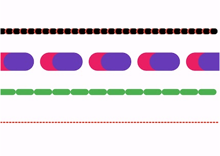
Dieses Paket ermöglicht es Ihnen, gestrichelte Linien mit Flutter zu zeichnen. Sie können eine schöne gestrichelte Linie zeichnen.
16Likes 164030-Tage-Downloads160Pub-Punkte
AndroidiOSWebmacOSWindowsLinux
Flutter Dotted Line ist ein leichtgewichtiges und hochgradig anpassbares Paket zum Zeichnen von Punktlinien, Strichlinien und gemusterten Linien in Flutter-Anwendungen. Es bietet vollständige Kontrolle über Farbe, Abstand, Strichbreite, Verlauf, Ausrichtung und Formen, was es ideal für die Verbesserung von UI-Designs macht.

{"sdk":"flutter"}{"sdk":"flutter"}Englischer Projektschnappschuss. Aktuelle Inhalte auf GitHub.
Logo
A highly customizable Flutter package for drawing dotted, dashed, and gradient lines in both horizontal and vertical directions. It also supports shadow effects and multiple shapes.
✅ Dotted and Dashed Lines
✅ Gradient Color Support
✅ Customizable Dash Width & Gap
✅ Horizontal & Vertical Orientation
✅ Shadow Effect for Depth
✅ More Shapes (Star, Circle, etc.)
✅ Star Shape
✅ Circle Dotted Line
✅ Custom Dash Shapes
✅ Patterned Dashes (Short-Long)
Add this to your pubspec.yaml file:
dependencies:
  dotted_line_flutter: latest_version
Then run:
flutter pub get
DottedLine(
axis: Axis.horizontal,
lineThickness: 2,
dashGap: 4,
dashWidth: 6,
colors: [Colors.red, Colors.blue], // Gradient Support
);
DottedLine(
axis: Axis.vertical,
lineThickness: 3,
dashGap: 5,
colors: [Colors.green], // Single color
);
DottedLine(
axis: Axis.horizontal,
lineThickness: 3,
dashGap: 6,
colors: [Colors.orange, Colors.purple],
shadowColor: Colors.black,
shadowBlurRadius: 10.0,
);
App Screenshot 1
App Screenshot 2
App Screenshot 3
App Screenshot 4
| Parameter | Default | Description |
|---|---|---|
size |
100.0 |
The overall size of the cube. |
dotSize |
4.0 |
The size of each individual dot. |
dotSpacing |
8.0 |
The spacing between dots. |
scaleFactor |
1.0 |
The scale factor to resize the widget. |
angle |
0.0 |
The rotation angle of the cube. |
gradientColors |
[Colors.blue, Colors.purple] |
The gradient colors used for the dots. |
The DottedCube widget can be used without parameters.
import 'package:flutter/material.dart';

DottedCube()
You can also customize it by specifying parameters.
import 'package:flutter/material.dart';

DottedCube(
  size: 120.0,
  dotSize: 5.0,
  dotSpacing: 10.0,
  scaleFactor: 1.2,
  angle: 0.5,
  gradientColors: [Colors.red, Colors.orange],
)
A Flutter widget to create a customizable dotted line with gradient colors, shadow effects, and adjustable spacing.
This widget can be used without parameters for a simple dotted line.
import 'package:dotted_line_flutter/dotted_line.dart';

DottedLine()
You can customize the dotted line by specifying various parameters:
import 'package:dotted_line_flutter/dotted_line.dart';

DottedLine(
  colors: [Colors.blue, Colors.green],
  lineThickness: 2.0,
  dashGap: 6.0,
  dashWidth: 8.0,
  height: 3.0,
  axis: Axis.horizontal,
  shadowColor: Colors.black38,
  shadowBlurRadius: 5.0,
)
| Parameter | Default | Description |
|---|---|---|
colors |
[Colors.purple] |
The gradient colors for the dotted line. |
lineThickness |
2.0 |
The thickness of the line. |
dashGap |
5.0 |
The space between dashes. |
dashWidth |
5.0 |
The width of each dash. |
height |
2.0 |
The height of the dotted line. |
axis |
Axis.horizontal |
The direction of the dotted line (horizontal/vertical). |
shadowColor |
Colors.black54 |
The color of the shadow. |
shadowBlurRadius |
4.0 |
The blur radius of the shadow. |
Here's how you can use DottedLine inside a Column or Row widget:
Column(
  children: [
    Text("Above the line"),
    DottedLine(
      colors: [Colors.red, Colors.orange],
      dashWidth: 6.0,
      dashGap: 4.0,
    ),
    Text("Below the line"),
  ],
)
This will create a colorful dotted line between two text widgets.
DottedStar is a customizable Flutter widget that renders a star shape with a dotted outline using a gradient color effect. It is built using CustomPaint and provides various customization options.
import 'package:flutter/material.dart';
import 'dotted_star.dart';

class MyApp extends StatelessWidget {
  @override
  Widget build(BuildContext context) {
    return MaterialApp(
      home: Scaffold(
        backgroundColor: Colors.black,
        body: Center(
          child: DottedStar(),
        ),
      ),
    );
  }
}
You can customize the DottedStar widget by specifying various parameters.
DottedStar(
  gradientColors: [Colors.purple, Colors.pink],
  size: 80.0,
  points: 6,
  dotSize: 4.0,
  dotSpacing: 6.0,
  scaleFactor: 1.5,
  angle: 0.5, // Rotation in radians
)
| Parameter | Default Value | Description |
|---|---|---|
gradientColors |
[Colors.yellow, Colors.orange] |
List of colors for the gradient effect. |
size |
50.0 |
The size of the star. |
points |
5 |
Number of points in the star. |
dotSize |
3.0 |
The size of each dot in the outline. |
dotSpacing |
5.0 |
The spacing between each dot. |
scaleFactor |
1.0 |
Scaling factor for resizing the star. |
angle |
0.0 |
Rotation angle in radians. |
The DottedStar widget uses a CustomPainter class (StarPainter) to draw the dotted outline of a star. It follows these steps:
_createStarPath.PathMetrics to place dots at equal intervals.The DottedText widget is a custom Flutter widget that renders text using dots instead of solid strokes. It provides customization options for dot size, spacing, colors, and text styling.
CustomPainter for efficient renderingTo use DottedText, simply add the Dart file to your Flutter project and import it.
import 'package:dotted_line_flutter/dotted_line_flutter.dart';
DottedText(
  text: "Hello, World!",
)
DottedText(
  text: "Flutter Dots",
  textStyle: TextStyle(fontSize: 50, fontWeight: FontWeight.bold, color: Colors.black),
  dotSize: 3.0,
  dotSpacing: 4.0,
  colors: [Colors.red, Colors.orange],
)
| Parameter | Default Value | Description |
|---|---|---|
text |
Required | The text to be displayed in dotted style. |
textStyle |
TextStyle(fontSize: 40, fontWeight: FontWeight.bold, color: Colors.black) |
The style of the text. |
dotSize |
2.0 |
The size of each individual dot. |
dotSpacing |
3.0 |
The spacing between dots. |
colors |
[Colors.purple, Colors.blue] |
A list of colors for gradient effect. |
DottedWidget is a Flutter custom widget that allows you to create a widget with a customizable dotted border. It supports different shapes, colors, and shadow effects, making it a versatile component for UI design.
DottedWidget(
            width: 150.0,
            height: 80.0,
            borderRadius: 12.0,
            colors: [Colors.blue, Colors.green],
            lineThickness: 2.0,
            dashWidth: 6.0,
            dashGap: 4.0,
            shadowBlurRadius: 6.0,
            shape: BoxShape.rectangle,
            child: const Text("Dotted Box", style: TextStyle(fontSize: 16)),
          ),
| Property | Type | Default Value | Description |
|---|---|---|---|
child |
Widget? |
null |
Child widget inside the dotted container. |
borderRadius |
double |
10.0 |
Border radius for rectangle shapes. |
colors |
List<Color> |
[Colors.purple] |
Gradient colors for the border. |
lineThickness |
double |
2.0 |
Thickness of the dotted border. |
dashGap |
double |
5.0 |
Gap between each dot in the border. |
dashWidth |
double |
5.0 |
Width of each individual dot. |
axis |
Axis |
Axis.horizontal |
Axis along which dots are drawn. |
shadowColor |
Color |
Colors.black54 |
Color of the shadow effect. |
shadowBlurRadius |
double |
4.0 |
Blur radius of the shadow. |
width |
double |
100.0 |
Width of the dotted widget. |
height |
double |
50.0 |
Height of the dotted widget. |
shape |
BoxShape |
BoxShape.rectangle |
Shape of the dotted widget (rectangle or circle). |
A Flutter widget for rendering various shapes with a dotted outline. This can be used to display creative and visually appealing shapes in your app.
DottedShape(
shapeType: ShapeType.hexagon,
size: 150.0,
dotSize: 5.0,
dotSpacing: 8.0,
dotColor: Colors.blue,
),
| Property | Description | Default Value |
|---|---|---|
shapeType |
The type of shape to render | ShapeType.triangle |
size |
The width and height of the shape | 100.0 |
dotSize |
The size of each individual dot | 4.0 |
dotSpacing |
The spacing between each dot | 6.0 |
dotColor |
The color of the dots | Colors.black |
If you have any feedback, please reach out to me at puneetsharma5525@gmail.com.
I'm a flutter and spring boot java developer .
This package is licensed under the MIT License.