AnimatedToggleSwitch
pub.dev
github
likes
downloads
pub points
license
codecov
buy me a coffee
If you like this package, please like it on pub.dev and star it on GitHub.
Fully customizable, draggable and animated switch with multiple choices and smooth loading animation. It has prebuilt constructors for rolling and size animations, but it also allows you to create your own switches with CustomAnimatedToggleSwitch.
LTR and RTL are both supported.
Switches without an (initial) selection and vertical switches are also possible.
Most builder arguments of AnimatedToggleSwitch have standard and a custom version. This ensures that you can get started easily and still customize a lot if necessary. There are several options for styling it.
For a slider with a similar look you can check out action_slider.
Example Usage
usage
Examples
AnimatedToggleSwitch.dual()
animated_toggle_switch_example_dual
animated_toggle_switch_example_borderradius_builder
animated_toggle_switch_example_gradient
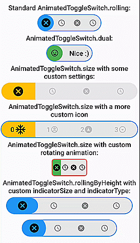
Switch inspired by lite_rolling_switch (made with AnimatedToggleSwitch.dual())
animated_toggle_switch_example_lite_rolling_switch
Switch inspired by toggle_switch (made with AnimatedToggleSwitch.size())
animated_toggle_switch_example_toggle_switch
Switch inspired by crazy-switch (made with CustomAnimatedToggleSwitch())
animated_toggle_switch_example_crazy_switch
Switch inspired by load_switch (made with CustomAnimatedToggleSwitch())
animated_toggle_switch_example_loading_switch
AnimatedToggleSwitch.rolling()
animated_toggle_switch_example_1
animated_toggle_switch_example_2
animated_toggle_switch_example_gradient
animated_toggle_switch_example_borderradius_builder_2
animated_toggle_switch_example_rolling_separator
You can build any other switch with CustomAnimatedToggleSwitch()
animated_toggle_switch_example_custom_1
AnimatedToggleSwitch.size()
animated_toggle_switch_example_size
animated_toggle_switch_example_size_2
AnimatedToggleSwitch.size() with custom rolling animation
animated_toggle_switch_example_6
AnimatedToggleSwitch.rolling() with custom indicatorSize, borderRadius and indicatorBorderRadius
animated_toggle_switch_example_7
animated_toggle_switch_example_8
Easy Usage
Easy to use and highly customizable.
Simple rolling animation
AnimatedToggleSwitch<int>.rolling(
  current: value,
  values: [0, 1, 2, 3],
  onChanged: (i) => setState(() => value = i),
  iconBuilder: iconBuilder,
  // iconList: [...], you can use iconBuilder, customIconBuilder or iconList
  style: ToggleStyle(...), // optional style settings
  ... // many more parameters available
)
Styling
Styling with constructor
style, styleBuilder, customStyleBuilder and styleList can be used to style an AnimatedToggleSwitch.
For the general look of the switch, you can use style.
For parameters that should change with the selection, you can use styleBuilder or styleList.
If you need additional parameters, you can use customStyleBuilder.
AnimatedToggleSwitch<int>.rolling(
  ...
  style: ToggleStyle(backgroundColor: Colors.red), // backgroundColor is set independently of the current selection
  styleBuilder: (value) => ToggleStyle(indicatorColor: value.isEven ? Colors.yellow : Colors.green)), // indicatorColor changes and animates its value with the selection
  ...
)
Styling with Theme
You can also add ToggleStyle to ThemeData.
This overwrites the default ToggleStyle values in all AnimatedToggleSwitch widgets in your MaterialApp.
MaterialApp(
  theme: ThemeData(..., extensions: [ToggleStyle(...)]),
  ...
)
After that, you can access this ToggleStyle anywhere in your MaterialApp:
import 'package:animated_toggle_switch/animated_toggle_switch.dart';
...

Theme.of(context).toggleStyle
Loading animation
animated_toggle_switch_example_rolling_loading
To use the loading animation, you simply have to return a Future in onChanged or onTap.
You can alternatively control the loading manually with the loading parameter.
Hence, to disable the loading animation, loading: false must be set.
AnimatedToggleSwitch<int>.rolling(
  current: value,
  values: [0, 1, 2, 3],
  onChanged: (i) async {
    setState(() => value = i);
    await Future.delayed(Duration(seconds: 3));
  },
  loading: false, // for deactivating loading animation
  iconBuilder: iconBuilder,
  ... // many more parameters available
)
Nullable selection
animated_toggle_switch_example_unlisted_value
To use this feature, you simply have to set allowUnlistedValues to true.
AnimatedToggleSwitch<int?>.rolling(
   allowUnlistedValues: true,
   current: nullableValue, // no selection if nullableValue is not contained in values
   values: const [0, 1, 2, 3],
   onChanged: (i) => setState(() => nullableValue = i),
   iconBuilder: iconBuilder,
   indicatorAppearingBuilder: ..., // appearing animation is fully customizable (optional)
)
Vertical switches
animated_toggle_switch_example_vertical
You can get a vertical version of any switch by calling vertical() on it.
AnimatedToggleSwitch<int>.rolling(...).vertical()
Fully customizable toggle switch with CustomAnimatedToggleSwitch
CustomAnimatedToggleSwitch<int>(
  current: value,
  values: [0, 1, 2, 3],
  wrapperBuilder: ..., // the builder for the wrapper around the whole switch
  iconBuilder: ..., // the builder for the icons
  foregroundIndicatorBuilder: ..., // a builder for an indicator in front of the icons
  backgroundIndicatorBuilder: ..., // a builder for an indicator behind the icons
  ... // many more parameters available
)
AnimatedToggleSwitch.size with some settings
animated_toggle_switch_example_size
AnimatedToggleSwitch<int>.size(
  textDirection: TextDirection.rtl,
  current: value,
  values: const [0, 1, 2, 3],
  iconOpacity: 0.2,
  indicatorSize: const Size.fromWidth(100),
  iconBuilder: iconBuilder,
  borderWidth: 4.0,
  iconAnimationType: AnimationType.onHover,
  style: ToggleStyle(
    borderColor: Colors.transparent,
    borderRadius: BorderRadius.circular(10.0),
    boxShadow: [
      BoxShadow(
        color: Colors.black26,
        spreadRadius: 1,
        blurRadius: 2,
        offset: Offset(0, 1.5),
      ),
    ],
  ),
  styleBuilder: (i) => ToggleStyle(indicatorColor: colorBuilder(i)),
  onChanged: (i) => setState(() => value = i),
)
Self-made rolling animation (with foregroundIndicatorIconBuilder)
animated_toggle_switch_example_6
AnimatedToggleSwitch<int>.size(
  current: value,
  values: const [0, 1, 2, 3],
  iconOpacity: 1.0,
  selectedIconScale: 1.0,
  indicatorSize: const Size.fromWidth(25),
  foregroundIndicatorIconBuilder: (context, global) {
    double pos = global.position;
    double transitionValue = pos - pos.floorToDouble();
    return Transform.rotate(
      angle: 2.0 * pi * transitionValue,
      child: Stack(children: [
        Opacity(
          opacity: 1 - transitionValue,
          child: iconBuilder(pos.floor(), global.indicatorSize)),
        Opacity(
          opacity: transitionValue,
          child: iconBuilder(pos.ceil(), global.indicatorSize))
        ]));
  },
  iconBuilder: iconBuilder,
  style: ToggleStyle(
    borderColor: Colors.red,
    borderRadius: BorderRadius.circular(8.0),
    indicatorBorderRadius: BorderRadius.zero,
  ),
  styleBuilder: (i) => ToggleStyle(indicatorColor: i.isEven == true ? Colors.green : Colors.tealAccent),
  onChanged: (i) => setState(() => value = i),
)


 v0.8.7