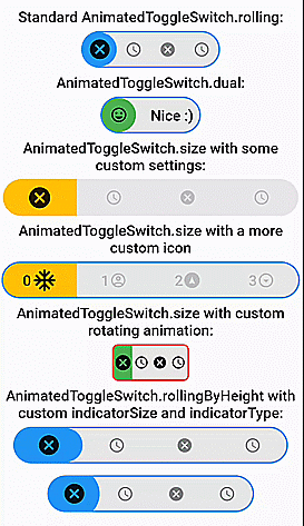
Vollständig anpassbarer, ziehbarer und animierter Schalter mit mehreren Auswahlmöglichkeiten und reibungsloser Ladeanimation. Es verfügt über vorgefertigte Konstruktoren für Roll- und Größenanimationen.
Aus öffentlichen Paketdaten erstellte Orientierung.
Ein vollständig anpassbarer, ziehbarer und animierter Schieberegler mit Unterstützung für mehrere Auswahlmöglichkeiten und reibungslose Ladeanimationen. Es bietet vorgefertigte Konstruktoren für Roll- und Größenübergänge, was es ideal für interaktive Benutzeroberflächen mit visuellem Feedback macht. Das Paket ist für den Einsatz auf mehreren Plattformen konzipiert und unterstützt Android, iOS, Web, macOS, Windows und Linux. Mit intuitiven APIs und nahtloser Integration verbessert es die Benutzererfahrung durch dynamische, reaktionsfähige Schalter.
Anwendungsfälle
Interaktive Einstellungspanels
Formularsteuerelemente mit visueller Rückmeldung
Anpassbare Thema-Schalter
Dynamische Auswahl
Glatte UI-Übergänge
Plattformübergreifende Schaltkomponenten
Hauptmerkmale
Draggable-Schnittstelle
Mehrfachauswahl-Unterstützung
vorgefertigte Roll- und Größenanimationen
Vollständig anpassbarer Design
Glatte Ladeübergänge
Plattformübergreifende Kompatibilität
Geeignet für
Entwickler, die interaktive Formulare erstellen
UI-Designer, die dynamische Schalter suchen
Apps, die Theme- oder Einstellungstoggle erfordern
Plattformübergreifende Flutter-Anwendungen
Projekte, die auf visuelles Polieren Wert legen
Hinweise
Kann die Leistung bei vielen Instanzen beeinträchtigen
Erfordert sorgfältige Stilisierung für optimales Erscheinungsbild
Beschränkt auf Toggle-artige Interaktionen
Nicht geeignet für nicht-interaktive Elemente
Die Komplexität einer Animation kann die Akkulaufzeit auf mobilen Geräten beeinträchtigen
Original-README
Originaler README-Schnappschuss aus dem verknüpften Quell-Repository. Aktuelle Inhalte finden Sie im Repository.
AnimatedToggleSwitch
If you like this package, please like it on pub.dev and star it on GitHub.
Fully customizable, draggable and animated switch with multiple choices and smooth loading animation. It has prebuilt constructors for rolling and size animations, but it also allows you to create your own switches with CustomAnimatedToggleSwitch. LTR and RTL are both supported. Switches without an (initial) selection and vertical switches are also possible.
Most builder arguments of AnimatedToggleSwitch have standard and a custom version. This ensures that you can get started easily and still customize a lot if necessary. There are several options for styling it.
For a slider with a similar look you can check out action_slider.
Example Usage
Examples
AnimatedToggleSwitch.dual()
Switch inspired by lite_rolling_switch (made with AnimatedToggleSwitch.dual())
Switch inspired by toggle_switch (made with AnimatedToggleSwitch.size())
Switch inspired by crazy-switch (made with CustomAnimatedToggleSwitch())
Switch inspired by load_switch (made with CustomAnimatedToggleSwitch())
AnimatedToggleSwitch.rolling()
You can build any other switch with CustomAnimatedToggleSwitch()
AnimatedToggleSwitch.size()
AnimatedToggleSwitch.size() with custom rolling animation
AnimatedToggleSwitch.rolling() with custom indicatorSize, borderRadius and indicatorBorderRadius
Easy Usage
Easy to use and highly customizable.
Simple rolling animation
AnimatedToggleSwitch<int>.rolling(
  current: value,
  values: [0, 1, 2, 3],
  onChanged: (i) => setState(() => value = i),
  iconBuilder: iconBuilder,
  // iconList: [...], you can use iconBuilder, customIconBuilder or iconList
  style: ToggleStyle(...), // optional style settings
  ... // many more parameters available
)
Styling
Styling with constructor
style, styleBuilder, customStyleBuilder and styleList can be used to style an AnimatedToggleSwitch.
For the general look of the switch, you can use style.
For parameters that should change with the selection, you can use styleBuilder or styleList.
If you need additional parameters, you can use customStyleBuilder.
AnimatedToggleSwitch<int>.rolling(
  ...
  style: ToggleStyle(backgroundColor: Colors.red), // backgroundColor is set independently of the current selection
  styleBuilder: (value) => ToggleStyle(indicatorColor: value.isEven ? Colors.yellow : Colors.green)), // indicatorColor changes and animates its value with the selection
  ...
)
Styling with Theme
You can also add ToggleStyle to ThemeData.
This overwrites the default ToggleStyle values in all AnimatedToggleSwitch widgets in your MaterialApp.
To use the loading animation, you simply have to return a Future in onChanged or onTap.
You can alternatively control the loading manually with the loading parameter.
Hence, to disable the loading animation, loading: false must be set.
AnimatedToggleSwitch<int>.rolling(
current: value,
values: [0, 1, 2, 3],
onChanged: (i) async {
setState(() => value = i);
awaitFuture.delayed(Duration(seconds: 3));
},
loading: false, // for deactivating loading animation
iconBuilder: iconBuilder,
... // many more parameters available
)
Nullable selection
To use this feature, you simply have to set allowUnlistedValues to true.
AnimatedToggleSwitch<int?>.rolling(
   allowUnlistedValues: true,
   current: nullableValue, // no selection if nullableValue is not contained in values
   values: const [0, 1, 2, 3],
   onChanged: (i) => setState(() => nullableValue = i),
   iconBuilder: iconBuilder,
   indicatorAppearingBuilder: ..., // appearing animation is fully customizable (optional)
)
Vertical switches
You can get a vertical version of any switch by calling vertical() on it.
AnimatedToggleSwitch<int>.rolling(...).vertical()
Fully customizable toggle switch with CustomAnimatedToggleSwitch
CustomAnimatedToggleSwitch<int>(
  current: value,
  values: [0, 1, 2, 3],
  wrapperBuilder: ..., // the builder for the wrapper around the whole switch
  iconBuilder: ..., // the builder for the icons
  foregroundIndicatorBuilder: ..., // a builder for an indicator in front of the icons
  backgroundIndicatorBuilder: ..., // a builder for an indicator behind the icons
  ... // many more parameters available
)