
 v2.1.1
paged_datatable
Ein völlig neuer Ansatz zum Erstellen paginierter DataTables in Flutter mit Sortierung und Filtern
75Likes 19430-Tage-Downloads50Pub-Punkte
Keine Plattformdaten
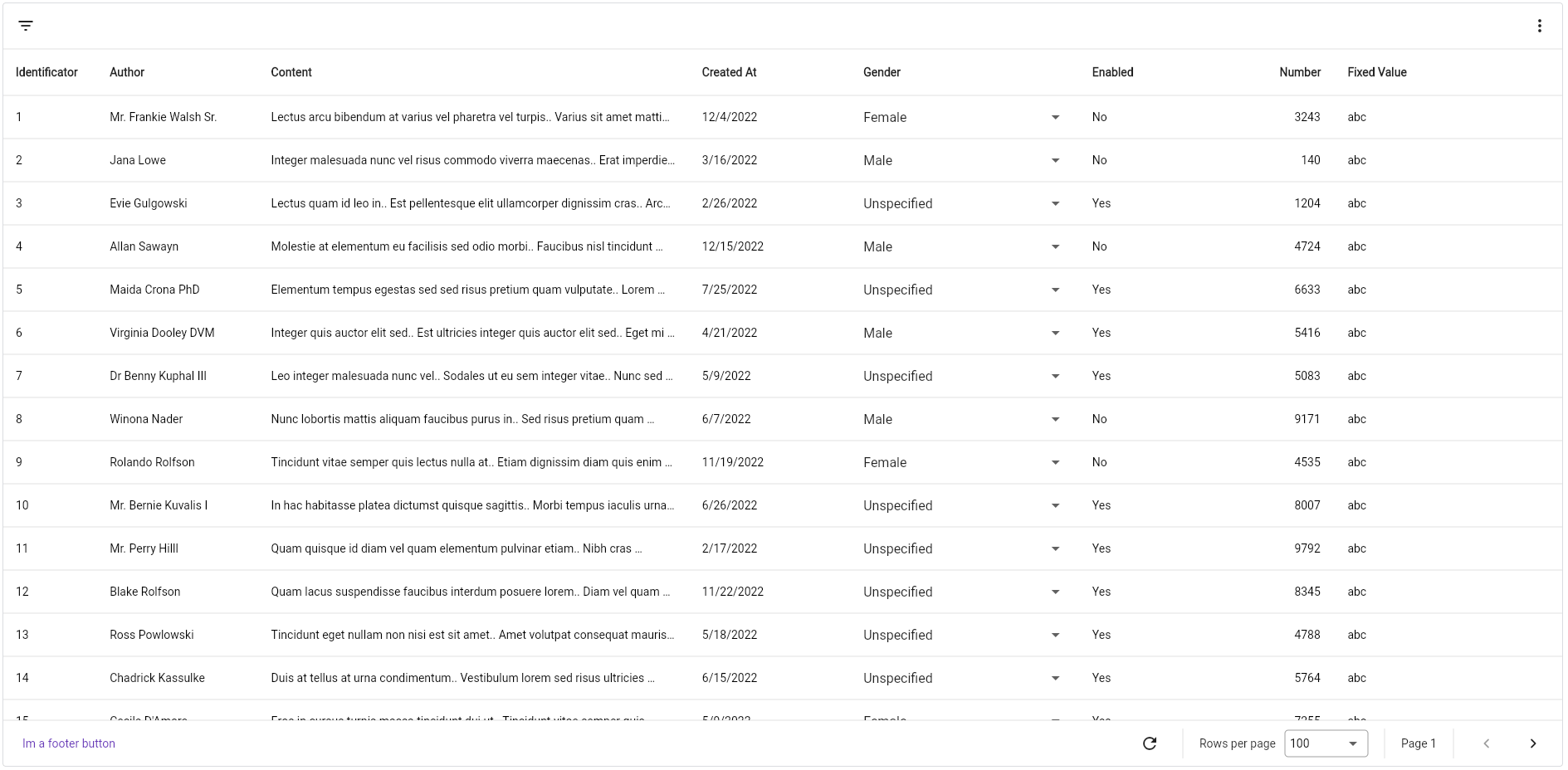
Eine anpassbare DataTable mit horizontaler Scrollfunktion, Cursor- und Offset-Pagination, Sortierung, Filterung, bearbeitbaren Spalten und erweiterbaren Zeilen, ideal zur Erstellung reicher und dynamischer Benutzeroberflächen.

{"sdk":"flutter"}{"sdk":"flutter"}^0.19.0^2.4.8^4.0.0^2.8.5Englischer Projektschnappschuss. Aktuelle Inhalte auf GitHub.
Completely customisable data table which supports cursor and offset pagination, filters and horizontal scrolling out-of-the-box. It's written from scratch, no dependency from Flutter's DataTable nor Table.
Designed to follow Google's Material You style.
Everything you need is a PagedDataTable<K, T> widget, which accepts two generic arguments, K and T, the type of object you will use as paging key and the type of object you will be showing in the table.
Keep in mind that
Kmust extendsComparable.
There are only two required parameters: columns and fetcher.
PagedDataTable<String, Post>(
  fetcher: (int pageSize, SortModel? sortModel, FilterModel filterModel, String? pageToken) => ...,
  columns: [...],
)
The fetcher is a function that gets called every time a page is requested. It gives you the current page size, sort and filter models and the page token that is requested. It must return
a FutureOr<(List<T>, K?)>, so you can convert it to a Future and do async-like requests or simply return the data.
It expects a tuple, where the first value is the list of items and the second the next page token:
PagedDataTable<String, Post>(
  fetcher: (int pageSize, SortModel? sortModel, FilterModel filterModel, String? pageToken) {
    final result = await FetchService.listPosts();
    return (result.data, result.nextPageToken);
  },
  columns: [...],
)
By default, PagedDataTable does not copy the returned list, so, if it is a shared list, you or the table may modify the items. If you want, PagedDataTable can copy the list
if you specify it in the configuration property:
Note that
PagedDataTableDOES NOT cache pages.
PagedDataTable<String, Post>(
  configuration: PagedDataTableConfiguration(
    copyItems: true,
  ),
)
The header renders the column names, but also the FilterBar exists, which is an additional header that renders the filter picker and, optionally, you can display additional widgets aligned at the right of the bar.
Just pass your widget to the filterBarChild property. Naturally you would want to display a PopupMenuButton that will act as a menu.
Using the footer property you can render anything. If you don't pass it, it will render the DefaultFooter widget,
which again, if not specified, will display, aligned to the right, the following widgets:
pageSizes property.IconButtons.If you want your own footer widget but reuse some of the already existing widgets, they are named: RefreshButton, PageSizeSelector, CurrentPage and NavigationButtons.
There are two types of columns in PagedDataTable:
KandTare the same parameters defined in thePagedDataTablewidget.
Every column type has:
Text widget displaying the name.FractionalColumnSize(.1), which means it will take 10% of the available width. You can use FixedColumnSize, FractionalColumnSize, RemainingColumnSize and MaxColumnSize.NumericColumnFormat, which aligns content to the right and AlignColumnFormat which aligns cell's content to the alignment property and you can implement your own implemeting the ColumnFormat interface.id is what you get in the Fetcher's SortModel. To sort, you click the column's header.ReadOnlyTableColumn's documentation.If you want to fix columns at the left, you can specify the amount of columns to fix using the
fixedColumnCountproperty.
Is the default ReadOnlyTableColumn that renders a cell using the cellBuilder property.
PagedDataTable<String, Post>(
  columns: [
    TableColumn(
      title: const Text("Author"),
      cellBuilder: (context, item, index) => Text(item.author),
    ),
  ],
)
This abstract class provides two more properties, getter and setter. The first one is used to provide the value V to render and the second one
is the function used to set the new value. It must return a boolean indicating if the operation succeeded or not. If is true, the cell will update its
value, otherwise will keep the old one.
There are three built in editable columns, which are DropdownTableColumn which renders a dropdown; TextTableColumn which renders a Text until double-clicked, then it renders a TextField used to edit the cell's content; LargeTextTableColumn, which is the same as TextTableColumn but when
double-clicked, it opens an overlay, designed to edit large text cells.
You can create your own column.
To create your own columns, simply extend ReadOnlyTableColumn or EditableTableColumn depending on your needs.
For example:
class MyColumnType<K, T> extends ReadOnlyTableColumn<K, T> {
  @override
  Widget build(BuildContext context, T item, int index) {
    return MyCellWidget();
  }
}
If you want more examples, check out the implementation of the already existing column types.
PagedDataTable allows you to define a set of filters that you can use to interactively select them using a
popup overlay or a bottom sheet if you are in a small device.
To define filters, use the filters property:
PagedDataTable<String, Post>(
  ...,
  filters: [
    TextTableFilter(
      id: "content",
      chipFormatter: (value) => 'Content has "$value"',
      name: "Content",
    ),
    DropdownTableFilter<Gender>(
      items: Gender.values
          .map((e) =>
              DropdownMenuItem(value: e, child: Text(e.name)))
          .toList(growable: false),
      chipFormatter: (value) =>
          'Author is ${value.name.toLowerCase()}',
      id: "authorGender",
      name: "Author's Gender",
    ),
  ],
)
There are five built-in filter types:
TextTableFilter: renders a TextField to filter by raw text.DropdownTableFilter: renders a DropdownButton with a set of options.DateTimePickerTableFilter: renders a TextField that, when tapped, opens the DateTime picker dialog.DateRangePickerTableFilter: the same as DateTimePickerTableFilter but selects a DateTimeRange.ProgrammingTextFilter: a filter that does not render nothing in the filter dialog but can be set using the controller.Every filter type must define, at least, the id, the name and the chipFormatter properties. The first one is the identifier of the filter, used in the fetcher's FilterMode property. The name is the label displayed in the filter picker and the chipFormatter is a function that maps the actual selected value to a more user-friendly string that is displayed in the selected filter's chip.
To create your own filter, extend the TableFilter<T> abstract class, where T is the type of value the filter will handle. Then, implement the buildPicker function, which renders the actual filter picker.
The implementation of the TextTableFilter as an example:
final class TextTableFilter extends TableFilter<String> {
  final InputDecoration? decoration;

  const TextTableFilter({
    this.decoration,
    required super.chipFormatter,
    required super.id,
    required super.name,
    super.initialValue,
    super.enabled = true,
  });

  @override
  Widget buildPicker(BuildContext context, FilterState<String> state) {
    return TextFormField(
      decoration: decoration ?? InputDecoration(labelText: name),
      initialValue: state.value,
      onSaved: (newValue) {
        if (newValue != null && newValue.isNotEmpty) {
          state.value = newValue;
        }
      },
    );
  }
}
If you want to control the table programatically, provide your own PagedDataTableController<K, V> instance passing it to the controller property. It provides methods to interact with rows (selecting, unselecting, removing, inserting, updating), filters, sorting, pagination, and more.
Update your MaterialApp or CupertinoApp widget with the following:
localizationsDelegates:  const  [
  PagedDataTableLocalization.delegate
],
And you're done.
At the moment of writing this, the supported locales are:
If you want more languages, you can contribute.
Screenshot 1 Screenshot 2 Screenshot 3 Screenshot 4 Screenshot 5
Any suggestion to improve/add is welcome, if you want to make a PR, you are welcome :)