Aus öffentlichen Paketdaten erstellte Orientierung.
PagedDatatable ist ein Flutter-Paket, das einen modernen Ansatz zur Erstellung paginierter DataTables mit integrierter Unterstützung für Sortierung und Filterung einführt. Es vereinfacht die Implementierung von Datentabellen, die große Datenmengen effizient verarbeiten, indem Daten in Seiten geladen werden. Das Paket integriert sich nahtlos in das Widget-System von Flutter und bietet eine saubere API zum Verwalten von Paginierung, Spaltensortierung und dynamischer Filterung. Speziell für Entwickler konzipiert, die eine leistungsstarke und anpassbare Lösung suchen, um strukturierte Daten benutzerfreundlich darzustellen.
Anwendungsfälle
Anzeigen großer Datensätze in Web- und Mobilanwendungen
Sortierbare und filterbare Daten-Tabellen implementieren
Verwaltungs-Dashboards mit strukturierten Daten erstellen
Reaktive Datenraster für Analysen erstellen
Verbesserung der Benutzererfahrung durch Lazy Loading
Integration von Such- und Sortierfunktionen
Hauptmerkmale
Eingebaute Paginierung mit konfigurierbaren Seitengrößen
Unterstützung für Spalten-Sortierung mit aufsteigender/absteigender Reihenfolge
Dynamische Filterfunktionen
Effizientes Datenladen mit lazy Rendering
Anpassbare Tabellenstilisierung und -layout
Einfache Integration mit bestehenden Datenquellen
Geeignet für
Entwickler, die datenintensive Anwendungen erstellen
Frontend-Teams, die wiederverwendbare Tabellenkomponenten benötigen
Projekte, die eine effiziente Datenvisualisierung erfordern
Flutter-Entwickler, die sich auf UX-Verbesserungen konzentrieren
Teams, die Administrations- oder Berichtschnittstellen implementieren
Hinweise
Benötigt manuelle Einrichtung für die Datenquellenintegration
Eingeschränkte plattformspezifische Optimierungen
Keine integrierte Exportfunktion
Für komplexe Layouts kann zusätzliche Styling notwendig sein
Abhängig von externer Zustandsverwaltung für fortgeschrittene Anwendungsfälle
Nicht für extrem hohe Aktualisierungsintervalle optimiert
Original-README
Originaler README-Schnappschuss aus dem verknüpften Quell-Repository. Aktuelle Inhalte finden Sie im Repository.
PagedDataTable
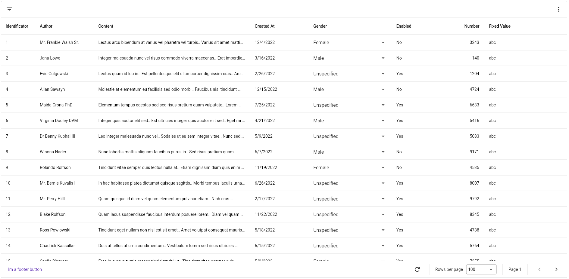
Completely customisable data table which supports cursor and offset pagination, filters and horizontal scrolling out-of-the-box. It's written from scratch, no dependency from Flutter's DataTable nor Table.
Designed to follow Google's Material You style.
Everything you need is a PagedDataTable<K, T> widget, which accepts two generic arguments, K and T, the type of object you will use as paging key and the type of object you will be showing in the table.
Keep in mind that K must extends Comparable.
There are only two required parameters: columns and fetcher.
The fetcher is a function that gets called every time a page is requested. It gives you the current page size, sort and filter models and the page token that is requested. It must return
a FutureOr<(List<T>, K?)>, so you can convert it to a Future and do async-like requests or simply return the data.
It expects a tuple, where the first value is the list of items and the second the next page token:
By default, PagedDataTable does not copy the returned list, so, if it is a shared list, you or the table may modify the items. If you want, PagedDataTable can copy the list
if you specify it in the configuration property:
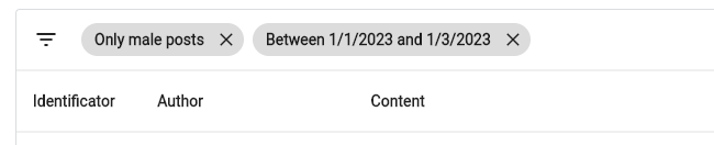
The header renders the column names, but also the FilterBar exists, which is an additional header that renders the filter picker and, optionally, you can display additional widgets aligned at the right of the bar.
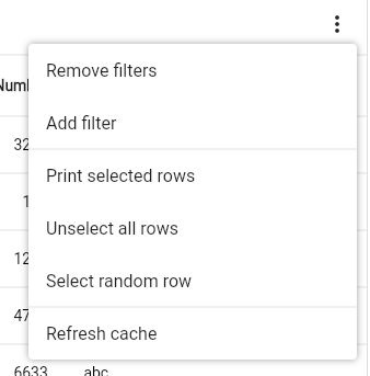
Just pass your widget to the filterBarChild property. Naturally you would want to display a PopupMenuButton that will act as a menu.
Footer
Using the footer property you can render anything. If you don't pass it, it will render the DefaultFooter widget,
which again, if not specified, will display, aligned to the right, the following widgets:
Refresh button: A button that can be used to refresh the current dataset.
Page size selector: A dropdown that can be used to select the current page size to use, based on the pageSizes property.
Current page display: Displays the current page number.
Navigation buttons: will display the previous and next buttons as IconButtons.
Custom footer
If you want your own footer widget but reuse some of the already existing widgets, they are named: RefreshButton, PageSizeSelector, CurrentPage and NavigationButtons.
Columns
There are two types of columns in PagedDataTable:
ReadOnlyTableColumn<K, T>: renders a simple widget that does not allow edition.
EditableTableColumn<K, T, V>: renders a simple widget too, but this can be modified in place and modify the dataset.
K and T are the same parameters defined in the PagedDataTable widget.
Every column type has:
title: the column's title. It is a widget but commonly it's a Text widget displaying the name.
size: configures the column's size. By default, it is a FractionalColumnSize(.1), which means it will take 10% of the available width. You can use FixedColumnSize, FractionalColumnSize, RemainingColumnSize and MaxColumnSize.
format: applies a transformation to the cell's widget. You have NumericColumnFormat, which aligns content to the right and AlignColumnFormat which aligns cell's content to the alignment property and you can implement your own implemeting the ColumnFormat interface.
sort and id: both properties are used to indicate that a column can be used for sorting. The id is what you get in the Fetcher's SortModel. To sort, you click the column's header.
There are other properties that you can use to play around and modify your columns. Check out the ReadOnlyTableColumn's documentation.
If you want to fix columns at the left, you can specify the amount of columns to fix using the fixedColumnCount property.
TableColumn<K, T>
Is the default ReadOnlyTableColumn that renders a cell using the cellBuilder property.
This abstract class provides two more properties, getter and setter. The first one is used to provide the value V to render and the second one
is the function used to set the new value. It must return a boolean indicating if the operation succeeded or not. If is true, the cell will update its
value, otherwise will keep the old one.
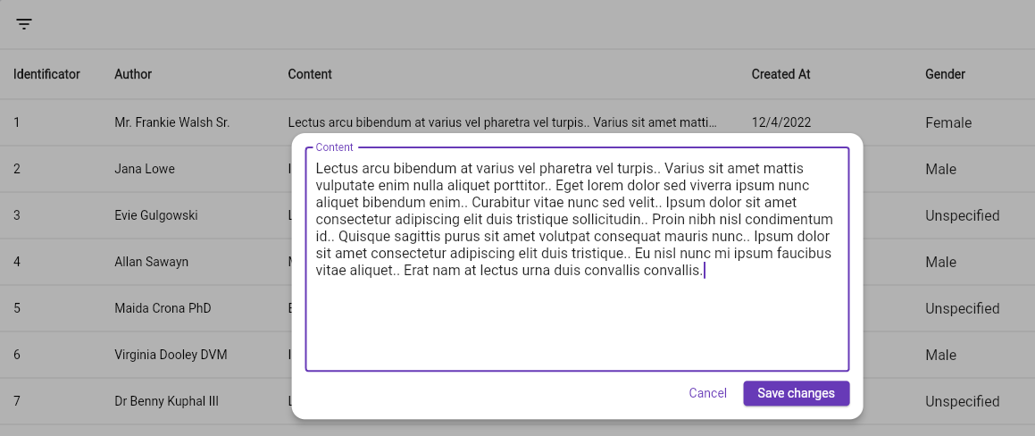
There are three built in editable columns, which are DropdownTableColumn which renders a dropdown; TextTableColumn which renders a Text until double-clicked, then it renders a TextField used to edit the cell's content; LargeTextTableColumn, which is the same as TextTableColumn but when
double-clicked, it opens an overlay, designed to edit large text cells.
To create your own columns, simply extend ReadOnlyTableColumn or EditableTableColumn depending on your needs.
For example:
classMyColumnType<K, T> extendsReadOnlyTableColumn<K, T> {
@overrideWidgetbuild(BuildContext context, T item, int index) {
returnMyCellWidget();
}
}
If you want more examples, check out the implementation of the already existing column types.
Filters
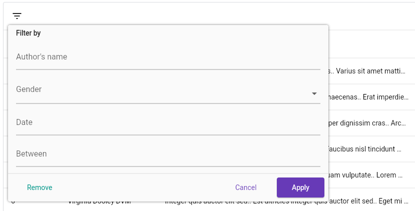
PagedDataTable allows you to define a set of filters that you can use to interactively select them using a
popup overlay or a bottom sheet if you are in a small device.
TextTableFilter: renders a TextField to filter by raw text.
DropdownTableFilter: renders a DropdownButton with a set of options.
DateTimePickerTableFilter: renders a TextField that, when tapped, opens the DateTime picker dialog.
DateRangePickerTableFilter: the same as DateTimePickerTableFilter but selects a DateTimeRange.
ProgrammingTextFilter: a filter that does not render nothing in the filter dialog but can be set using the controller.
Every filter type must define, at least, the id, the name and the chipFormatter properties. The first one is the identifier of the filter, used in the fetcher's FilterMode property. The name is the label displayed in the filter picker and the chipFormatter is a function that maps the actual selected value to a more user-friendly string that is displayed in the selected filter's chip.
Custom filters
To create your own filter, extend the TableFilter<T> abstract class, where T is the type of value the filter will handle. Then, implement the buildPicker function, which renders the actual filter picker.
The implementation of the TextTableFilter as an example:
If you want to control the table programatically, provide your own PagedDataTableController<K, V> instance passing it to the controller property. It provides methods to interact with rows (selecting, unselecting, removing, inserting, updating), filters, sorting, pagination, and more.
Internationalization
Update your MaterialApp or CupertinoApp widget with the following: