
 v1.1.2
selector_wheel
A Flutter package for creating a customizable value selector wheel.
30Likes 12830-day downloads130Pub points
AndroidiOSWebmacOSWindowsLinux
A Flutter package for creating customizable selector wheel widgets.

^2.3.3{"sdk":"flutter"}^2.3.2^2.2.0{"sdk":"flutter"}^2.0.1English project snapshot. Visit GitHub for the latest content.
A Flutter package for creating customizable selector wheel widgets.
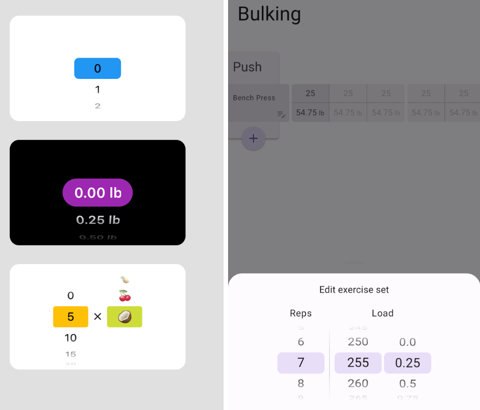
Usage example regular Usage example with bottom sheet
Add selector_wheel to your pubspec.yaml by running the following command:
flutter pub add selector_wheel
Import the package:
import 'package:selector_wheel/selector_wheel.dart';
Use the SelectorWheel widget in your app:
SizedBox(
  width: 200,
  height: 200,
  child: SelectorWheel(
    childCount: 10,
    // convertIndexToValue is a function that converts the index of the
    // child to a value that is displayed on the selector wheel. In this
    // case, we are converting the index to a string. I.e we'll have
    // 0, 1, 2, 3, 4, 5, 6, 7, 8, 9 on the selector wheel.
    convertIndexToValue: (int index) {
      return SelectorWheelValue(
        label: index.toString(),
        value: index,
        index: index,
      );
    },
    onValueChanged: (SelectorWheelValue<int> value) {
      // print the value that was selected
      print(value);
    },
  ),
)
Keep in mind, that the convertIndexToValue function can be used to convert the index to any value.
In the example below, we are converting the index to a double value to represent quarter lbs.
SizedBox(
  width: 200,
  height: 200,
  child: SelectorWheel(
    childCount: 10,
    convertIndexToValue: (int index) {
      // This is just to illustrate, that the index can be converted
      // to any value. In this case, we are converting the index to
      // a quarter of a pound.
      final quarter = index / 4;

      return SelectorWheelValue(
        // The label is what is displayed on the selector wheel
        label: '${quarter.toString()} lb',
        value: quarter,
        index: index,
      );
    },
    onValueChanged: (SelectorWheelValue<double> value) {
      // print the value that was selected
      print(value);
    },
  ),
)
The colors of the selector wheel can be customized by overriding the ThemeData in the following way:
// Overriding the colors of the selector wheel
Theme(
  data: ThemeData(
    textTheme: Theme.of(context).textTheme.copyWith(
      titleLarge: Theme.of(context).textTheme.titleLarge?.copyWith(
        fontSize: 24.0,
        fontWeight: FontWeight.w600,
      ),
    ),
    colorScheme: Theme.of(context).colorScheme.copyWith(
      surface: Colors.black,
      onSurface: Colors.white,
      secondaryContainer: Colors.amber,
    ),
  ),
  child: SizedBox(
    width: 200,
    height: 200,
    child: SelectorWheel(
      childCount: 10,
      highlightBorderRadius: 16.0,
      highlightHeight: 40.0,
      highlightWidth: 100.0,
      convertIndexToValue: (int index) {
        return SelectorWheelValue(
          label: index.toString(),
          value: index,
          index: index,
        );
      },
      onValueChanged: (value) {
        // print the value that was selected
        print(value);
      },
    ),
  ),
)
Notice, that we're also customizing the "highlighted" item's border radius, height, and width. To see all the customizable properties, check out the SelectorWheel class.
Contributions are welcome! If you find a bug or have a feature request, please open an issue on the GitHub repository.
This package is licensed under the MIT License. For more details, please refer to the LICENSE file included in the repository.