Search packages, repositories and app categories

selector_wheel cover
Package detailsv1.1.2

selector_wheel

A Flutter package for creating a customizable value selector wheel.

AndroidiOSWebmacOSWindowsLinux
30-day downloads
174
Likes
30
Pub points
130

Install package

flutter pub add selector_wheel

Package Overview

Package selection guidance compiled from public package information, community data, and project usage.

A Flutter package that enables the creation of customizable, interactive value selector wheels for user input. It provides a visually engaging way to select values from a rotating wheel, ideal for settings, timers, or any scenario requiring intuitive numeric or categorical selection. The wheel supports smooth animations, custom styling, and responsive behavior across platforms. It is designed for developers seeking an alternative to traditional text fields or dropdowns with enhanced user experience.

Use cases

  • Form inputs with visual feedback
  • Time or quantity selectors
  • Gamified user interfaces
  • Settings with adjustable parameters
  • Interactive educational tools

Key features

  • Customizable wheel appearance
  • Smooth rotation animations
  • Responsive touch and drag support
  • Support for discrete and continuous values
  • Cross-platform compatibility

Suitable for

  • Developers building interactive UIs
  • Apps needing intuitive value selection
  • Designers wanting unique form elements
  • Projects targeting multiple platforms

Considerations

  • May require performance tuning on low-end devices
  • Limited built-in validation
  • Not optimized for very large value ranges
  • Requires careful design for accessibility

Original README

Original README snapshot from the linked source repository. Visit the repository for the latest content.

Selector Wheel

pub package codecov

A Flutter package for creating customizable selector wheel widgets.

Table of Contents

Features

  • Customizable selector wheel widget
  • Supports variable wheel size, item width, item height, and more
  • Built with Flutter's best practices for optimal performance
  • Supports haptic feedback, fade-out effect, and more
  • Can be used with any data type

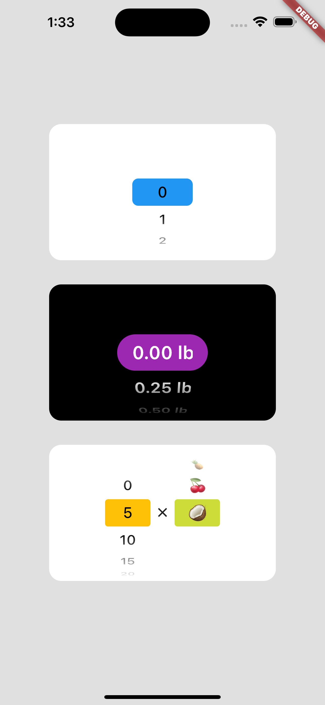
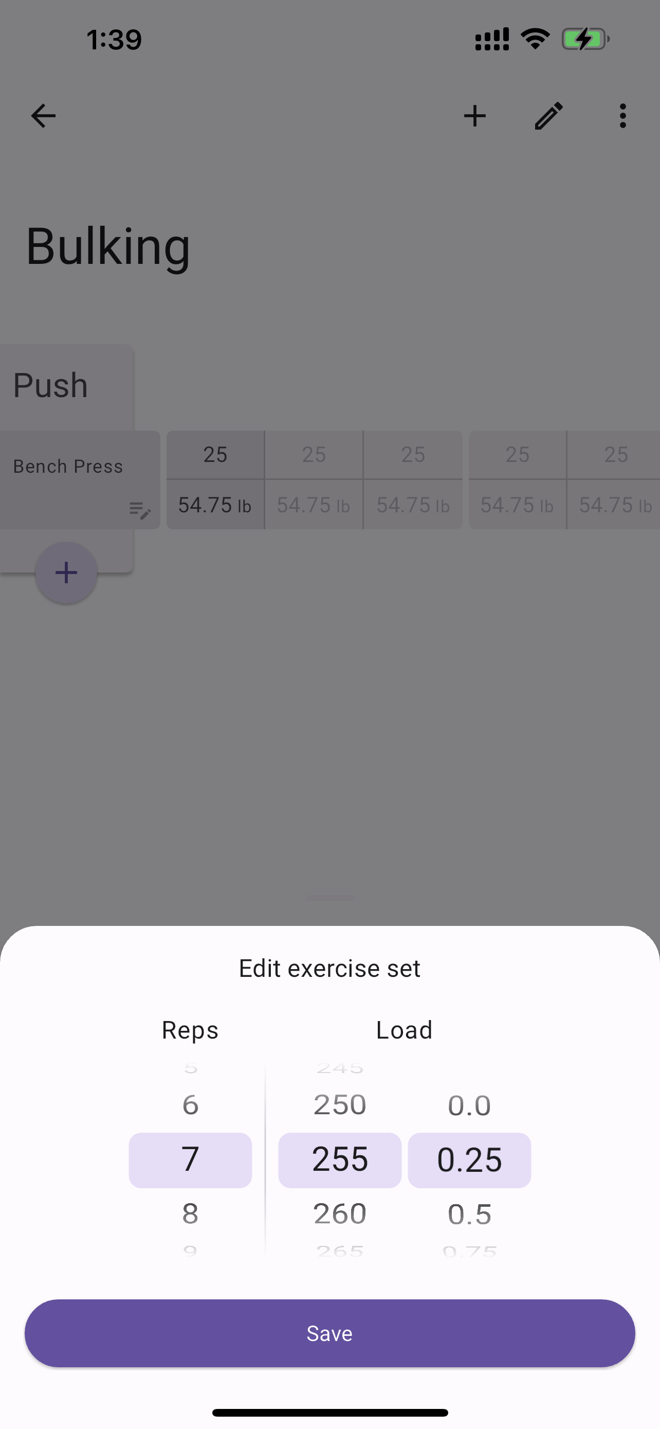
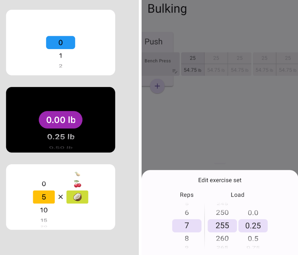
Usage example regular Usage example with bottom sheet

Getting started

Add selector_wheel to your pubspec.yaml by running the following command:

flutter pub add selector_wheel

Usage

Import the package:

import 'package:selector_wheel/selector_wheel.dart';
Basic usage

Use the SelectorWheel widget in your app:

SizedBox(
  width: 200,
  height: 200,
  child: SelectorWheel(
    childCount: 10,
    // convertIndexToValue is a function that converts the index of the
    // child to a value that is displayed on the selector wheel. In this
    // case, we are converting the index to a string. I.e we'll have
    // 0, 1, 2, 3, 4, 5, 6, 7, 8, 9 on the selector wheel.
    convertIndexToValue: (int index) {
      return SelectorWheelValue(
        label: index.toString(),
        value: index,
        index: index,
      );
    },
    onValueChanged: (SelectorWheelValue<int> value) {
      // print the value that was selected
      print(value);
    },
  ),
)
Customizing the selector wheel

Keep in mind, that the convertIndexToValue function can be used to convert the index to any value. In the example below, we are converting the index to a double value to represent quarter lbs.

SizedBox(
  width: 200,
  height: 200,
  child: SelectorWheel(
    childCount: 10,
    convertIndexToValue: (int index) {
      // This is just to illustrate, that the index can be converted
      // to any value. In this case, we are converting the index to
      // a quarter of a pound.
      final quarter = index / 4;

      return SelectorWheelValue(
        // The label is what is displayed on the selector wheel
        label: '${quarter.toString()} lb',
        value: quarter,
        index: index,
      );
    },
    onValueChanged: (SelectorWheelValue<double> value) {
      // print the value that was selected
      print(value);
    },
  ),
)

The colors of the selector wheel can be customized by overriding the ThemeData in the following way:

// Overriding the colors of the selector wheel
Theme(
  data: ThemeData(
    textTheme: Theme.of(context).textTheme.copyWith(
      titleLarge: Theme.of(context).textTheme.titleLarge?.copyWith(
        fontSize: 24.0,
        fontWeight: FontWeight.w600,
      ),
    ),
    colorScheme: Theme.of(context).colorScheme.copyWith(
      surface: Colors.black,
      onSurface: Colors.white,
      secondaryContainer: Colors.amber,
    ),
  ),
  child: SizedBox(
    width: 200,
    height: 200,
    child: SelectorWheel(
      childCount: 10,
      highlightBorderRadius: 16.0,
      highlightHeight: 40.0,
      highlightWidth: 100.0,
      convertIndexToValue: (int index) {
        return SelectorWheelValue(
          label: index.toString(),
          value: index,
          index: index,
        );
      },
      onValueChanged: (value) {
        // print the value that was selected
        print(value);
      },
    ),
  ),
)

Notice, that we're also customizing the "highlighted" item's border radius, height, and width. To see all the customizable properties, check out the SelectorWheel class.

Contributing

Contributions are welcome! If you find a bug or have a feature request, please open an issue on the GitHub repository.

License

This package is licensed under the MIT License. For more details, please refer to the LICENSE file included in the repository.

Categories

Dependencies

Dependency list 3 items

Source repository

Projects using this package

No data available yet.