 v4.1.3
multi_select_flutter
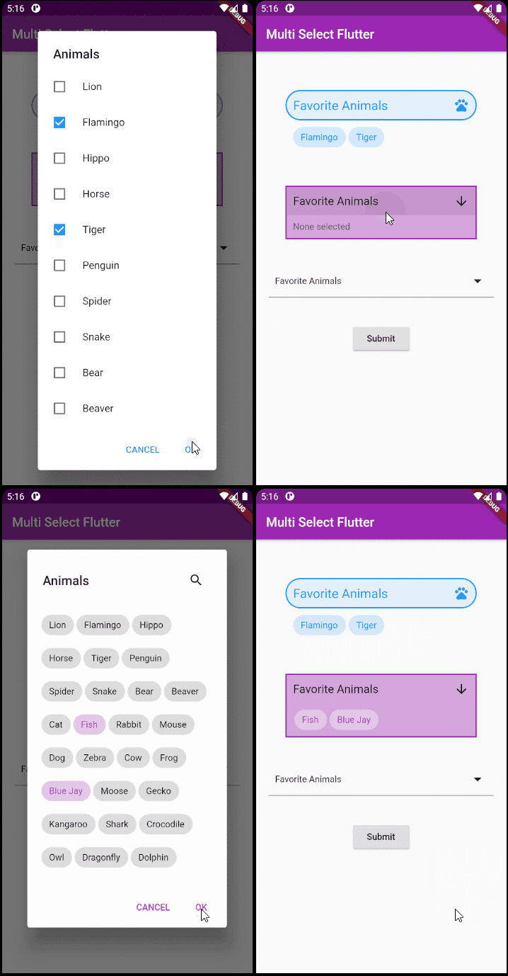
A flexible multi select package for Flutter. Make multi select widgets the way you want.
808Likes 57.6K30-day downloads150Pub points
AndroidiOSWebmacOSWindowsLinux
Explore Checkbox & Radio Button Flutter packages and compare platform support and community metrics.
21 packages
A flexible multi select package for Flutter. Make multi select widgets the way you want.
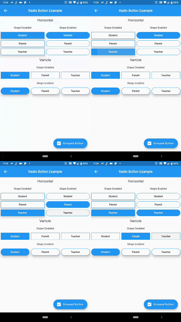
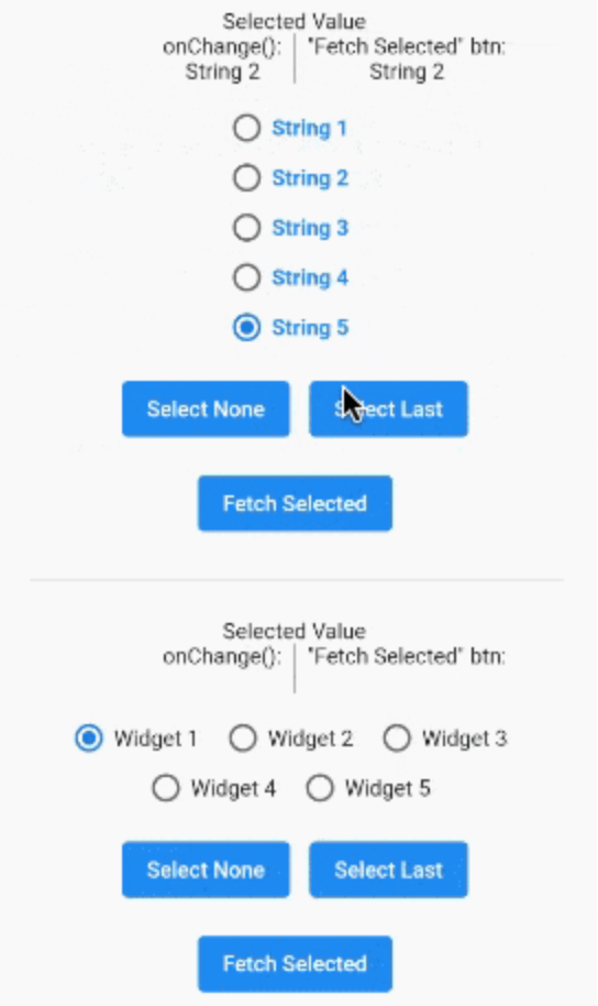
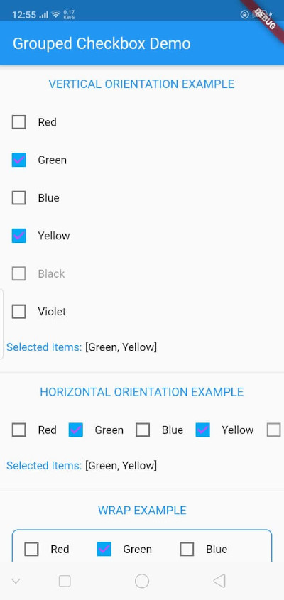
Custom Radio Buttons and Grouped Check Box Button
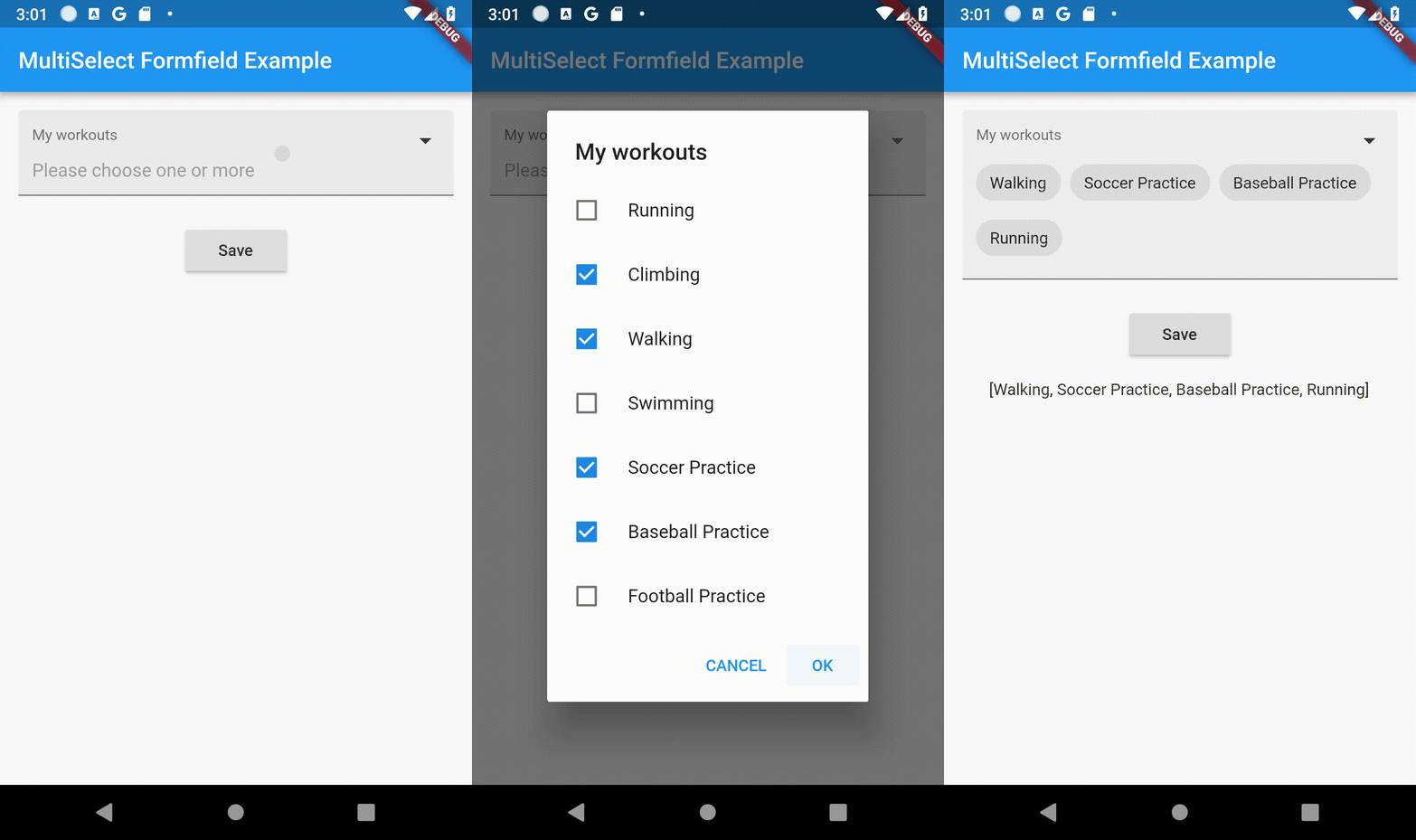
A multi select form field using alert dialog to select multiple items with checkboxes and showing as chips.
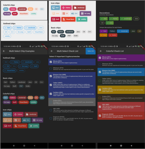
A Flutter package for creating customizable flutter multi select widgets.
Package to make easier the proccess of creating a round circle box. The component created is fully customizable to your needs.
A simple package that makes grouping Checkboxes and Radio Buttons much easier.
Flutter librity to create radio groups and radio button with labels.
An animated checkbox, inspired by BEMCheckbox for iOS, using an API similar to Flutter's own Checkbox.
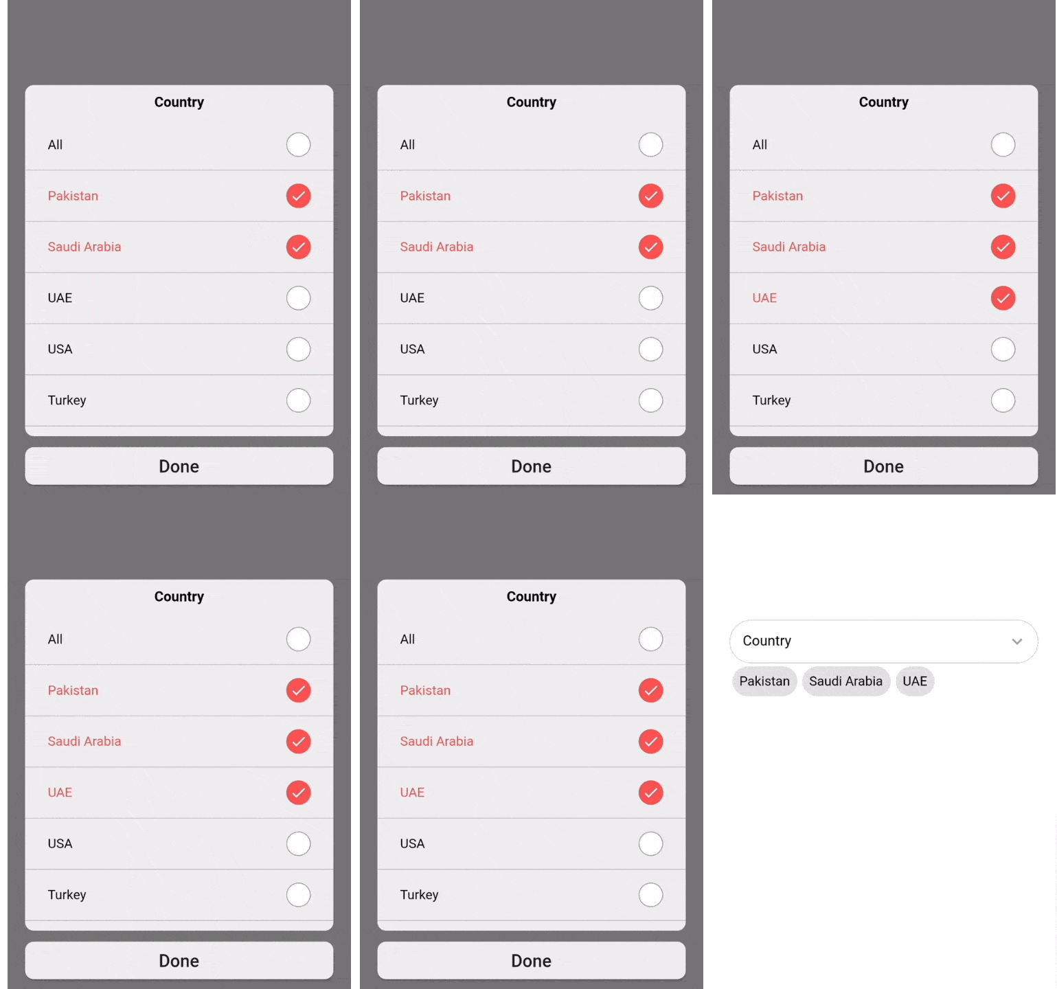
A flexible multi select and single select package for Flutter. Flutter custom selector dart package with awesome UI. Make your selection unique and fantacy
flutter widget that grouping checkbox, recuperate the actual selection,support multiple selection
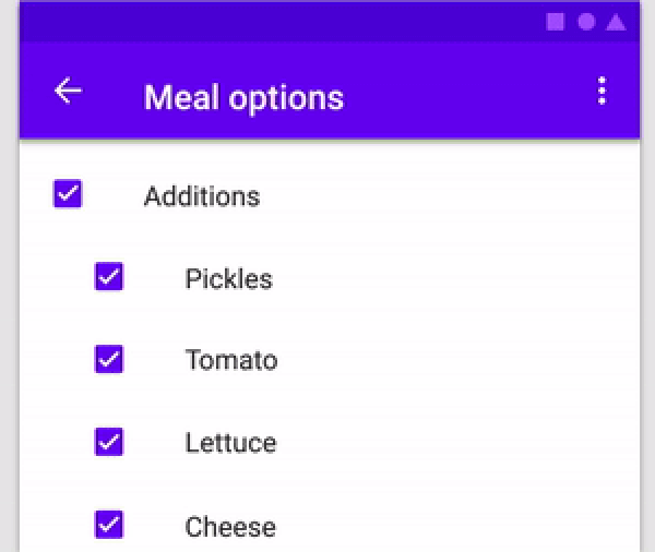
Parent Child Checkbox is a type of checkbox where we can establish hierarchy in Checkboxes
Generic item picker that encapsulates single or multiple item selection logic.
A widget that groups radio buttons so they can work together to give the user a pleasant experience when making selections within the app.
This package contains checkbox widgets that can be used as FormField for Flutter beginners.
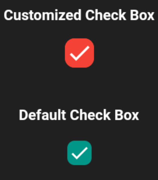
A custom flutter check box with custom active and inactive color & icon with custom corner radius.
EasyRadio is a customizable radio button widget for Flutter that offers consistent animation, easy customization of sizes, shape, inner dot shape.
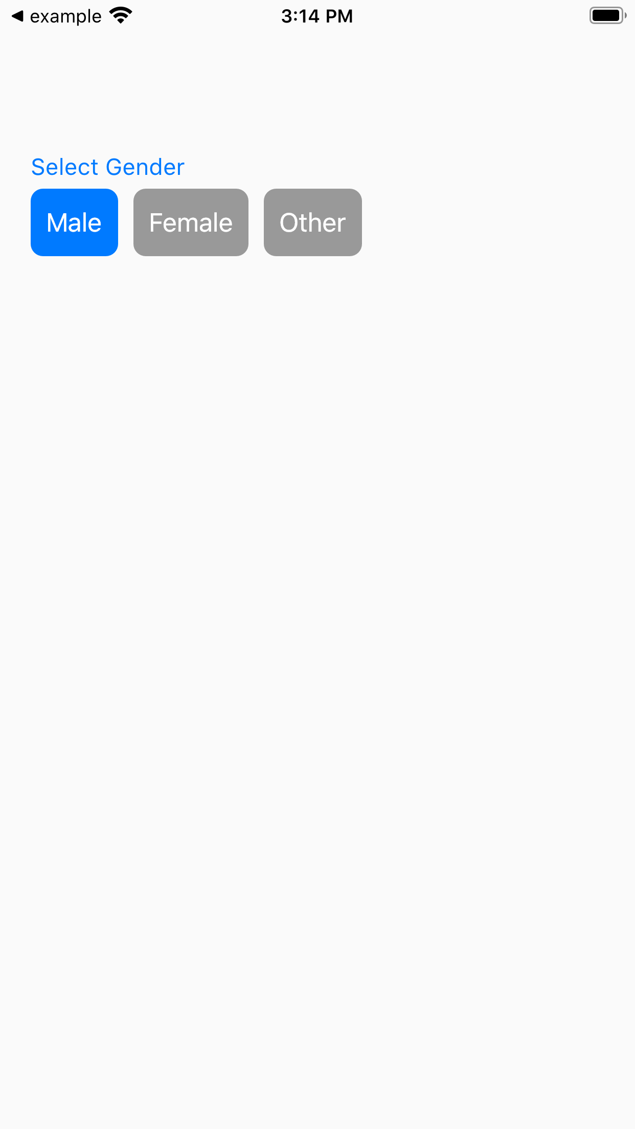
Cupertino buttons which are used as radio buttons in order to select one value.
A package to easily group checkboxes in different styles in Flutter projects.
A flexible dropdown field supporting single/multiple selection modes, styles, titles, etc
A CheckboxListTile with more customizable details, which provides more customizable functions, based on the traditional flutter CheckboxListTile.
A radio component suitable for almost any radio scenario. You will like it.
Check the required features and target platforms first, then compare versions, downloads, and Pub points. Open package details to consult the original documentation and test compatibility in your project.
Flutter is an open-source framework for building beautiful, natively compiled, multi-platform applications from a single codebase.
Check versions and package metadata on pub.dev, and source code, licensing, and maintenance in the project’s GitHub repository. The official Dart documentation explains that package metadata lives in pubspec.yaml.
pub.dev · GitHub · Dart — The pubspec file
All of this metadata goes in the package's pubspec