v2.3.0toggle_switch
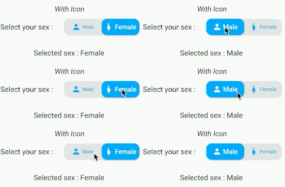
Toggle Switch - A simple toggle switch widget. It can be fully customized with desired icons, width, colors, text, corner radius etc. It also maintains selection state.
Explore Switch Flutter packages and compare platform support and community metrics.
24 packages
Toggle Switch - A simple toggle switch widget. It can be fully customized with desired icons, width, colors, text, corner radius etc. It also maintains selection state.
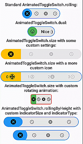
Fully customizable, draggable and animated switch with multiple choices and smooth loading animation. It has prebuilt constructors for rolling and size animations.
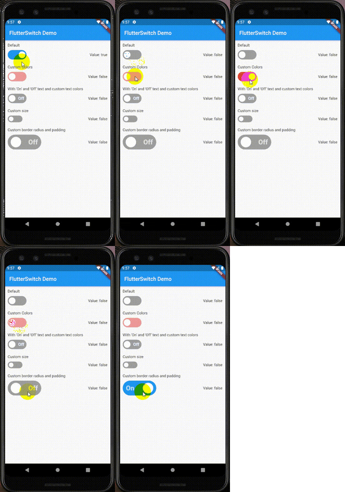
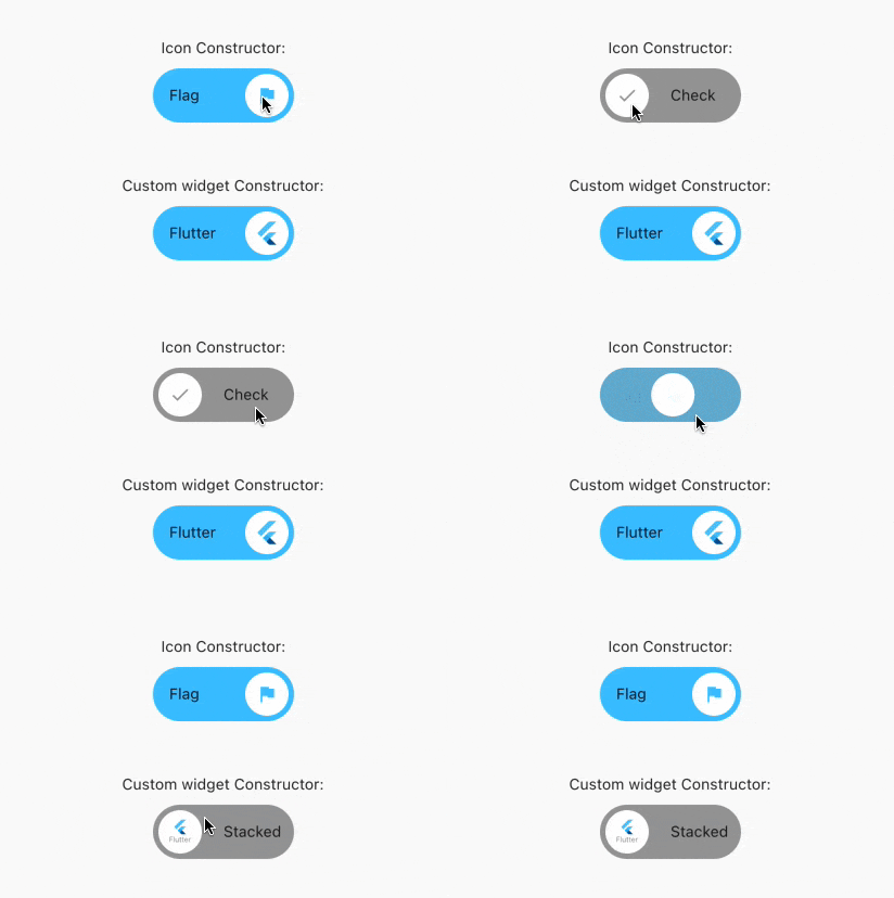
A custom switch widget that can have a custom height and width, borders, border radius, colors, toggle size, custom text and icons inside the toggle.
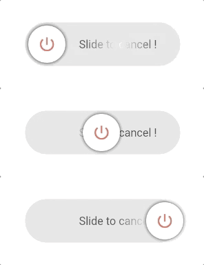
Customizable slider button widget for activating/deactivating some event.
Custom Switch button with nice looking and attractive animation, made to allow you to customize colors, icons and other cosmetic content. Now supports null safety.
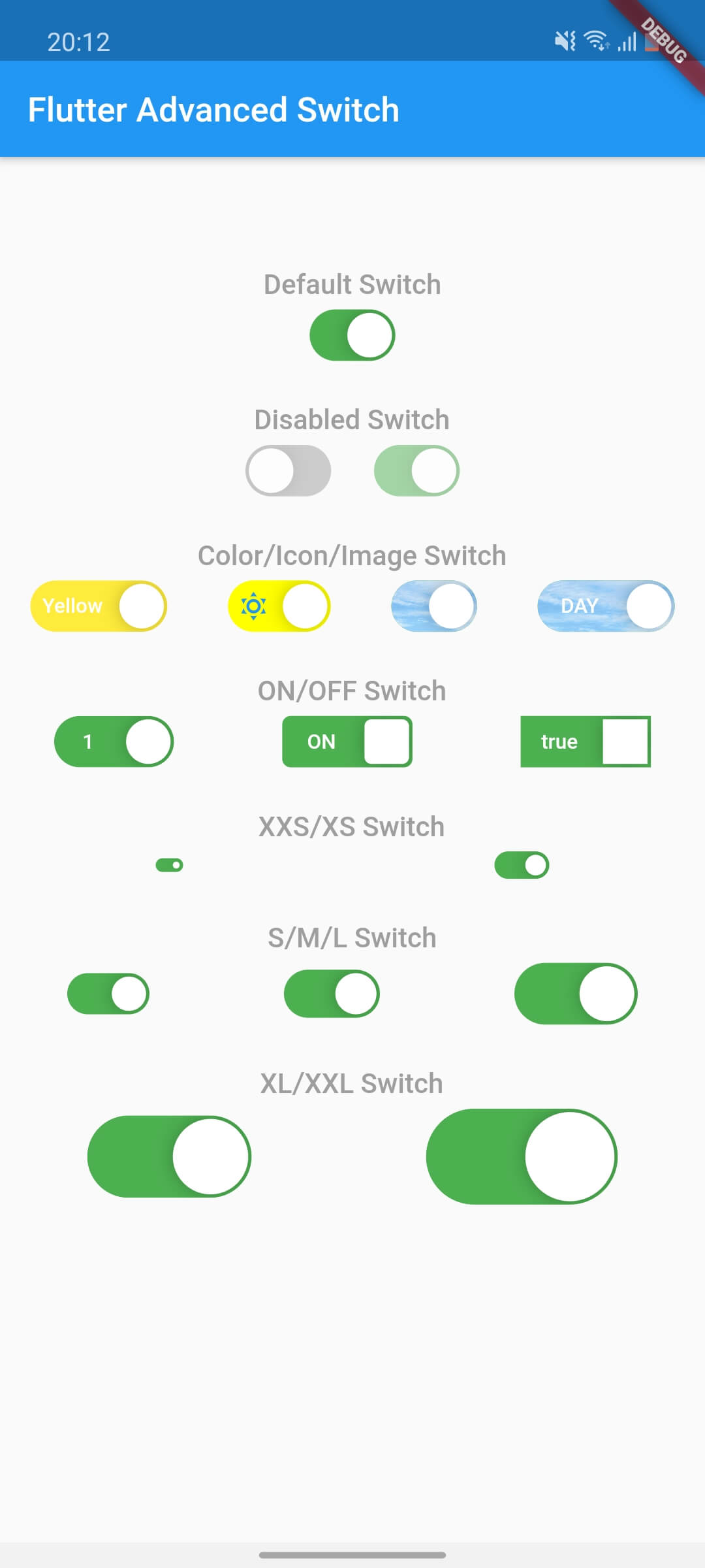
An advanced switch control provides a rich API for widget customization that opens a new look and feel in your app.
Library to create Beautiful and Customized Toggle Tab Widget on Flutter
Flutter switch button with minimal design and material animation and highly customizable.It can be use as switch button or toggle buttons.
A highly customizable toggle switch with a loading state. Useful when getting data from remote calls.
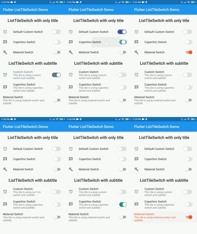
A simple yet elegant widget combines Material ListTile with custom and original Material and Cupertino switch implementations.
A custom tab viewer with built-in animation and different design from default `TabViewer`.
Custom Switch button with attractive animation, made to allow you to customize colors, icons and other cosmetic content.
Prebuilt transitions for AnimatedSwitcher such as flip, zoom and translation
Beautiful Custom Switch created with Flutter.
A switch widget plugin with custom UI and design similar to Oleg Frolov's design on Dribbble
A beautiful animated, and personalized switcher widget component.
Sliding Switch - A simple switch widget. It can be fully customized with desired width, colors, text etc. It also maintains selection state.
Custom switch that looks good for changing the theme of the app
Animated check mark. Customise colors, curves, duration, and more.
An animated toggle switch which can be fully customized with desired width, colors, text, corner radius, animation etc. It also maintains selection state.
An interesting switch component.
A Flutter package for morphing animated switches/sliders with gradients, icons, and glass effects. Highly customizable shapes, sizes, and animations. Perfect for modern UIs.
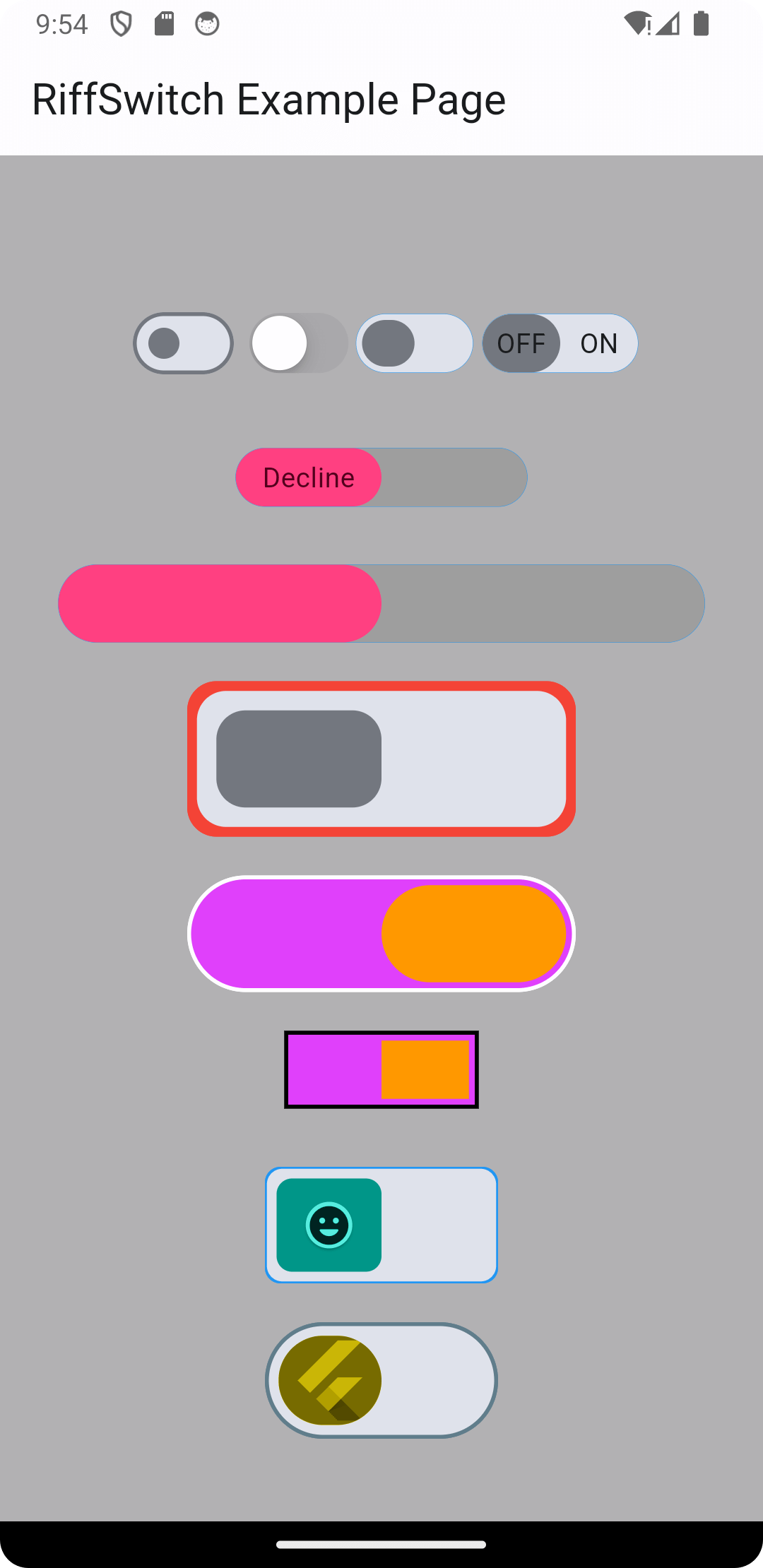
Experience seamless transitions and engaging interactions with RiffSwitch. The switch library that empowers effortless sliding effects and captivating animations.
一个有趣的开关组件。
Check the required features and target platforms first, then compare versions, downloads, and Pub points. Open package details to consult the original documentation and test compatibility in your project.
Flutter is an open-source framework for building beautiful, natively compiled, multi-platform applications from a single codebase.
Check versions and package metadata on pub.dev, and source code, licensing, and maintenance in the project’s GitHub repository. The official Dart documentation explains that package metadata lives in pubspec.yaml.
pub.dev · GitHub · Dart — The pubspec file
All of this metadata goes in the package's pubspec
v0.8.7
v0.3.2
v3.1.0
v1.0.1
v3.2.2
v2.0.0
v0.0.4
v3.2.0
v1.0.0
v1.0.3
v0.0.2
v1.5.1
v1.0.0
v1.1.0
v0.0.2+1
v0.0.2+1
v0.0.4
v2.0.2