Search packages, repositories and app categories

rolling_switch cover
Package detailsv0.0.2

rolling_switch

Custom Switch button with attractive animation, made to allow you to customize colors, icons and other cosmetic content.

AndroidiOSWebmacOSWindowsLinux
30-day downloads
305
Likes
59
Pub points
150

Install package

flutter pub add rolling_switch

Package Overview

Package selection guidance compiled from public package information, community data, and project usage.

A customizable switch button in Flutter featuring smooth, attractive animations. It allows developers to tailor colors, icons, and other visual elements to match their app's design. Ideal for toggling states with a dynamic, engaging user experience across multiple platforms. The package is lightweight and easy to integrate, supporting Android, iOS, Web, macOS, Windows, and Linux. Its flexible customization options make it suitable for both simple and complex UI needs.

Use cases

  • Toggling themes
  • Enabling/disabling features
  • User preference settings
  • Interactive onboarding flows
  • Custom form controls

Key features

  • Smooth rolling animation
  • Color customization
  • Icon support
  • Cross-platform compatibility
  • Easy integration
  • Configurable toggle behavior

Suitable for

  • UI designers seeking animated switches
  • Developers building interactive forms
  • Apps requiring theme or setting toggles
  • Projects with custom aesthetic requirements
  • Flutter apps targeting multiple platforms

Considerations

  • May require additional styling for accessibility
  • Animation performance depends on device
  • Limited to visual customization, not state management
  • Not suitable for high-frequency state changes
  • Best used with clear visual feedback

Original README

Original README snapshot from the linked source repository. Visit the repository for the latest content.

Rolling Switch Package


Full customizable rolling switch widget for flutter apps forked from this library
Custom Switch button with attractive animation, made to allow you to customize colors, icons, custom widget and other cosmetic content.

Manage the widget states in the same way you do with the classical material's switch widget.

style: lint


Quick Start

Import this library into your project:

roling_switch: ^latest_version

Basic Implementation

Using the icon constructor

RollingSwitch.icon(
  onChanged: (bool state) {
    print('turned ${(state) ? 'on' : 'off'}');
  },
  rollingInfoRight: const RollingIconInfo(
    icon: Icons.flag,
    text: Text('Flag'),
  ),
  rollingInfoLeft: const RollingIconInfo(
    icon: Icons.check,
    backgroundColor: Colors.grey,
    text: Text('Check'),
  ),
),
More possibilities
  • Create a custom widget, use:
    const RollingWidgetInfo(icon: FlutterLogo())
    

  • Change color background between transactions left/right
    RollingSwitch.icon(    
      rollingInfoRight: const RollingIconInfo(
        backgroundColor: Colors.green,
      ),
      rollingInfoLeft: const RollingIconInfo(
        backgroundColor: Colors.grey,
      ),
    )
    

  • Change Circular color
    RollingSwitch.icon(
      ...
      circularColor: (icon: FlutterLogo())
    )
    

  • Create a custom text indicator
    RollingSwitch.icon(    
      rollingInfoRight: const RollingIconInfo(
        text: Text('Flag'),
      ),
      rollingInfoLeft: const RollingIconInfo(
        text: Text('Stack'),
      ),
    )
    

  • Enable drag switch
    RollingSwitch.icon(
      ...
      enableDrag: true
    )
    

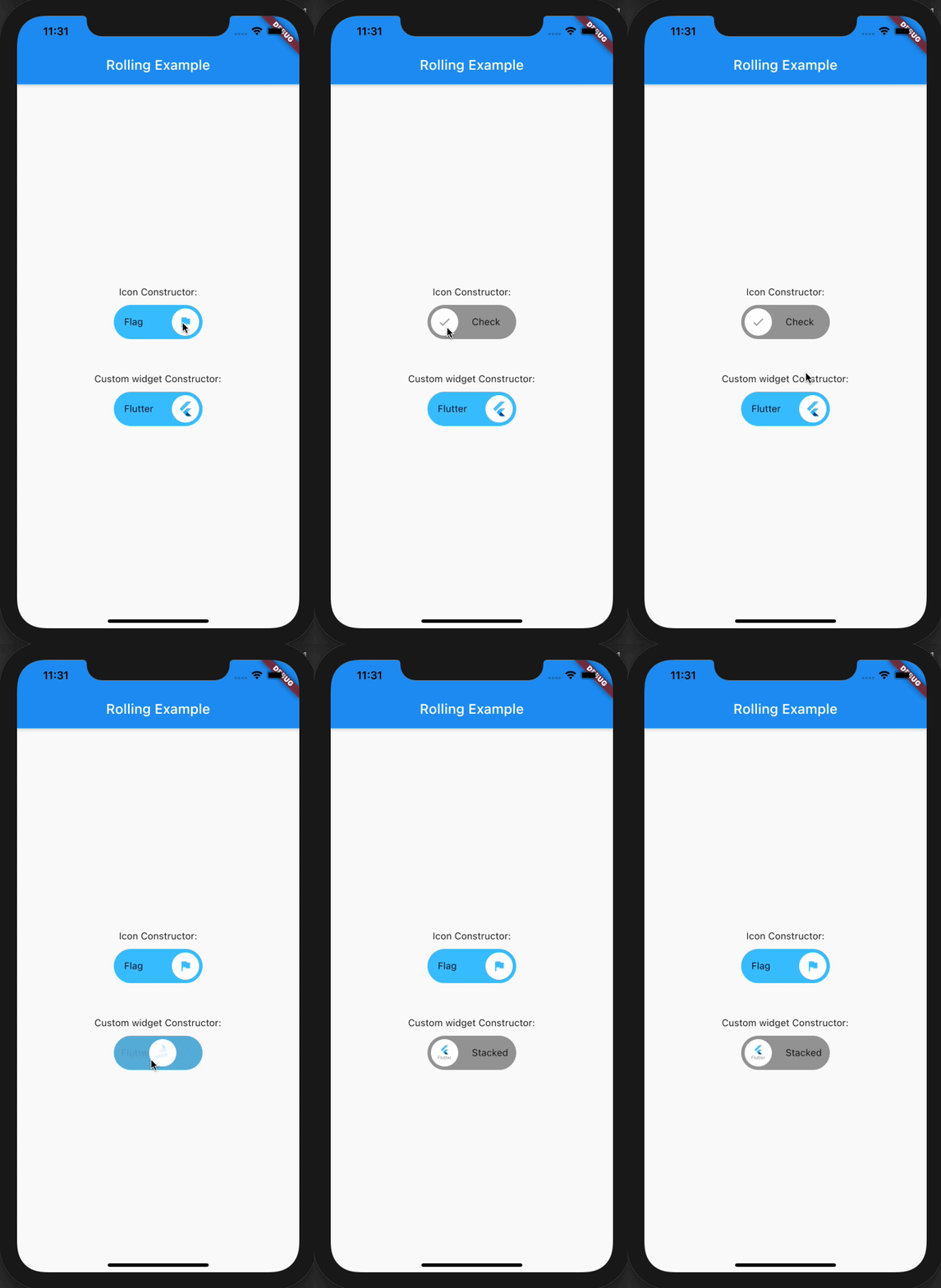
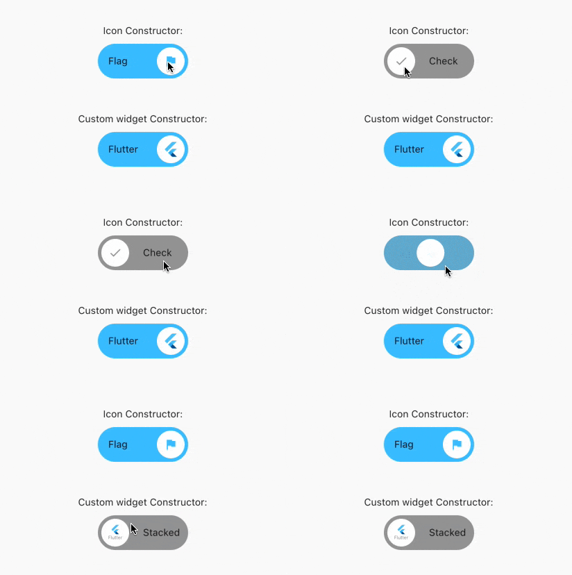
Previews

Categories

Source repository

Projects using this package

No data available yet.