Search packages, repositories and app categories

sliding_switch cover
Package detailsv1.1.0

sliding_switch

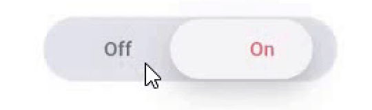
Sliding Switch - A simple switch widget. It can be fully customized with desired width, colors, text etc. It also maintains selection state.

AndroidiOSWebmacOSWindowsLinux
30-day downloads
731
Likes
33
Pub points
130

Install package

flutter pub add sliding_switch

Package Overview

Package selection guidance compiled from public package information, community data, and project usage.

SlidingSwitch is a customizable switch widget for Flutter that allows users to toggle between two states with a sliding motion. It supports full customization of width, colors, text labels, and animation. The widget maintains its selection state across rebuilds, ensuring consistent user experience. Designed for simplicity and flexibility, it works seamlessly across Android, iOS, Web, macOS, Windows, and Linux platforms. Ideal for settings, preferences, and on/off toggles in apps.

Use cases

  • User preference toggles
  • Settings panels
  • On/off switches
  • Form controls
  • Dark mode switches

Key features

  • Fully customizable appearance
  • State persistence
  • Cross-platform support
  • Smooth sliding animation
  • Text label support
  • Configurable width and colors

Suitable for

  • Simple toggle UIs
  • Customizable form elements
  • Multi-platform apps
  • Preference settings
  • Lightweight switch components

Considerations

  • Limited to two-state switching
  • No built-in accessibility features
  • Requires manual handling of state in complex scenarios
  • Not suitable for multi-option selections

Original README

Original README snapshot from the linked source repository. Visit the repository for the latest content.

sliding_switch

Sliding Switch - A simple switch widget. It can be fully customized with desired width, colors, text etc. It also maintains selection state.

Live Demo (Codeapprun)

codeapprun.io

Getting Started

In the pubspec.yaml of your flutter project, add the following dependency:

dependencies:
  ...
  sliding_switch: "latest"

Import it:

import 'package:sliding_switch/sliding_switch.dart';

Usage Examples

Minimum sliding switch configuration
SlidingSwitch(
 value: false,
 width: 250,
 onChanged: (bool value) {
   print(value);
 },
)

sliding switch

sliding switch other configurations
SlidingSwitch(
 value: false,
 width: 250,
 onChanged: (bool value) {
   print(value);
 },
 height : 55,
 animationDuration : const Duration(milliseconds: 400),
 onTap:(){},
 onDoubleTap:(){},
 onSwipe:(){},
 textOff : "Female",
 textOn : "Male",
 iconOff: Icons.human-female,
 iconOn: Icons.human-male,
 contentSize: 17,
 colorOn : const Color(0xffdc6c73),
 colorOff : const Color(0xff6682c0),
 background : const Color(0xffe4e5eb),
 buttonColor : const Color(0xfff7f5f7),
 inactiveColor : const Color(0xff636f7b),
),

If iconOn or iconOff are not null, they will be displayed in lieu of the respective textOn and textOff. The values for textOn and textOff are used as semantic labels for the icons for accessibility. The icons in the example are not in the default material icon set, but are from [Material Design Icons] (https://materialdesignicons.com/), available on pub.dev here.

contentSize drives the height of the text or icons.

Licensed Under the MIT License.

Inspiration

Jitu Raut

Categories

Source repository

Projects using this package

No data available yet.