Search packages, repositories and app categories

toggle_switch cover
Package detailsv2.3.0

toggle_switch

Toggle Switch - A simple toggle switch widget. It can be fully customized with desired icons, width, colors, text, corner radius etc. It also maintains selection state.

AndroidiOSWebmacOSWindowsLinux
30-day downloads
217K
Likes
1.6K
Pub points
160

Install package

flutter pub add toggle_switch

Package Overview

Package selection guidance compiled from public package information, community data, and project usage.

A customizable toggle switch widget for Flutter that supports full customization of appearance and behavior. Users can adjust width, colors, icons, text, corner radius, and more. It maintains selection state across rebuilds and is suitable for various UI needs requiring on/off toggling. The package is lightweight and compatible with all major platforms including mobile, web, and desktop.

Use cases

  • User preference settings
  • On/off feature toggles
  • Form input controls
  • Dark mode switches
  • Profile configuration panels

Key features

  • Fully customizable design
  • Maintains selection state
  • Supports icons and text
  • Cross-platform compatibility
  • Adjustable size and styling
  • Simple API integration

Suitable for

  • Developers building responsive UIs
  • Apps needing toggle-based inputs
  • Customizable form components
  • Multi-platform Flutter projects

Considerations

  • Requires manual handling of state in some cases
  • Limited built-in animations
  • Best suited for simple toggle logic
  • Not ideal for complex interactive widgets

Original README

Original README snapshot from the linked source repository. Visit the repository for the latest content.

Toggle Switch

A simple toggle switch widget. It can be fully customized with desired icons, width, colors, text, corner radius, animation etc. It also maintains selection state.

Getting Started

In the pubspec.yaml of your flutter project, add the following dependency:

dependencies:
  ...
  toggle_switch: ^2.3.0

Import it:

import 'package:toggle_switch/toggle_switch.dart';

Usage Examples

Basic toggle switch
// Here, default theme colors are used for activeBgColor, activeFgColor, inactiveBgColor and inactiveFgColor
ToggleSwitch(
  initialLabelIndex: 0,
  totalSwitches: 3,
  labels: ['America', 'Canada', 'Mexico'],
  onToggle: (index) {
    print('switched to: $index');
  },
),

Basic toggle switch

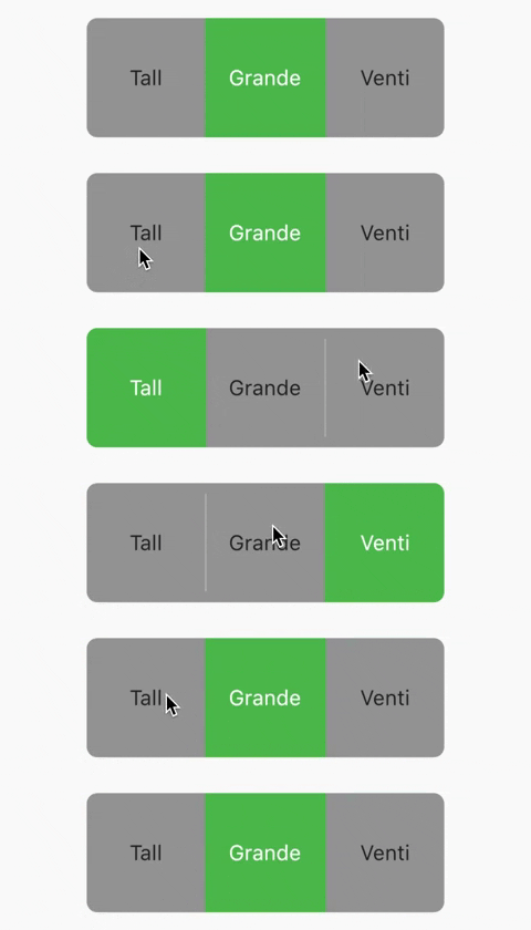
Basic toggle switch with custom height and font size
ToggleSwitch(
  minWidth: 90.0,
  minHeight: 90.0,
  fontSize: 16.0,
  initialLabelIndex: 1,
  activeBgColor: [Colors.green],
  activeFgColor: Colors.white,
  inactiveBgColor: Colors.grey,
  inactiveFgColor: Colors.grey[900],
  totalSwitches: 3,
  labels: ['Tall', 'Grande', 'Venti'],
  onToggle: (index) {
    print('switched to: $index');
  },
),

Basic toggle switch with custom height and font size

With text or icon and custom widths
ToggleSwitch(
  customWidths: [90.0, 50.0],
  cornerRadius: 20.0,
  activeBgColors: [[Colors.cyan], [Colors.redAccent]],
  activeFgColor: Colors.white,
  inactiveBgColor: Colors.grey,
  inactiveFgColor: Colors.white,
  totalSwitches: 2,
  labels: ['YES', ''],
  icons: [null, FontAwesomeIcons.times],
  onToggle: (index) {
    print('switched to: $index');
  },
),

With text or icon and custom widths

With icons, text and different active background colors
ToggleSwitch(
  minWidth: 90.0,
  initialLabelIndex: 1,
  cornerRadius: 20.0,
  activeFgColor: Colors.white,
  inactiveBgColor: Colors.grey,
  inactiveFgColor: Colors.white,
  totalSwitches: 2,
  labels: ['Male', 'Female'],
  icons: [FontAwesomeIcons.mars, FontAwesomeIcons.venus],
  activeBgColors: [[Colors.blue],[Colors.pink]],
  onToggle: (index) {
    print('switched to: $index');
  },
),

With icons, text and different active background colors

With border color, border width, icons, custom height and different active background colors
ToggleSwitch(
  minWidth: 90.0,
  minHeight: 70.0,
  initialLabelIndex: 2,
  cornerRadius: 20.0,
  activeFgColor: Colors.white,
  inactiveBgColor: Colors.grey,
  inactiveFgColor: Colors.white,
  totalSwitches: 3,
  icons: [
    FontAwesomeIcons.mars,
    FontAwesomeIcons.venus,
    FontAwesomeIcons.transgender
  ],
  iconSize: 30.0,
  borderWidth: 2.0,
  borderColor: [Colors.blueGrey],
  activeBgColors: [[Colors.blue], [Colors.pink], [Colors.purple]],
  onToggle: (index) {
    print('switched to: $index');
  },
),

With border color, border width, icons, custom height and different active background colors

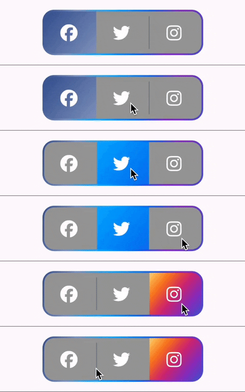
With gradient border color, divider color and gradient active background colors
ToggleSwitch(
  minWidth: 90.0,
  minHeight: 70.0,
  initialLabelIndex: 0,
  cornerRadius: 20.0,
  activeFgColor: Colors.white,
  inactiveBgColor: Colors.grey,
  inactiveFgColor: Colors.white,
  totalSwitches: 3,
  icons: [
    FontAwesomeIcons.facebook,
    FontAwesomeIcons.twitter,
    FontAwesomeIcons.instagram
  ],
  iconSize: 30.0,
  borderColor: [Color(0xff3b5998), Color(0xff8b9dc3), Color(0xff00aeff), Color(0xff0077f2), Color(0xff962fbf), Color(0xff4f5bd5)],
  dividerColor: Colors.blueGrey,
  activeBgColors: [[Color(0xff3b5998), Color(0xff8b9dc3)], [Color(0xff00aeff), Color(0xff0077f2)], [Color(0xfffeda75), Color(0xfffa7e1e), Color(0xffd62976), Color(0xff962fbf), Color(0xff4f5bd5)]],
  onToggle: (index) {
    print('switched to: $index');
  },
),

With gradient border color, divider color and gradient active background colors

With bounceInOut animation
ToggleSwitch(
  minWidth: 90.0,
  minHeight: 70.0,
  initialLabelIndex: 0,
  cornerRadius: 20.0,
  activeFgColor: Colors.white,
  inactiveBgColor: Colors.grey,
  inactiveFgColor: Colors.white,
  totalSwitches: 2,
  icons: [
    FontAwesomeIcons.lightbulb,
    FontAwesomeIcons.solidLightbulb,
  ],
  iconSize: 30.0,
  activeBgColors: [[Colors.black45, Colors.black26], [Colors.yellow, Colors.orange]],
  animate: true, // with just animate set to true, default curve = Curves.easeIn
  curve: Curves.bounceInOut, // animate must be set to true when using custom curve
  onToggle: (index) {
    print('switched to: $index');
  },
),

With bounceInOut animation

With radius style
ToggleSwitch(
  minWidth: 90.0,
  cornerRadius: 20.0,
  activeBgColors: [[Colors.green[800]!], [Colors.red[800]!]],
  activeFgColor: Colors.white,
  inactiveBgColor: Colors.grey,
  inactiveFgColor: Colors.white,
  initialLabelIndex: 1,
  totalSwitches: 2,
  labels: ['True', 'False'],
  radiusStyle: true,
  onToggle: (index) {
    print('switched to: $index');
  },
),

With radius style

With custom text styles, null initial label, double tap to de-activate
ToggleSwitch(
  minWidth: 90.0,
  cornerRadius: 20.0,
  inactiveFgColor: Colors.white,
  initialLabelIndex: null,
  doubleTapDisable: true, // re-tap active widget to de-activate
  totalSwitches: 3,
  labels: ['Normal', 'Bold', 'Italic'],
  customTextStyles: [
    null,
    TextStyle(
        color: Colors.brown,
        fontSize: 18.0,
        fontWeight: FontWeight.w900),
    TextStyle(
        color: Colors.black,
        fontSize: 16.0,
        fontStyle: FontStyle.italic)
  ],
  onToggle: (index) {
    print('switched to: $index');
  },
),

With custom text styles, null initial label, double tap to de-activate

With custom icons
ToggleSwitch(
  minWidth: 90.0,
  minHeight: 90.0,
  cornerRadius: 20.0,
  activeBgColors: [
    [Color(0xfffdbb0a)],
    [Colors.black54],
    [Colors.white54]
  ],
  inactiveFgColor: Colors.white,
  initialLabelIndex: 2,
  totalSwitches: 3,
  customIcons: [
    Icon(
      FontAwesomeIcons.ccVisa,
      color: Color(0xff1a1f71),
      size: 55.0,
    ),
    Icon(
      FontAwesomeIcons.ccMastercard,
      color: Color(0xffF79E1B),
      size: 55.0,
    ),
    Icon(
      FontAwesomeIcons.ccAmex,
      color: Color(0xff27AEE3),
      size: 55.0,
    )
  ],
  onToggle: (index) {
    print('switched to: $index');
  },
),

With custom icons

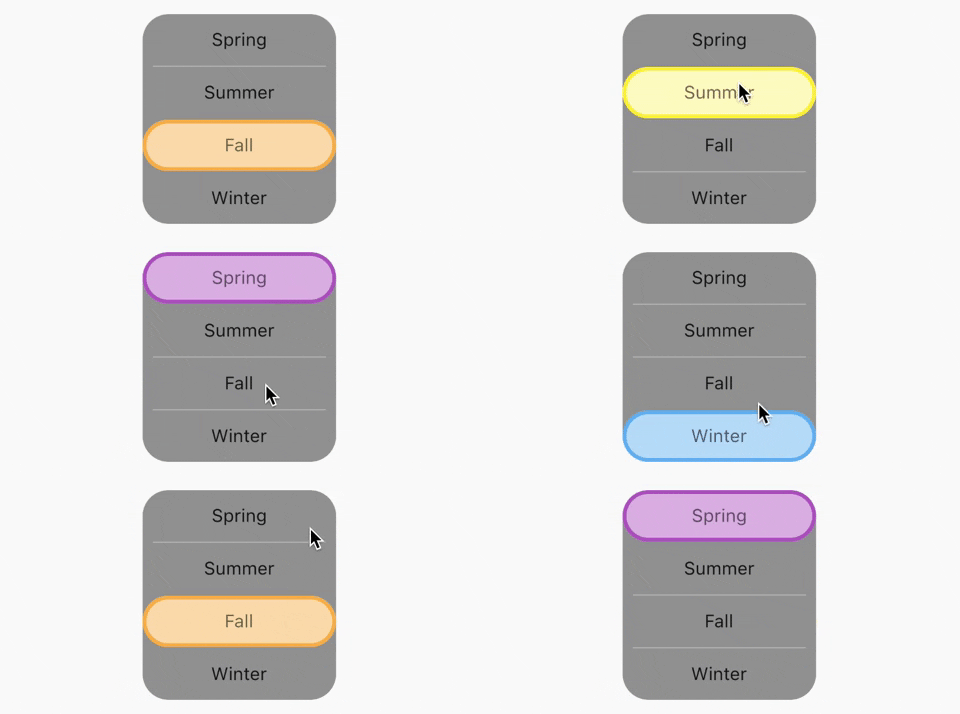
Vertical toggle switch with active border
ToggleSwitch(
  activeBorders: [
    Border.all(
      color: Colors.purple,
      width: 3.0,
    ),
    Border.all(
      color: Colors.yellow.shade700,
      width: 3.0,
    ),
    Border.all(
      color: Colors.deepOrangeAccent,
      width: 3.0,
    ),
    Border.all(
      color: Colors.blue.shade500,
      width: 3.0,
    ),
  ],
  activeFgColor: Colors.black54,
  isVertical: true,
  minWidth: 150.0,
  radiusStyle: true,
  cornerRadius: 20.0,
  initialLabelIndex: 2,
  activeBgColors: [
    [Colors.purpleAccent],
    [Colors.yellow],
    [Colors.orange],
    [Colors.lightBlueAccent]
  ],
  labels: ['Spring', 'Summer', 'Fall', 'Winter'],
  onToggle: (index) {
    print('switched to: $index');
  },
),

Vertical toggle switch with active border

Custom widths greater than device width
SingleChildScrollView(
  scrollDirection: Axis.horizontal,
  child: Scrollbar(
    child: Padding(
      padding: const EdgeInsets.symmetric(horizontal: 10.0),
      child: ToggleSwitch(
        customWidths: [300.0, 100.0, 100.0],
        cornerRadius: 20.0,
        activeBgColors: [
          [Colors.green],
          [Colors.redAccent],
          [Colors.blue]
        ],
        activeFgColor: Colors.white,
        inactiveBgColor: Colors.grey,
        inactiveFgColor: Colors.white,
        labels: ['Yes, the statement above is true', 'False', 'Other'],
        onToggle: (index) {
          print('switched to: $index');
        },
      ),
    ),
  ),
),

Custom widths greater than device width

Multi-line text with custom text style inheriting activeFgColor and inactiveFgColor
ToggleSwitch(
  initialLabelIndex: 0,
  minHeight: 100.0,
  minWidth: 100.0,
  activeBgColor: [Colors.blueAccent.shade200],
  activeFgColor: Colors.yellow,
  customTextStyles: [
    TextStyle(
      fontSize: 15.0
    )
  ],
  multiLineText: true,
  centerText: true,
  totalSwitches: 2,
  labels: ['This is multi-line text.', 'One line'],
  onToggle: (index) {
    print('switched to: $index');
  },
),

Multi-line text with custom text style inheriting activeFgColor and inactiveFgColor

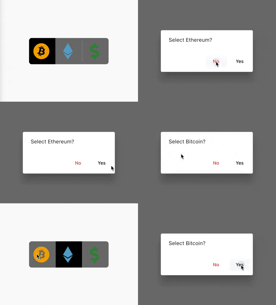
Cancel toggle
ToggleSwitch(
  initialLabelIndex: 0,
  inactiveBgColor: Colors.black54,
  activeBgColor: [Colors.black],
  totalSwitches: 3,
  minHeight: 80.0,
  minWidth: 80.0,
  customIcons: [
    Icon(
      FontAwesomeIcons.bitcoin,
      color: Color(0xFFF2A900),
      size: 50.0,
    ),
    Icon(
      FontAwesomeIcons.ethereum,
      color: Color(0xFF5ca6ce),
      size: 50.0,
    ),
    Icon(
      FontAwesomeIcons.dollarSign,
      color: Colors.green.shade700,
      size: 50.0,
    )
  ],
  onToggle: (index) {
    print('switched to: $index');
  },
  cancelToggle: (index) async {
    String selection = index == 0
        ? 'Bitcoin'
        : index == 1
            ? 'Ethereum'
            : 'Fiat';
    return await showDialog(
      context: context,
      builder: (dialogContext) => AlertDialog(
        content: Text("Select $selection?"),
        actions: [
          TextButton(
              child: Text("No",
                  style: TextStyle(color: Colors.red)),
              onPressed: () {
                Navigator.pop(dialogContext, true);
              }),
          TextButton(
              child: Text("Yes",
                  style: TextStyle(color: Colors.black)),
              onPressed: () {
                Navigator.pop(dialogContext, false);
              })
        ],
      ),
    );
  },
),

Cancel toggle

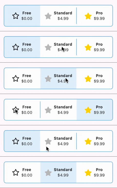
Custom widgets
ToggleSwitch(
  initialLabelIndex: 0,
  minHeight: 75.0,
  minWidth: double.maxFinite,
  activeBgColor: [Colors.blue.shade50],
  inactiveBgColor: Colors.white,
  dividerColor: Colors.blue,
  borderColor: [Colors.blue],
  borderWidth: 1.0,
  customWidgets: [
    // Overrides default widgets, foreground colors
    Row(
      mainAxisAlignment: MainAxisAlignment.center,
      children: [
        Icon(
          FontAwesomeIcons.star,
        ),
        const SizedBox(width: 10.0),
        Column(
          mainAxisAlignment: MainAxisAlignment.center,
          children: [
            Text(
              'Free',
              style: TextStyle(
                fontWeight: FontWeight.bold,
              ),
              maxLines: 1,
              overflow: TextOverflow.ellipsis,
            ),
            Text(
              '\$0.00',
              maxLines: 1,
              overflow: TextOverflow.ellipsis,
            ),
          ],
        ),
      ],
    ),
    Row(
      mainAxisAlignment: MainAxisAlignment.center,
      children: [
        Icon(
          FontAwesomeIcons.solidStar,
          color: Color(0xffC0C0C0),
        ),
        const SizedBox(width: 10.0),
        Column(
          mainAxisAlignment: MainAxisAlignment.center,
          children: [
            Text(
              'Standard',
              style: TextStyle(
                fontWeight: FontWeight.bold,
              ),
              maxLines: 1,
              overflow: TextOverflow.ellipsis,
            ),
            Text(
              '\$4.99',
              maxLines: 1,
              overflow: TextOverflow.ellipsis,
            ),
          ],
        ),
      ],
    ),
    Row(
      mainAxisAlignment: MainAxisAlignment.center,
      children: [
        Icon(
          FontAwesomeIcons.solidStar,
          color: Color(0xffFFD700),
        ),
        const SizedBox(width: 10.0),
        Column(
          mainAxisAlignment: MainAxisAlignment.center,
          children: [
            Text(
              'Pro',
              style: TextStyle(
                fontWeight: FontWeight.bold,
              ),
              maxLines: 1,
              overflow: TextOverflow.ellipsis,
            ),
            Text(
              '\$9.99',
              maxLines: 1,
              overflow: TextOverflow.ellipsis,
            ),
          ],
        ),
      ],
    ),
  ],
  onToggle: (index) {
    print('switched to: $index');
  },
),

Custom widgets

TextDirection.rtl and corner radius
// When ToggleSwitch is used with Directionality widget and textDirection is set to TextDirection.rtl (right-to-left), 
// switches are displayed right to left along with their respective index values. In this case, corner radius of switches aren't set correctly. 
// To fix this, please use textDirectionRTL parameter and set it to true as shown in the example below. 
Directionality(
  textDirection: TextDirection.rtl,
  child: ToggleSwitch(
    initialLabelIndex: 0,
    cornerRadius: 12.0,
    textDirectionRTL: true,
    activeFgColor: Colors.white,
    totalSwitches: 2,
    labels: ['left', 'right'],
    onToggle: (index) {
      print('switched to: $index');
    },
  ),
),
setState() inside onToggle

Example code with explanation

Code Contributors

Categories

Source repository

Projects using this package

Rankings